
Timebandit
Member
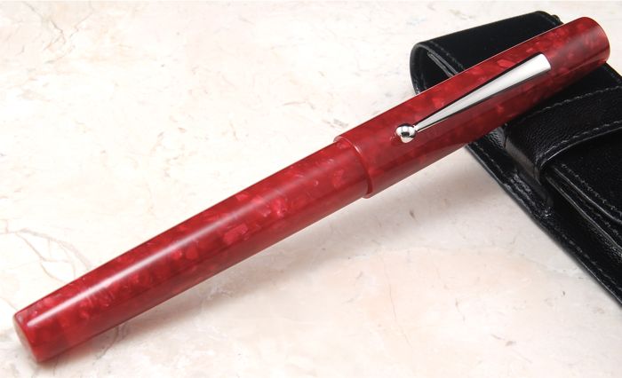
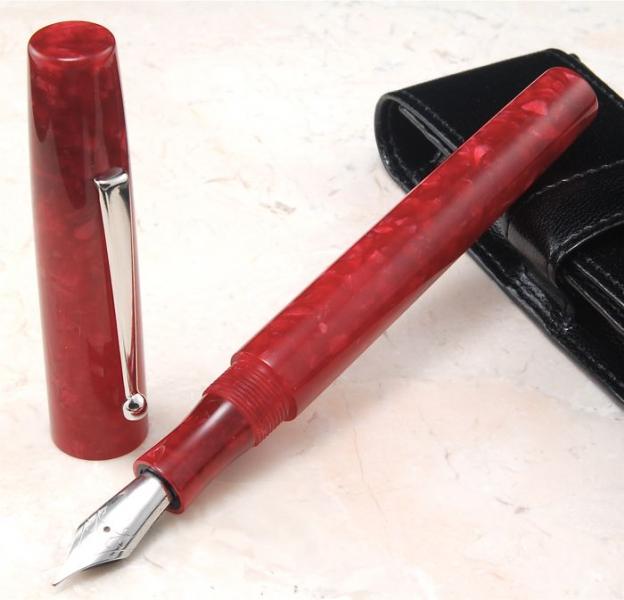
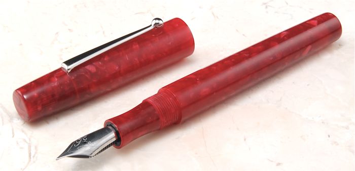
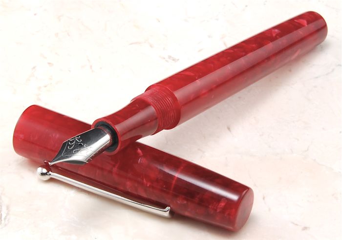
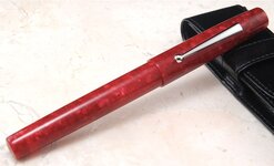
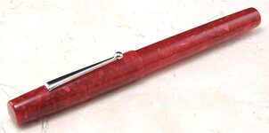
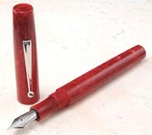
Here is one i did a week or so ago. I hope no one gets sick of seeing my work.:redface:This is Crimson Flake acrylic with a #6 Meitser Nib. This one turned out good i think. The flake came out real nice on the crimson background.
Hmm. ...not sure why a couple pics came out really light...sorry
All Comments Welcome
Thanks For Looking
Justin


Hmm. ...not sure why a couple pics came out really light...sorry
All Comments Welcome
Thanks For Looking
Justin


")