
thetalbott4
Member
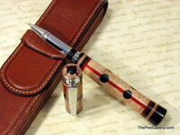
Ok, here is another example of something I envisioned when I started, and when it was done I was disappointed. Not with the segmenting or drilling, which was fairly straight forward, but the over-all look.
First off, I didnt like the chrome as much as I thought I would. My first thought was black ti, but I thought it would be too much black because the black segments would be next to the black metal parts. Now I think it would have been better with black ti.
Next is the cap. I didnt put enough arc on it to match the body. I also think the cap would have been better off in blackwood alone (except the final, which I like). The pen is a little busy and that would help tone it down.
With the body, the flare at the end is too big. I also think I should have alternated the dots with two, then one, and so on or something like that.
I'm interested in hearing how other people see it as it is, what they think about my ideas or how they would do it better.
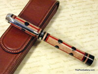
 There was definately many hours of careful measuring and planning in that pen and you should be very pleased with the result. Well done!!:biggrin: