Purple rose froggy victorian, by Toni

Signed-In Members Don't See This Ad
See more from edstreet

edstreet

Member
Joined
Aug 12, 2007
Messages
3,684
Location
No longer confused....
Many of you may have seen the progression of this but it was time to show the final pen and what great potential to come. With any 'new' design comes a good magnitude of things like hope, fear, doubt, faith and a ton of unknowns.

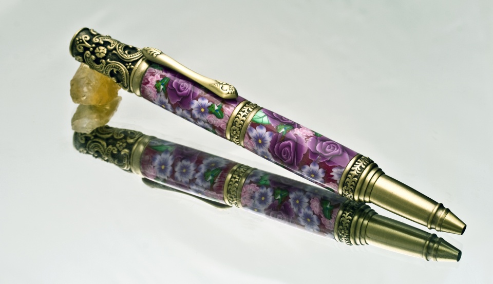
Here we have the new Victorian Antique Brass Twist Pen Kit at Penn State Industries Make no mistake here, this is a souped up bling-a-fied cigar pen.

I insisted that she get the very first pen made and here it is.

IMG_0924.jpg


IMG_0926.jpg


IMG_0898.jpg


attachment.php
 

Attachments

  • IMG_0937.jpg
    IMG_0937.jpg
    117.2 KB · Views: 563
Last edited:
Signed-In Members Don't See This Ad

edstreet

Member
Joined
Aug 12, 2007
Messages
3,684
Location
No longer confused....
I added one additional photo. The first 3 I had to host on my gallery, having some problems with the black backgrounds on uploads. The additional image is a white background hosted here on IAP.
 

dexter0606

Member
Joined
Jun 11, 2009
Messages
525
Location
Cambridge, ON
Nice blanks. Not so sure about that kit though. It's a little busy! And I much prefer the lighter background although I'm not a big fan of the mirror shots. Toni will be pleased
 

BSea

Member
Joined
Dec 28, 2009
Messages
4,628
Location
Little Rock, Arkansas
Nice blanks. Not so sure about that kit though. It's a little busy! And I much prefer the lighter background although I'm not a big fan of the mirror shots. Toni will be pleased
I agree with the kit being a little busy. I think it competes with the blank a bit. I do like the clip, and the centerband. I prefer the black background. Maybe it's because I've tried it, and know the editing involved to get it looking perfect. :bulgy-eyes: But it really makes the colors pop.

And what can you say about Toni's blanks other than WOW!!!
 
Last edited:

CaptG

Member
Joined
Jan 3, 2007
Messages
2,686
Location
Otsego, Mi, USA.
An out of the park home run by Toni. IMHO, yes it looks very busy, BUT, it is Victorian and that is the essence of Victorian. I can see the sales potential of these and to me that looks very good. Awesome job Toni.
 

walshjp17

Member
Joined
Jul 29, 2012
Messages
3,418
Location
Weddington, NC
Some may think that the the kit is a bit too busy, but in my mind the combination of that kit with that blank is the quintessence of 'Victorian'.

Outstanding in every aspect.
 
Last edited:

edstreet

Member
Joined
Aug 12, 2007
Messages
3,684
Location
No longer confused....
Nice blanks. Not so sure about that kit though. It's a little busy! And I much prefer the lighter background although I'm not a big fan of the mirror shots. Toni will be pleased
I agree with the kit being a little busy. I think it competes with the blank a bit. I do like the clip, and the centerband. I prefer the black background. Maybe it's because I've tried it, and know the editing involved to get it looking perfect. :bulgy-eyes: But it really makes the colors pop.

And what can you say about Toni's blanks other than WOW!!!

Mostly it was removing dust from the black areas. There was no editing to get it to look that way.

The lighting angle and direction makes the colors pop and it's the colored background that makes certain detail in the pen come out or be hidden.

I am still uncertain if it is 'to busy' or not. The more you look at victorian patterns the more you see this is not busy.
 

BSea

Member
Joined
Dec 28, 2009
Messages
4,628
Location
Little Rock, Arkansas
Mostly it was removing dust from the black areas. There was no editing to get it to look that way.

The lighting angle and direction makes the colors pop and it's the colored background that makes certain detail in the pen come out or be hidden.

I am still uncertain if it is 'to busy' or not. The more you look at victorian patterns the more you see this is not busy.
Removing the dust was what I meant. I've done a couple of photos using a piece of black plexiglass, and when i get done removing the dust, i
I swear I'll never do it again. of course, I will.:rolleyes:

btw, how do you get your black so black? Mine come out more dark gray than black. I sure wish I could take pictures closer to yours.
 

robersonjr

Member
Joined
Jul 29, 2011
Messages
456
Location
Yuma, Az
Beautiful pen, Toni's blanks are amazing which coupled with your skills makes a beautiful writing instrument.
 

Toni

Member
Joined
Feb 23, 2010
Messages
2,042
Location
Phenix City, Alabama
Cant lie I was a bit hesitant to do tubes for this kit as it is so busy. But Once I took on the challenge it was well worth it. The kit is beautiful and I get frogs:biggrin: on my pen.

Thank you Ed Street for the beautiful photos!!
 

edstreet

Member
Joined
Aug 12, 2007
Messages
3,684
Location
No longer confused....
Mostly it was removing dust from the black areas. There was no editing to get it to look that way.

The lighting angle and direction makes the colors pop and it's the colored background that makes certain detail in the pen come out or be hidden.

I am still uncertain if it is 'to busy' or not. The more you look at victorian patterns the more you see this is not busy.
Removing the dust was what I meant. I've done a couple of photos using a piece of black plexiglass, and when i get done removing the dust, i
I swear I'll never do it again. of course, I will.:rolleyes:

btw, how do you get your black so black? Mine come out more dark gray than black. I sure wish I could take pictures closer to yours.

The camera see's everything in zone V. 3 or 4 zones up/down nets you into the heavy detail area. Zone 0 and zone 1 is where you want the background to be at. Even then there is a graduation of the background from top to bottom on these images and that to is related to angles of the background, angle of the mirror and direction of the lighting.

The goal is to expand the zones in the visual image and get away from zone V as much as you can, that way the wow factor, the pop and the detail really starts to stand out. Zone details really hits heavy in 2,3, then again in 7 and 8. Shoot the image for one side then adjust levels for the other side will net you an expanded range.

attachment.php
 

Attachments

  • ZONE SYSTEM.jpg
    ZONE SYSTEM.jpg
    265.4 KB · Views: 214

edstreet

Member
Joined
Aug 12, 2007
Messages
3,684
Location
No longer confused....
Nice choice for that kit. Lower barrel looks a little proud of the centerband.

This is one of the disadvantages of doing heavy detail, macro and close up photography. You will start to see *ALL* the problems with the object. The more macro you get the more flaws and imperfections will start to stick out with a sore thumb.

If I do a distance shot you will see it differently. Also worthy of note the pen rotates in that area and the lower section is unsupported, as is all cigars, in that region.

attachment.php
 

Attachments

  • IMG_0947.jpg
    IMG_0947.jpg
    131.6 KB · Views: 194
Top Bottom