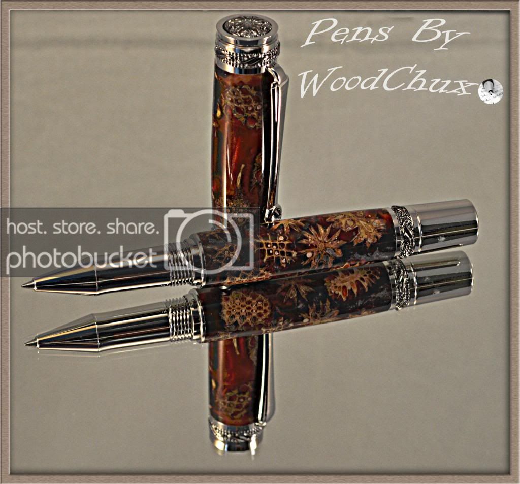
Beautiful job on that pen with the turning and finish! As for the photos, they look good, its amazing what you see in your photos that your naked eye doesn't pick up with pen in hand.
I would reduce your company name by half or more, it takes alot away from the beautiful picture and lose that little circle with the pen tip from your logo - it looks out of place with the nice text you've selected.
Did you do the casting yourself? Very stunning either way.
Kirk