ORIENTAL DRAGON: The "Ruby" must go!

Signed-In Members Don't See This Ad
See more from SteveG

SteveG

Member
Joined
Dec 21, 2009
Messages
2,989
Location
Eugene, Oregon 97404
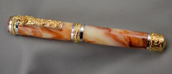
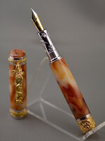
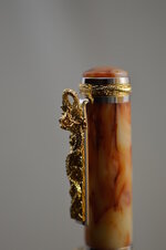
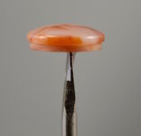
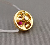
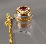
I have just completed my first run at the Oriental Dragon component set. That, along with the Heritance nib, were found at Exotic Blanks. My sales are all "kit pens", so I welcome this unique (and slightly ostentatious) design. The blank material is a nice, vintage Bakelite. One problem: the color tones of the Bakelite do not go well with the finial "Ruby". My first plan was to replace just the crystal with matching Bakelite, but it proved too difficult to remove. Bending the keeper tabs looked like trouble waiting to happen. I started to drill out the reverse side of the finial. (Pic shows it prior to modification attempt.) This was not going well, so I turned a finial part from Bakelite to completely replace the original finial insert. (Isn't it cool how I was able to balance that little part on a small screwdriver while snapping a photo? :rolleyes:) I put the finial pics in so others can see what you face if you want to mod the final. Comments, those favorable, and those which instruct, are welcome. :)
 

Attachments

  • DSC_0015 (6).jpg
    DSC_0015 (6).jpg
    66.5 KB · Views: 404
  • DSC_0018 (1).jpg
    DSC_0018 (1).jpg
    84.6 KB · Views: 373
  • DSC_0016.jpg
    DSC_0016.jpg
    58 KB · Views: 350
  • DSC_0012.jpg
    DSC_0012.jpg
    26.1 KB · Views: 299
  • DSC_0008.jpg
    DSC_0008.jpg
    96.7 KB · Views: 308
  • DSC_0006 (1).jpg
    DSC_0006 (1).jpg
    58 KB · Views: 331
Signed-In Members Don't See This Ad

maxwell_smart007

Lead Moderator
Staff member
Joined
Aug 4, 2007
Messages
6,711
Location
middle of nowhere in the great, white North
Well done - but I just can't handle the gold on that kit....way too much!

I like the silver design a lot - but the gold is just too eye-catching for my taste! That being said - it's a personal preference...

I like what you did with the finial...As an alternative, I wonder if you could keep the ruby 'holders' and turn a smaller cabachon of bakelite to fit inside...
 

pianomanpj

Member
Joined
Sep 24, 2007
Messages
1,147
Location
Augusta, Maine, USA.
Very well done! I think that blank works wonderfully with those components. I like the cap as designed, but you're treatment looks nice, too. Is the finial as "busy" as the cap? (i.e. Is there a crystal on the other end?)

I almost ordered one from Exotics, but I've got too many other pens I need to get out the door right now. Although they are different, the accents around the cap and centerband remind me of the Majestic.
 

mark james

IAP Collection, Curator
Joined
Sep 6, 2012
Messages
12,752
Location
Medina, Ohio
The finial is excellent!

I agree with Andrew that for ME (my preference only), is that the gold is far to glitzy; but I do like the silver accents.

The Bakelite looks excellent with the colors, so it fits well.

It is a shame to remove the components you have paid extra for! I have also been removing the inserts on Kits (Triton I think), and while it is a nice finial, I like the custom matching wood/acrylic to the blank. I am using more Jr Gents as they are less costly, less embellished, and I can make the modifications without feeling like I paid for ornamentations I will remove.

Beautiful Pen!
 
Last edited:

stonepecker

Member
Joined
Oct 29, 2012
Messages
4,382
Location
central Minnesota
I like what you did. The 'ruby' is a matter of personal taste.

Personally, I would pick your design but I am also sure there are people that would pick the other.

Great looking pen.
 

SteveG

Member
Joined
Dec 21, 2009
Messages
2,989
Location
Eugene, Oregon 97404
...As an alternative, I wonder if you could keep the ruby 'holders' and turn a smaller cabachon of bakelite to fit inside...
That was my first thought, but I was afraid I would break or distort or chip the plating on the holders that retain the ruby. I now have the entire finial insert, unneeded for this pen, and am going to experiment to see if a transplant is possible without breaking the retainers. I will post results and pics.

Very well done! I think that blank works wonderfully with those components. I like the cap as designed, but you're treatment looks nice, too. Is the finial as "busy" as the cap? (i.e. Is there a crystal on the other end?)
The barrel end has an all gold one piece insert with a pattern in the metal, no crystal.

Why did you do a nib change. What was you logic for that.
No logic, just personal preference...I really like the clean look of the nib used. Since I was in charge of the operation, I put on what I liked the best. I guess there was a little logic, in that my personal tastes as reflected in the materials and pens I choose usually find favor with my customers. :)

I like what you did. The 'ruby' is a matter of personal taste.

Personally, I would pick your design but I am also sure there are people that would pick the other.

Great looking pen.
Being a novice (or less) photographer, the Bakelite color is off a little in these pics. The true color is a bit more burnt orange. Side-by-side with the "Ruby", the colors really seem to fight with each other. I sought harmony.:wink:
-----------------------------------------------
I appreciate the comments and questions from all. The "over the top" design of this pen will help to round out my offerings at the sales table. I am thinking of doing a high quality (to the extent I am capable of), close-up, 8 X 10 photo of the cap/clip as part of the display. When I look at the clip, I kind of get lost in the detail, with all the reflections coming off the gold. I think it will help the prospective buyer come to realize just how much they NEED this pen.:cool:
 
Top Bottom