Novelty custom FP

Signed-In Members Don't See This Ad
See more from dgscott

dgscott

Member
Joined
Aug 17, 2008
Messages
933
Location
Portland, Oregon
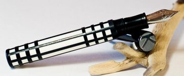
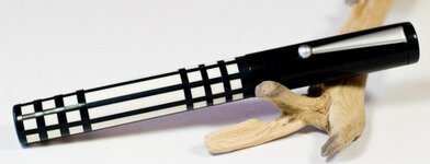
The barrel was the result of playing with what seemed like an uninspiring striped blank. A little segmenting later, I thought it started to look like something out of the the Mission furniture style. The finial is engraved on the CNC mill with what is becoming a "signature" K for me (as in "Kairos Pens").

Thanks for looking.
Doug
 

Attachments

  • missionu.jpg
    missionu.jpg
    30.3 KB · Views: 279
  • mission.jpg
    mission.jpg
    23.3 KB · Views: 217
Signed-In Members Don't See This Ad

Ed McDonnell

Member
Joined
Oct 20, 2008
Messages
2,294
Location
Melbourne, FL
Hi Doug - Kynsey uses a K as well. That could lead to some interesting discussions if you start selling a lot of pens with your K mark.

Nice job on the pen.

Ed
 

dgscott

Member
Joined
Aug 17, 2008
Messages
933
Location
Portland, Oregon
Hi Doug - Kynsey uses a K as well. That could lead to some interesting discussions if you start selling a lot of pens with your K mark.
Ed

I know -- their logo is a K in a circle, and I think the design is trademarked. No one, however (at least to my knowledge) can trademark a letter of the alphabet. At least, I hope not!

Thanks.
Doug
 

08K.80

Member
Joined
Dec 31, 2012
Messages
390
I like it.

I'm new here and don't want to step on anyones toes.

I think I would have incorporated some white into the cap. With the black line on the end and butted up to the cap, it looks like the cap is a little too long to me. Maybe just a thin line of white across the threaded end of the cap?
I can't imagine how difficult it is to line up the lines.
I do like it.

I hope you don't mind, I added a couple lines real quick.


missioncopy_zps3a5b7056.jpg
 
Last edited:

SDB777

Member
Joined
Feb 6, 2010
Messages
6,620
Location
Cabot, Arkansas USA
If this is a 'little segmenting later', I'd like to see what will happen when you get bored and go 'all out segmenting'!!!!:eek:


The contrasting colors will be the huge selling point on this one! White against black, is a show stopper!!!!!


Scott (super coffee drinker) B
 

Katya

Member
Joined
Jan 12, 2012
Messages
393
Location
Toronto, Ontario Canada
Beautifully done!

I like it.

I'm new here and don't want to step on anyones toes.

I think I would have incorporated some white into the cap. With the black line on the end and butted up to the cap, it looks like the cap is a little too long to me. Maybe just a thin line of white across the threaded end of the cap?
I can't imagine how difficult it is to line up the lines.
I do like it.

I hope you don't mind, I added a couple lines real quick.


missioncopy_zps3a5b7056.jpg

This pen is amazing! I'm learning segmenting too, so have been doing a lot of thinking about proportions. Replying to Kelly, I agree that white on the cap might be a good idea, but I think it has to be the same width as the other black stripes. Mission design would keep to the same thicknesses. Just my $0.02.
Please show us more of your work!
 

dgscott

Member
Joined
Aug 17, 2008
Messages
933
Location
Portland, Oregon
I like it.

I'm new here and don't want to step on anyones toes.

I think I would have incorporated some white into the cap. With the black line on the end and butted up to the cap, it looks like the cap is a little too long to me. Maybe just a thin line of white across the threaded end of the cap?
I can't imagine how difficult it is to line up the lines.
I do like it.

I hope you don't mind, I added a couple lines real quick.

I have to say, one of the things I like about this pastime is that there is no end to possibilities. My wife suggested some white material in the cap as well, only she wanted to see a small striped band to tie in the barrel. As for me, after days of tiny little pieces and sticky fingers, I'm glad to move on to the next one!
:)

Thanks for all the kind comments!

Doug
 
Top Bottom