Nice 'n' Creamy Kitless

Signed-In Members Don't See This Ad
See more from Timebandit

Timebandit

Member
Joined
Sep 25, 2010
Messages
1,446
Location
Austin,TX
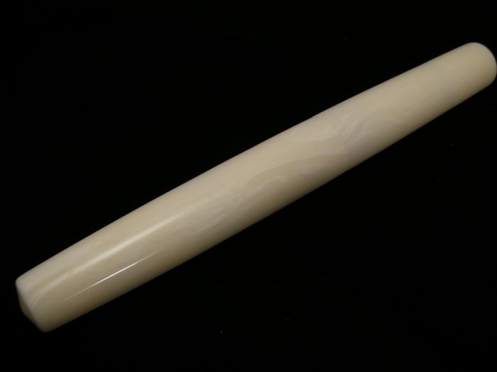
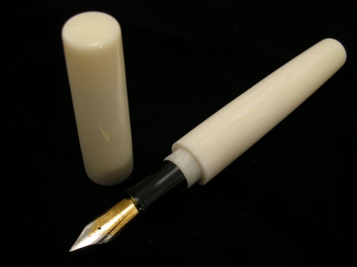
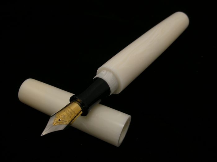
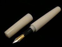
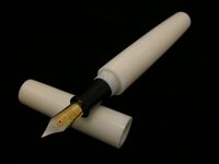
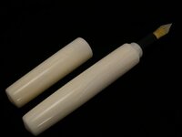
Here is my third attempt. It Cream Lucite and I went with a different shape on this one. I am fairly happy with it. Again i had to use a regular nib as i am still waiting on my nib feeds from heritance to show up so i can start making matching front sections. I also had trouble photoing this pen so i had to go with the black background which makes the front section disappear, which i dont like.

Anyway, all comment welcome

Thanks for looking

Justin

attachment.php

attachment.php

attachment.php

attachment.php

attachment.php
 

Attachments

  • DSCN0640.jpg
    DSCN0640.jpg
    16 KB · Views: 514
  • DSCN0642.jpg
    DSCN0642.jpg
    19.3 KB · Views: 498
  • DSCN0644.jpg
    DSCN0644.jpg
    19.7 KB · Views: 494
  • DSCN0645.jpg
    DSCN0645.jpg
    17.8 KB · Views: 503
  • DSCN0648.jpg
    DSCN0648.jpg
    18.8 KB · Views: 499
Signed-In Members Don't See This Ad

wizard

Member
Joined
Aug 27, 2009
Messages
3,569
Location
Houston, Texas
That is a gorgeous pen. Simple and striking with the contrasting black and white nib section and pen body, respectively. Technically, another one of your kitless wonders!!! :)Thanks for showing. Doc
 

Texatdurango

Member
Joined
Apr 23, 2007
Messages
4,649
Location
Show Low, Arizona
....Anyway, all comment welcome....

I have three comments;

1. First, the pen looks nice, I like the overall shape.

2. I think I would have made the wall thickness of the cap a bit thinner which would in turn reduce the lower body diameter. This would make the transition from the lower body to the male cap threads a little less. As an example, say you move from a 5/8" diameter to a 1/2" dia lower body. I guess the only downside would be that the lucite is so transparant that you might see through the cap.

3. I think the black section with the white body looks fine as it is and probably wouldn't make a matching section, but that's just personal taste.
 

Rick P

Member
Joined
Apr 30, 2011
Messages
1,686
Location
Palmer Alaska
Very nice! Personally I have often thought "I wish I didn't have to put that dang clip on this" especially when using the more exotic materials. Next time I turn Mammoth bone I just might try and turn it without exposed hardware.
 

ldb2000

Member
Joined
Sep 11, 2007
Messages
5,381
Location
Laurence Harbor, NJ, USA.
Great looking pen , the shape is just right . The only nit I have to pick is the transition between the threads and body . you either need to turn the body a little thinner or chamfer the step so it don't look so big . If you chamfer the step and the inside of the cap it can still fit with a small seam and would look a little less balky at the transition .
 

cnirenberg

Member
Joined
Jan 26, 2004
Messages
2,700
Location
Fort Myers, Fl
Justin,
That is a sharp looking pen. I am going to have to agree with both George and Butch on the barrel transition area. Overall it is one sweet looking pen.
 

Timebandit

Member
Joined
Sep 25, 2010
Messages
1,446
Location
Austin,TX
You going to try a clip next Justin?

Yep. As soon as i can get something accurate enough to cut me a little slot without destroying my work. Also thinking about a different way to attach the clip:biggrin:

....Anyway, all comment welcome....

I have three comments;

1. First, the pen looks nice, I like the overall shape.

2. I think I would have made the wall thickness of the cap a bit thinner which would in turn reduce the lower body diameter. This would make the transition from the lower body to the male cap threads a little less. As an example, say you move from a 5/8" diameter to a 1/2" dia lower body. I guess the only downside would be that the lucite is so transparant that you might see through the cap.

3. I think the black section with the white body looks fine as it is and probably wouldn't make a matching section, but that's just personal taste.

Thanks. I agree with you. The diameter needs to go down some for sure. These are just kind of the trial pens to get the sizes dialed in a little bit. I also wanted the pen to flow with no breaks, so getting the seam to match meant that the lower barrel had to be larger. The mandrels i made are 5/8 so i have just been turning to the size. And like you said, the downside would be the transparency of the Lucite.

And the more i look at the pen, i like the black front section as well. Might just make me a black one for it.

Thanks

Great looking pen , the shape is just right . The only nit I have to pick is the transition between the threads and body . you either need to turn the body a little thinner or chamfer the step so it don't look so big . If you chamfer the step and the inside of the cap it can still fit with a small seam and would look a little less balky at the transition .

Thanks Butch. I have been thinking a bout chamfering the step, but on this pen i wanted the upper and lower barrel to be flush, so that kind of x'd the chamfer plan. I will probably do that on a different shape though. And i have been putting a chamfer in my caps. Just looks better and cleans up the threads on the edge. Then i also polish that chamfer so it shines like the rest of the pen. I think thats a nice little touch of detail. Also the diameter of the pen is a little large. Its 5/8 so if i could have brought it down a bit the step wouldnt have been so pronounced. My next few will be a little smaller diameter.
 
Top Bottom