New Bulb filler

Signed-In Members Don't See This Ad
See more from apple320

apple320

Member
Joined
Feb 2, 2008
Messages
372
Location
Orangeville, Ontario, Canada.
Got this one off the lathe today

IMG_2381.jpg


IMG_2382.jpg


Hope you all like

Chris
 
Signed-In Members Don't See This Ad

workinforwood

Member
Joined
Mar 1, 2007
Messages
8,173
Location
Eaton Rapids, Michigan, USA.
Honestly Chris..it overwhelms me. The pen body and shape is ok, but that cap just kills it for me. I generally think your pens look great, and like watching you have fun with old stuff..this one just misses the mark for me sorry.
 

workinforwood

Member
Joined
Mar 1, 2007
Messages
8,173
Location
Eaton Rapids, Michigan, USA.
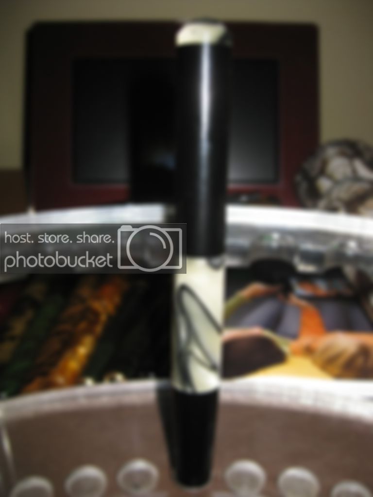
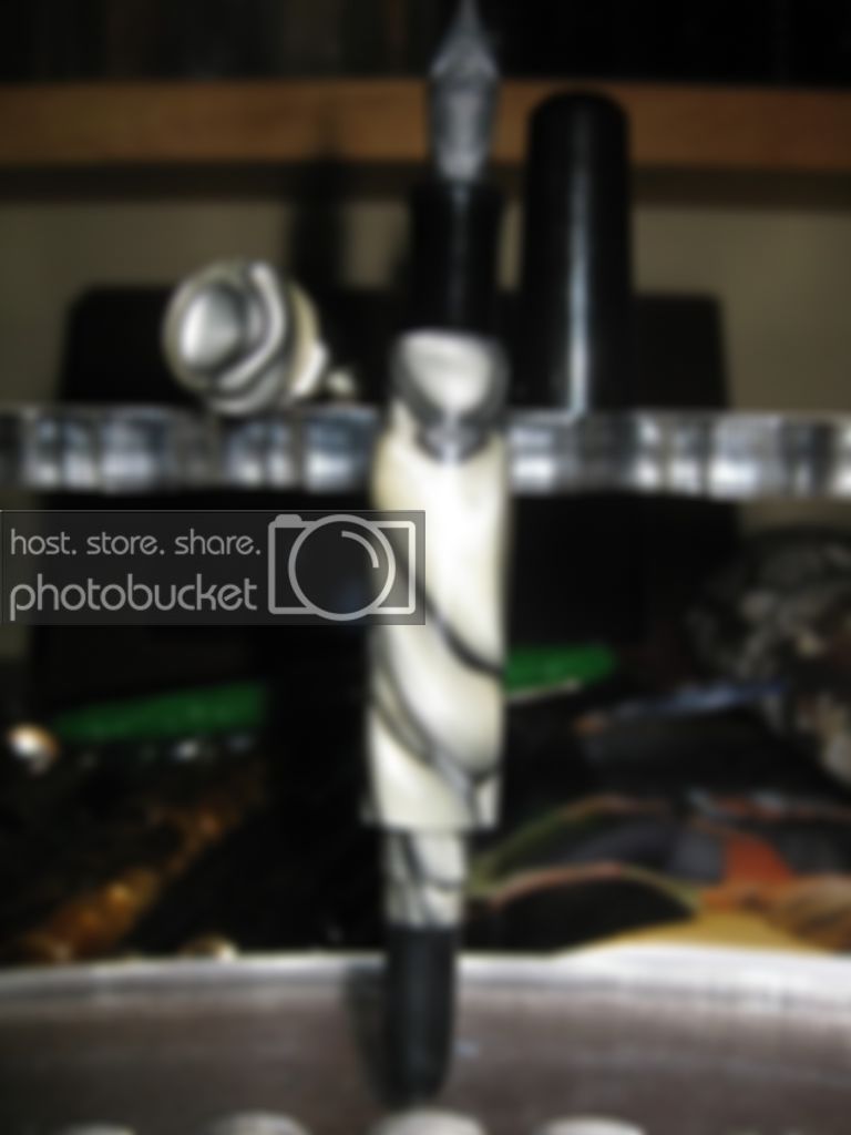
I'd say the cap looks longer than the pen..it might not be, but the pic makes it look at least equal in length..so that's a small turn off, but the biggest turn off for me is all the black in the pen, especially in the cap. I think if the cap was exactly opposite of what it is, it would be quite an improvement...so the cap mostly the white swirl and a small piece of black on top. It's like the black is the focus of the pen, but the white is more interesting, so I'm lost on what I'm looking at if that makes sense. Of course this is all just my opinion, I don't see anyone else saying anything about it..kinda nervous and hate to say anything bad about it myself if you know what I mean, as I hate to criticize.
 

Chthulhu

Member
Joined
Oct 15, 2010
Messages
233
Location
Escondido, California
I'd suggest that if the cap were the same shape and proportions as the barrel and blind cap, but countercharged - reversing the order of materials - it would be perfect.

Make the cap body black and the same length and profile as the part of the barrel that's visible with the cap off, and the swirly jewel the same length and shape as the blind cap.

Vice versa would also work, but you'd never know which end was the cap. :)
 

skiprat

Passed Away Mar 22, 2022
In Memoriam
Joined
Oct 19, 2006
Messages
7,812
Location
In a Skip in Wales
I like the vast majority of the pens you make, but I rarely comment on them as I can't see the entire pen in one frame. I always have to scroll to see the top then the bottom. The pics are so close up, that I also get distracted by the stuff in the background.
I'm always impressed by your 'thread work' though. They always look very well made with good clean crisp edges.:wink:
 

apple320

Member
Joined
Feb 2, 2008
Messages
372
Location
Orangeville, Ontario, Canada.
Well at least I can cut threads lol Thanks Skip

If I had more white material I might have tried a cap but it is quite see through and I did not think seeing the nib turn would be cool. It is good for the body as you can see if it is full of ink. The cap is about .75 of an inch shorter than the body but I think the long blind cap may make it look a bit out of wack. I did not use the white as a blind cap because once again I did not think seeing the bulb would be good but hey at the end of the day I got some new ideas from you all and the most important thing is the pen fills and writes so I guess all is good.

Chris
 

Chthulhu

Member
Joined
Oct 15, 2010
Messages
233
Location
Escondido, California
Chris, what about possibly coating the insides of translucent white parts with white paint to make them opaque, but still have depth?

Also, some of us *like* to see the dirty innards of our pens. :)
 

workinforwood

Member
Joined
Mar 1, 2007
Messages
8,173
Location
Eaton Rapids, Michigan, USA.
I think Steve makes a great point where the pictures are so huge you have to scroll the screen to see the pen and that's has quite an impact. Seeing the innards is no big deal to me. You are building a pen with a classic concept and back in the 40's when they made bulb fillers, some could be semi transparent just like in todays world they still can be. No matter what you make, not everyone is going to like, but I think we can all agree the pics a bit big. :)
 

azamiryou

Member
Joined
Aug 14, 2010
Messages
1,015
Location
Silver Spring, MD USA
I think the photo is throwing us all off. My browser lets me resize the image so I can see the whole pen, and the cap definitely appears to be longer than the body on the closed pen, which makes the whole thing look unbalanced.

Since the cap is in fact shorter, the photo must be distorting things, and we can't judge the whole pen fairly.
 

bluwolf

Member
Joined
Oct 2, 2008
Messages
995
Location
SW Florida
I've wanted to say the same thing as Skip and others every time I look at your work. I can tell there's some nice work there but I just can't put the whole thing together in my mind because of having to scroll up and down.

And as long as I'm kicking you while you're down, I see a lot of great details and work in this pen (the same goes for all your others) but it just doesn't seem to come together in this one. Which just means you're like the rest of us. I know sometimes I finish one, look at it, and go, what the hell was I thinking?...Or maybe it is just me:biggrin:
 
Top Bottom