
You are using an out of date browser. It may not display this or other websites correctly.
You should upgrade or use an alternative browser.
You should upgrade or use an alternative browser.
need opinions plz.
- Thread starter Cherie
- Start date
Signed-In Members Don't See This Ad
See more from Cherie


Signed-In Members Don't See This Ad
Cherie
Member
Cherie
Member
theidlemind
Member
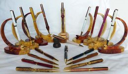
One and two show the pens better.
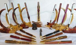
Close is good.
Close is good.
Monty
Group Buy Coordinator
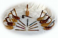
I like #1 better. Two looks like you weren't paying attention when you cropped it. In 3, you don't see the detail.
#1 also
run91
Member
I like number one also.
longbeard
Member
dido here, #1
#3 looks good, but just alittle to far away. All of the pens look very nice by the way.
If i may ask, how does the pens sell with the " knots " as i call em, in the middle and on the end of pens.
Harry
#3 looks good, but just alittle to far away. All of the pens look very nice by the way.
If i may ask, how does the pens sell with the " knots " as i call em, in the middle and on the end of pens.
Harry
Of the three, #1 is the best. However, I think you should rather have at least two pics with half the amount of pens each so that they can all be seen in better detail.
Cherie
Member
Harry, the pens with "KNOTS" is something I was playing with. Got a lot of comments about them. I have to be different.
D. Oliver, thanks again about the pen stands. And I do understand peer pressure.
D. Oliver, thanks again about the pen stands. And I do understand peer pressure.
weasel1219
Member
Even though I like number three a lot, number one would be a better pic for a web page.
Toni
Member
Cherie #1 looks great
scottsheapens
Member
#1 looks the best for me. Those pen stands are also fantastic!!!! Great Pictures.
Ambidex
Member
1's got my vote..although they all look good..in the boat with the others who love those penholders..
Last edited:
cwolfs69
Member
as ageneral picture for your web site, i actually like #3. subtle but still displays you pen series.
broitblat
Member
I guess I like #1 the best -- I agree that it shows somewhat more detail, but all of the pictures seem too busy to me. They don't give me anything to focus on or oo and ah over.
Just my thoughts.
-Barry
Just my thoughts.
-Barry
JohnGreco
Member
I'm willing to go against the grain here and will say #3. Mostly because the pen laying flat in the center has the clip facing upright, whereas in 1 & 2 it is tilted off to the side. think #1 is a good shot, but for a general 'look and feel' sort of pic for a website I think 3 is good.
Buzzzz4
Member
If you can clean up 1 with less pens and have them lined up perfectly. It looks a bit cluttered in the setup imho.
butchf18a
Member
Most any of them would be fine for a general, overall representation of what you have to offer. This general photo should be supported with individual pen detail shots and descriptions.
Keep the individual pen photos sharply focused and 'un-busy'. By this I mean emphasize the pen and not the background or the holder. The eye of the viewer should be immediately drawn to the pen as the main object of attention.
I realize you are just getting started, and perhaps you have already considered these things. Good luck
butch
76winger
Member
I like #1.
It states what you're selling, and those stands are absolutely awesome. Hope you're making and selling them as well!
It states what you're selling, and those stands are absolutely awesome. Hope you're making and selling them as well!