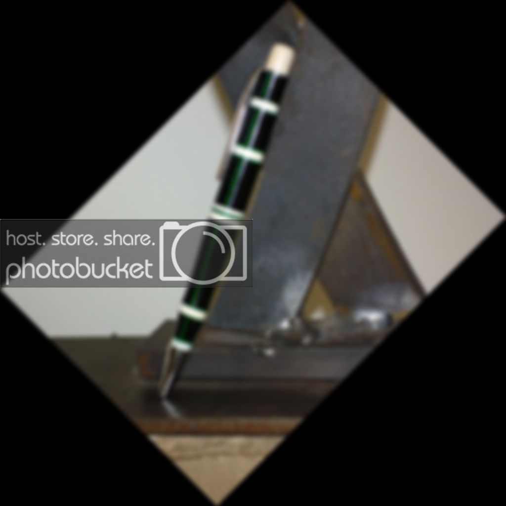
MY writing pen Ebony/Ivory/Green Veneer

Signed-In Members Don't See This Ad
See more from gr8danish

gr8danish

Member
Joined
Jul 17, 2010
Messages
141
Location
Chicago
Well, here it is... This is one of my segmented pens I made that I really enjoy writing with, but it's not good enough to sell. There are a few flaws, and instead of fixing them, I've chosen to make this my daily writer. (especially b/c one of my co-workers just bought the pen I've been writing with for the last 6 months :))

Made with Gaboon Ebony, real elephant Ivory, and green Poplar vacuum dyed veneer.
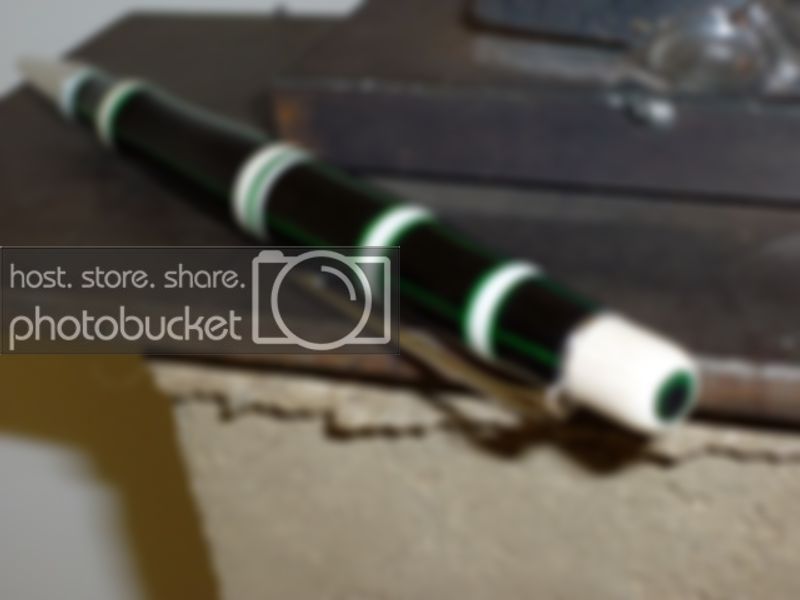
P1020020.jpg

P1020019.jpg
 
Signed-In Members Don't See This Ad

jttheclockman

Member
Joined
Feb 22, 2005
Messages
19,145
Location
NJ, USA.
Good looking pen and nice idea. Leaves alot of possibilityies open. Just need to work on the nib dimentions more. People are very picky when it comes to transition from nib to blank. That is the part of the pen that gets felt the most. Needs to be a sooooooooothe transition.
 

gr8danish

Member
Joined
Jul 17, 2010
Messages
141
Location
Chicago
John, you pointed out only one of SEVERAL issues with this one... I originally planned on using a different set of hardware that was black Ti, but when I put the nib on, it looked funny. Black ti & Ebony = not good combination IMO.

A few other flaws include the vertical veneer not running all the way to the horizontal bands in a few places, and the 2nd ivory band from the nib is actually crooked.

The concept has been a big hit though. I've sold 6 of these already with different colored veneers. In my later revisions I also trimmed down the height of the finial. On my pen it is WAY too tall, making it look more like a click pen. Everyone that picks it up immediately thumbs the Ivory cap.
 

jttheclockman

Member
Joined
Feb 22, 2005
Messages
19,145
Location
NJ, USA.
John, you pointed out only one of SEVERAL issues with this one... I originally planned on using a different set of hardware that was black Ti, but when I put the nib on, it looked funny. Black ti & Ebony = not good combination IMO.

A few other flaws include the vertical veneer not running all the way to the horizontal bands in a few places, and the 2nd ivory band from the nib is actually crooked.

The concept has been a big hit though. I've sold 6 of these already with different colored veneers. In my later revisions I also trimmed down the height of the finial. On my pen it is WAY too tall, making it look more like a click pen. Everyone that picks it up immediately thumbs the Ivory cap.


That is one that stands out to me because I look at just about all photos posted here and that is the first point to look for quality and many are told oh how nice and all that but in reality they do need serious critiqueing and that is how we learn. Not by all the ohs and ahs. Any time you pick up another turners pen look at the transition points and it will tell you how good they really are.

Like I said there is alot of potential with the combination and people do love color. That is a proven fact. Yes the cap should need to be trimmer or add some bead detail to it. Add a green dot on the center or so many ideas come to mind. Thanks for showing.
 
Top Bottom