
You are using an out of date browser. It may not display this or other websites correctly.
You should upgrade or use an alternative browser.
You should upgrade or use an alternative browser.
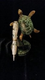
My latest creation :)
- Thread starter ladycop322
- Start date
Signed-In Members Don't See This Ad
See more from ladycop322


Signed-In Members Don't See This Ad
plantman
Member
Fay; I don't mean to be harsh, and I think you are comming along fine in the pen turning process, but in your first photo the turtle draws your eye away from your pen. In both photos the black backgrounds mute any details of your pen and we can't see the beauty of your work. This is just what my eye sees and many people may look at it differently. Jim S
ladycop322
Member
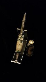
Ok..thanks...I'll try to repost other clearer and brighter photos tomorrow....
")
OZturner
Member
Nice Pen, Michelle.
Beautiful Blank, but IMHO, I would prefer to see the blank shaped down further.
I don't think the "Pinched Waist" look is right for this Pen and Blank.
Good Fit and Finish.
It is Great to see you back turning, I trust you are feeling much improved.
Brian.
Beautiful Blank, but IMHO, I would prefer to see the blank shaped down further.
I don't think the "Pinched Waist" look is right for this Pen and Blank.
Good Fit and Finish.
It is Great to see you back turning, I trust you are feeling much improved.
Brian.
BJohn
Member
Good Morning Michelle
Good Job the pen looks nice, IMHO I like the turtle prop. While some may think that prop's take away from the pen. But to me it show's what your thought are when you made the pen.
While to me, if the customer is buying 'just" a pen then let him go to Wal-Mart and get a package of Bic's. Now our pens, again IMHO we put a little bit of 'ourselves' into the pens we create.
Are we artists or pen makers, I don't know about ya'll but I don't work for 'BIC'
I maybe all wet, I don't know 'But I really don't care'
After posting this reply, I went back and looked again. I really like the using the turtle as your pen holder. Good Job.
Last edited:
ladycop322
Member
My client FELL IN LOVE when he saw this pen! He LOVES it with ZERO complaints and no changes requested So happy I can make someone happy with my creations....
Have a blessed day to ALL!
So happy I can make someone happy with my creations....Have a blessed day to ALL!
BJohn
Member
Did you give him the turtle?
designer
Member
Shapes are shapes. Everyone like a little different shape. It looks good. The turtle looks fine. I agree the background needs to be lightened up though. That is photography not the pen though. The pen looks great.
Besides, I did not have to turn my monitor on it's side this time to view it. Progress once again for you.
Keep it up!
Besides, I did not have to turn my monitor on it's side this time to view it. Progress once again for you.
Keep it up!
Brooks803
Member
Very cool! I like the turtle. That's wonderful that your customer loves it!!