My first attempt at casting

Signed-In Members Don't See This Ad
See more from eliasbboy

eliasbboy

Member
Joined
Sep 2, 2012
Messages
357
Location
Manhattan, IL
Hello! Next to a thread introducing myself, this is my first "real" thread here.

I'd like to first thank you ALL for helping me tremendously in my attempt to start selling my pens.

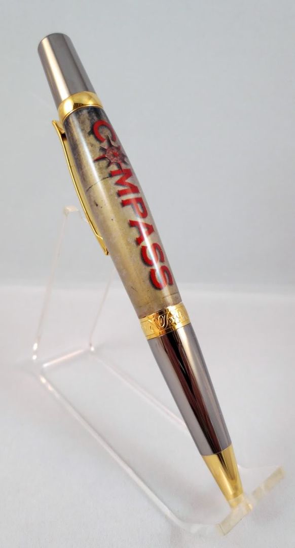
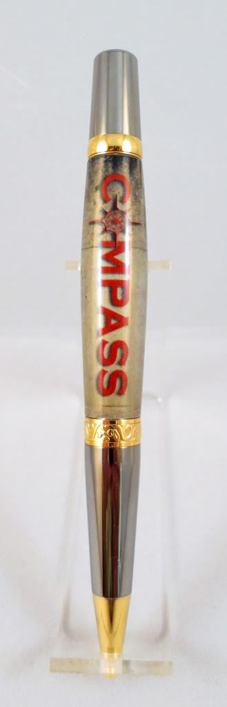
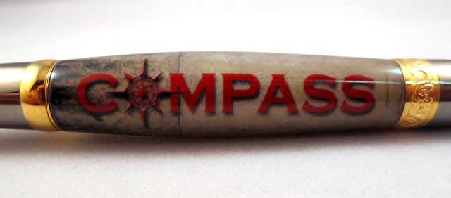
I tried to do some cast pens for our family business as test. This is just a label printed on sticker paper and wrapped around the tube. The background is a weathered concrete wall (our business deals with commercial concrete repair and waterproofing) and a simple logo placed on top.

I'm not 100% happy with the artwork I made, but the process worked. I used a kit from Barry Gross' website. I made 2, and the other had 1 bubble in it that I was able to hide with the pen clip.:redface:

Any and all critiques are more than welcome. I'm eager to learn as much as I can.

Thanks again!

-Michael

IMG_0438.jpg


IMG_0431.jpg


IMG_0426.jpg
 
Signed-In Members Don't See This Ad

Curly

Member
Joined
Nov 20, 2010
Messages
4,837
Location
Saskatoon SK., Canada.
That just might be the first concrete pen ever posted. First I know of anyway. Looks really good and your cast label is fitting and appropriate to the work you do. Well done.
 

eliasbboy

Member
Joined
Sep 2, 2012
Messages
357
Location
Manhattan, IL
Did you power trowel it? :biggrin:

Great first (or any other) cast! :)

It actually was cast-in-place come to think of it.:biggrin:

I tried like hell to find something that looked like concrete and finally figured the hell with it. It sure couldn't hurt to try.

Only problem is my father really liked it, so now he wants to make a bunch to give out as Christmas presents. He mistakenly believes I know what I'm doing.
 
Joined
Feb 24, 2012
Messages
4,368
Location
Claremont NH
I just love the pocket clip. It is always good to hide something behind it! Saved me more than once that is for sure! Great job keep it up!
 

eliasbboy

Member
Joined
Sep 2, 2012
Messages
357
Location
Manhattan, IL
Thanks! I just tried my first decal tonight too. This site is either going to be the best thing for me or the worst thing. For every solution I find to a problem, I find 10 more NEW things to try!
 

eliasbboy

Member
Joined
Sep 2, 2012
Messages
357
Location
Manhattan, IL
Also, I do a ton of work in photoshop and I'm more than happy to help if anyone ever needs anything. I'm not a professional but I've spent enough time working with it that I should be.

At least that's what my wife tells me...
 

CSue

Local Chapter Leader
Joined
Jan 16, 2007
Messages
2,368
Location
Laveen, AZ, USA.
Very interesting! Cool, actually. Are you going to offer them to your customers?

For beginner in this, you've certainly done a great job.
 

Gilrock

Member
Joined
Oct 18, 2011
Messages
560
Location
Tucson, AZ
Also, I do a ton of work in photoshop and I'm more than happy to help if anyone ever needs anything. I'm not a professional but I've spent enough time working with it that I should be.

At least that's what my wife tells me...

Hey a lot of us are Photoshop experts...how do you think we get our pens to look so nice....:biggrin:
 

frank123

Member
Joined
Feb 5, 2012
Messages
613
Location
Colorado
That should be one way to make your pen turning hobby tax deductible - advertising expenses and such if you give the pens to customers.

I really like the way that turned out, you could probably do this for other businesses as well and make a small business out of it as well.
 

OOPS

Member
Joined
Feb 6, 2010
Messages
674
Location
Spokane, WA
I agree with the others, the casting turned out great. If you intend to give these as corporate premiums, you might consider reducing the size of the font for your word Compass to see how that looks. When I first saw the pen, I was surprised by the size of the word, which covers the entire blank. I think that by reducing the font size, it might make for a classier look for the pen. Just my 2 cents.
 

Jjartwood

Member
Joined
Jan 30, 2011
Messages
697
Location
Chicopee,Ma
Cool pen, The only way to improve it is to keep doing it until YOU are satisfied with it.
It looks good from here.
Well done
Mark
 

eliasbboy

Member
Joined
Sep 2, 2012
Messages
357
Location
Manhattan, IL
I agree with the others, the casting turned out great. If you intend to give these as corporate premiums, you might consider reducing the size of the font for your word Compass to see how that looks. When I first saw the pen, I was surprised by the size of the word, which covers the entire blank. I think that by reducing the font size, it might make for a classier look for the pen. Just my 2 cents.

Excellent idea, thanks. This is precisely why I made one at a time until I got it right. It looked so much smaller in my head.


There's a joke there somewhere I'm sure...:biggrin:
 

robutacion

Member
Joined
Aug 6, 2009
Messages
6,514
Location
Australia - SA Adelaide Hills
Well, the first thing that got my attention, was the name on the pen that you explained to be your cement business but, the pen name would also be well suited for this town that is also called "Compass" as people call it but, the real name is Mount Compass...!

I can't recall exactly where I heard of a "cement pen" but that doesn't mean a thing, there many way to skin a cat, you sure had yours.

I'm one to frequently mention, the ridiculous number of materials I've seen made into a pen and when it comes to embedding "stuff" in resin, I'm as guilty as anyone else, if not worse so, well done on your work.

I hope you remember and can repeat the process a few more times as from what you're saying, regardless if your father thinks that you know what you're doing or nor, I don't think you are going to get out of his request, that easy so, better to get back to work, huh...???

Cheers
George
 

Gilrock

Member
Joined
Oct 18, 2011
Messages
560
Location
Tucson, AZ
Well I made the Photoshop comment but forgot to praise the pen. Great job casting and well done for a first thread. Someone previously commented about the size of the lettering and when I read that I thought it was a good suggestion. Maybe try making the lettering about half that size and I would probably still start the words more to the clip side of the pen but you can experiment when you lay it out. Also if you have control of that background where the darker areas are near the "C" I would experiment with flipping it around to the bottom side of the pen when you reduce the lettering to keep better contrast around the letters.

Really good job with the photographs. In fact so good I can see a hairline gap where the body meets at the bottom. Maybe it's not completely pushed together or needs a little squaring up or maybe they always look like that...I forget.

P.S. - The last photo has a white dot near the top of the first "S". You should be able to fix that with the healing brush. :wink:
 

eliasbboy

Member
Joined
Sep 2, 2012
Messages
357
Location
Manhattan, IL
I feel like a broken record saying "thanks" so much, but I will. Thanks! All the advice and comments are greatly appreciated. I'm going to redo the label with the name smaller. It it quite large. I'll post updated pics as soon as I have them!
 
Top Bottom