InvisibleMan
Member
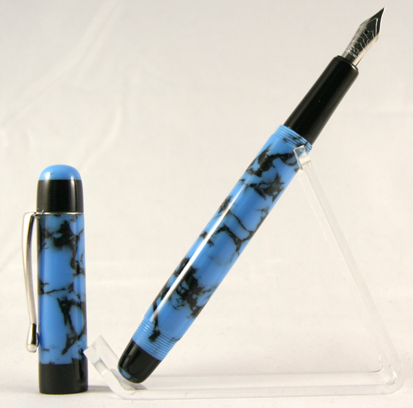
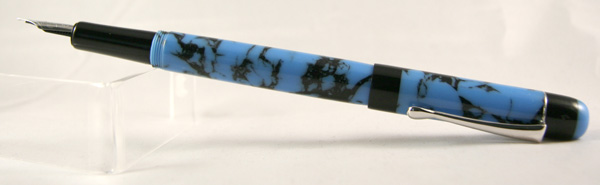
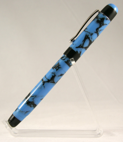
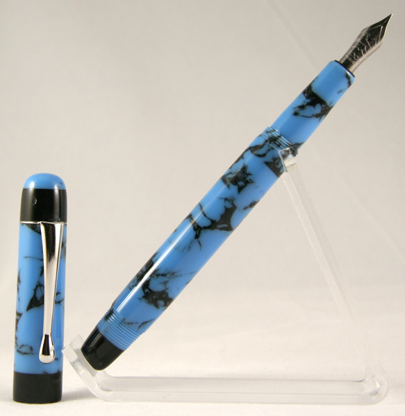
Kitless #2 is finally in the books!
This pen was a pain in the butt. Nothing went right, but in the end I like it. And I think SWMBO likes it too. I asked her to pick a blank, any blank, and I'd make her first fountain pen. She picked an experimental PR pour that I knew would be trouble. It looked nice, but I knew it had some bubbles in it. It did have a few, but nothing major and they didn't pose a problem.
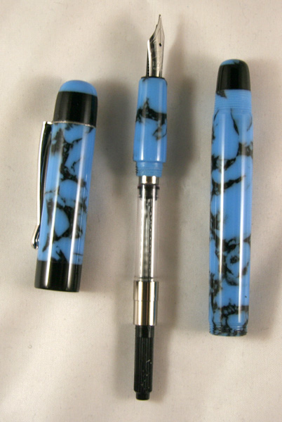
Everything else did pose a problem. I can't even remember them all. You are looking at barrel #2 though. The first was sacrificed to the dull tool gods. They were ticked off and I just gave it to them.
The cap was supposed to be a hidden clip, but I turned it too thin and didn't see a thread where cutting a piece of the clip out was mentioned until it was too late. No biggie, just expose the clip. Looks good anyway. Well, except for the fact I tried to hide it first and ended up just shortening the cap until the nib wouldn't fit with any threads in the finial. So, I just cramped both hands up holding it all together until the epoxy dried enough I could move it to the pen press. It'll fall apart eventually, and then I'll get to start over on it, which I should have done anyway.
Let's see, oh yes, then I managed to file the housing threads down to nothing in the section when I was opening the back hole just enough to get the converter in. Not too bad of a problem - just glued a piece of PR inside and re-drilled, re-tapped.
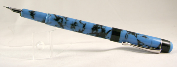
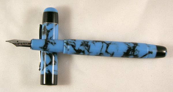
Anywhoooo, here she is. Blue Turquoise w/Black Web PR I poured a couple weeks ago, and some black PR accents. I really like how the pour turned out - the color is just fantastic, and the bubbles I thought would be a real problem were actually quite minor. I do need a better pressure pot though.
The finials are just segmented on - too lazy to try to inlay them. That'll be my next pen probably. And it's postable, per customer request. I was worried about weight issues, but it's actually quite comfortable to write with the cap posted.
Any comments, critiques, tips and tricks are welcome Thanks for looking.
This pen was a pain in the butt. Nothing went right, but in the end I like it. And I think SWMBO likes it too. I asked her to pick a blank, any blank, and I'd make her first fountain pen. She picked an experimental PR pour that I knew would be trouble. It looked nice, but I knew it had some bubbles in it. It did have a few, but nothing major and they didn't pose a problem.
Everything else did pose a problem. I can't even remember them all. You are looking at barrel #2 though. The first was sacrificed to the dull tool gods. They were ticked off and I just gave it to them.
The cap was supposed to be a hidden clip, but I turned it too thin and didn't see a thread where cutting a piece of the clip out was mentioned until it was too late. No biggie, just expose the clip. Looks good anyway. Well, except for the fact I tried to hide it first and ended up just shortening the cap until the nib wouldn't fit with any threads in the finial. So, I just cramped both hands up holding it all together until the epoxy dried enough I could move it to the pen press. It'll fall apart eventually, and then I'll get to start over on it, which I should have done anyway.
Let's see, oh yes, then I managed to file the housing threads down to nothing in the section when I was opening the back hole just enough to get the converter in. Not too bad of a problem - just glued a piece of PR inside and re-drilled, re-tapped.
Anywhoooo, here she is. Blue Turquoise w/Black Web PR I poured a couple weeks ago, and some black PR accents. I really like how the pour turned out - the color is just fantastic, and the bubbles I thought would be a real problem were actually quite minor. I do need a better pressure pot though.
The finials are just segmented on - too lazy to try to inlay them. That'll be my next pen probably. And it's postable, per customer request. I was worried about weight issues, but it's actually quite comfortable to write with the cap posted.
Any comments, critiques, tips and tricks are welcome
Thanks for looking.