
Okay, so today I had a wild hair and tried something a little different. It's very odd looking and might just win an ugly pen contest, but it is a weekend effort so here goes.
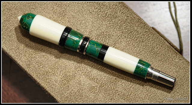
Tru-Stone from exotics, Black Knight Resin from exotics, and Alt Ivory from exotics on a Majestic Jr. Kit. I glued this all together with Medium CA and spun it together keeping the black band a bit higher than the rest while shaping the other bits. It feels good in my hand, but looks rather odd:clown:
*NOTE: I TURNED THE LOWER BARREL DOWN TODAY AND THIS IS THE RESULT*
*THE SHOTS BELOW ARE THE ONES FROM BEFORE TODAYS TURN*
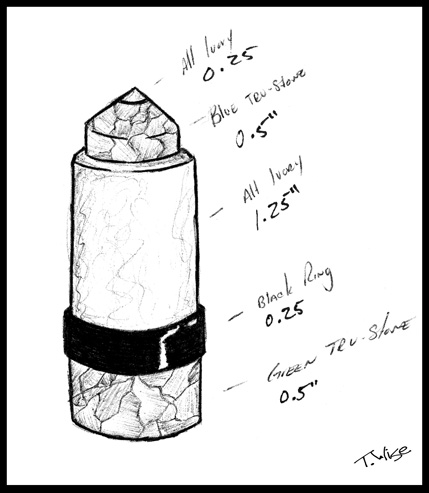
Here's the sketch I did before making the pen and the sizes used.
Okay, bash away:biggrin:
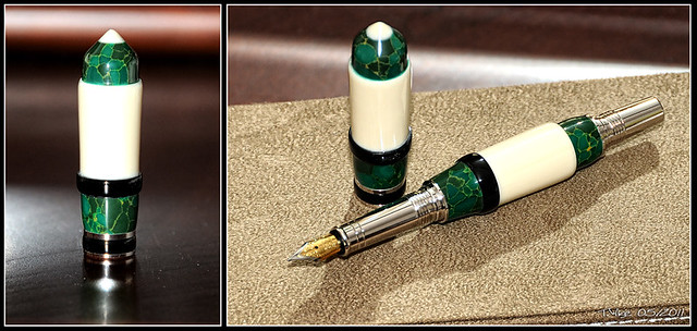
Tru-Stone from exotics, Black Knight Resin from exotics, and Alt Ivory from exotics on a Majestic Jr. Kit. I glued this all together with Medium CA and spun it together keeping the black band a bit higher than the rest while shaping the other bits. It feels good in my hand, but looks rather odd:clown:
*NOTE: I TURNED THE LOWER BARREL DOWN TODAY AND THIS IS THE RESULT*
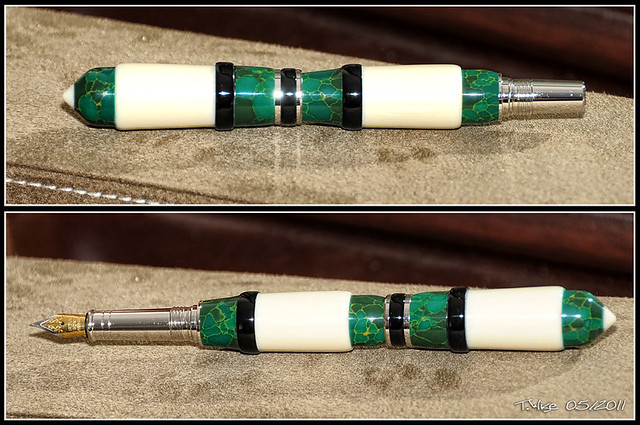
*THE SHOTS BELOW ARE THE ONES FROM BEFORE TODAYS TURN*
Here's the sketch I did before making the pen and the sizes used.
Okay, bash away:biggrin:
Last edited:
")