
workinforwood
Member
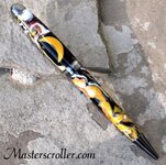
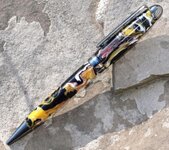
A yellow/gold pearly crescent moon set into black with metal flake, red pearl, white with pearl, and mustard yellow mixed in gold pearl. Bti euro kit. That is really pushing it with size, I know it's going to look even better with a JR kit where I can position the moon further up due to the size difference in the kit, but I think it's amazing looking in it's simplicity. The color combo is more than I ever could have imagined, and the timing in the pour was perfect, as the colors maintain their distinctions pretty good and there is a lot of variation between the depths in the colors giving the pen a really attractive look. Or I might just be a bit bias in my opinion. :wink:
")

