Lucky 7's

Signed-In Members Don't See This Ad
See more from elkhorn

elkhorn

Member
Joined
Apr 22, 2013
Messages
1,199
Location
Utah
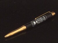
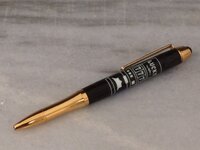
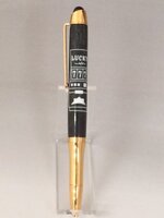
Here's an Eclipse pen kit with a Masterscroller Lucky 7's pen blank from Exotic Blanks I made for a customer. I am posting three pictures to get your input. One is photographed on my usual black granite, one on a gray/white piece of granite and the third against a graduated gray background on a pen stand (oops! Sorry, I didn't rotate it!). Which do you prefer? I'm trying to learn what is the best background for each type of pen. Your opinions are valued!

Comments & Critiques always welcome!
 

Attachments

  • Lucky 7 Black Background.JPG
    Lucky 7 Black Background.JPG
    73.8 KB · Views: 216
  • Lucky 7 White Background.JPG
    Lucky 7 White Background.JPG
    76.9 KB · Views: 171
  • Lucky 7 Front View.JPG
    Lucky 7 Front View.JPG
    24.9 KB · Views: 174
Last edited:
Signed-In Members Don't See This Ad

ed4copies

Local Chapter Manager
Joined
Mar 25, 2005
Messages
24,528
Location
Racine, WI, USA.
I think the center one looks more "in focus". Could easily be an optical illusion, but it is definitely my favorite.

AND it is a NICE-LOOKING pen!!! Well done!!
 

elkhorn

Member
Joined
Apr 22, 2013
Messages
1,199
Location
Utah
Thanks, everyone. I agree with you as well: the center one looks better.

Ed, thanks for carrying such an interesting blank!

Hope everyone has a great weekend.

Take care,

John
 
Joined
Aug 6, 2013
Messages
836
Location
Jasper Indiana
Hi John great a pen. I think that I like #2 better. The fittings on the kit look better in #1 but you can't tell very well where the blank stops and the background begins.

Mike
 
Top Bottom