I thought I would try something a little different...

Signed-In Members Don't See This Ad
See more from Sandsini

Sandsini

Member
Joined
May 11, 2014
Messages
437
Location
Lake Arrowhead, California
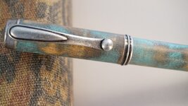
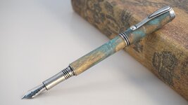
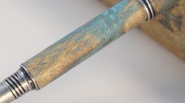
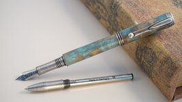
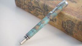
When I first saw the Jr George component set in Antique Silver, I was inspired to make a distressed pen to match. Since I live at the beach, I wanted something that would fit in with the weathered beachy furniture that is popular here.

I made this one out of curly maple, then applied acrylic paint in 3 layers: Black, Sea Foam Green and Teal Blue. Then I sanded back to the wood in several areas, sealed it with CA, then lightly sanded the gloss off of the finish.

This was a really different process for me, as I generally try to make perfect, glossy pens. I have held onto this one a while to determine if I actually like it, and it's been growing on me.

What do you think?
 

Attachments

  • DSC00616.jpg
    DSC00616.jpg
    145.9 KB · Views: 256
  • DSC00619.jpg
    DSC00619.jpg
    126.3 KB · Views: 274
  • DSC00621.jpg
    DSC00621.jpg
    105.5 KB · Views: 265
  • DSC00622.jpg
    DSC00622.jpg
    146 KB · Views: 208
  • DSC00618.jpg
    DSC00618.jpg
    137.3 KB · Views: 275
Signed-In Members Don't See This Ad

Charlie_W

Member
Joined
Nov 16, 2011
Messages
5,918
Location
Sterling, VA USA
Eric,
A unique finish on this pen! I agree that linear sanding could help the final appearance.
This reminds me of a patina as in copper patina.

Let's see some more of these!
 

KenV

Member
Joined
Oct 28, 2005
Messages
4,720
Location
Juneau, Alaska.
The approach is a traditional one with furniture, especially Windsor chairs and milk paint.

If the sanding through was more subtle, without the radial lines and better shading between coats, the,effect could be spectacular.

A technique that shows promise.
 

CREID

Member
Joined
Jul 23, 2008
Messages
3,009
Location
Vancouver, wa
I like the colours . My only suggestion would be to do the last bit of paint removal sanding lengthwise with the grain so it looks a bit more natural .
I was going to say the exact same thing. To me it looks like sanding marks around the blank. Great idea, I like the distressed idea.
Curt
 

Sandsini

Member
Joined
May 11, 2014
Messages
437
Location
Lake Arrowhead, California
Thanks for the feedback everyone. I think you are right, it needs to be more linear, with the grain and I should have taken more time to preserve each layer... I'm going to try it again and see what I can do with this.
 

mecompco

Member
Joined
Apr 24, 2015
Messages
1,607
Location
Fairfield, Maine
The pen looks great--I love the concept. Now that others have pointed it out, I guess the distressing of the finish could look a little more "natural". Great concept!

Regards,
Michael
 
Top Bottom