
You are using an out of date browser. It may not display this or other websites correctly.
You should upgrade or use an alternative browser.
You should upgrade or use an alternative browser.
I don't know what..........
- Thread starter Janster
- Start date
Signed-In Members Don't See This Ad
See more from Janster


This one's got better focus and you can see more details of the body, but it looks like it's got too much red, thus the gold bands look much darker, almost orange in color. Keep playing and learning and you'll get there though.
By the way, what free program are you using Gimp by chance, or something else? I've got that one, even got a book for it, but haven't had the time to sit down and play with it, even a year after getting the book!
Just to play around and hopefully serve as a learning experience for all of us I took you photo and put it in an older standby of mine, Paintshop Pro, and reduced the saturation level, then enhanced the mid-tone to try and lighten the darker area, this is is what I got. I was trying to back down the color so the gold metal parts look more realistic, and attempt to make the wood body a little more visible in the process. Somebody who does this kind of thing all the time could certainly do a better job, and I don't have the pen in front of me to compare with, so this is only what I think it might really look like.
Again, just playing around and trying to share the attempt with you. In any case the pen DOES look very nice!


 Jan; Only thing I would add, is to filter your light sorce to get rid of the reflection on your pen. It's realy amazing how you can take a so-so photo and improve it with programs that are out there. I know it has helped my photos look better than the original ones I have taken. Keep up the good work !! Jim S


I purchased it from Smittys Pen Works. It is the Le Roi Elegant. Be well....Jan


Signed-In Members Don't See This Ad
Toni
Member
I have no idea what the wood is, but its gorgeous!!! Great job!!
dozer
Member
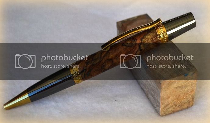
Jan that is a great looking pen and a good picture.
Hubert H
Member
Wow! Very nice.
..........still messing with getting better pictures so I am adding another here. I used a photo shop type program, a FREE one at that! Thanks for you kind words..Be well.......JanJan that is a great looking pen and a good picture.
Last edited:
plantman
Member
:bananen_smilies051: Jan; That is a great looking pen !!! Photos realy bring out the beauty of the grain. Fantastic blank. Jim S
Bobostro61
Member
AWESOME PEN!
76winger
Member
..........still messing with getting better pictures so I am adding another here. I used a photo shop type program, a FREE one at that! Thanks for you kind words..Be well.......JanJan that is a great looking pen and a good picture.
This one's got better focus and you can see more details of the body, but it looks like it's got too much red, thus the gold bands look much darker, almost orange in color. Keep playing and learning and you'll get there though.
By the way, what free program are you using Gimp by chance, or something else? I've got that one, even got a book for it, but haven't had the time to sit down and play with it, even a year after getting the book!
booney0717
Member
Love that blank. Picture are looking good too.
76winger
Member
..........still messing with getting better pictures so I am adding another here. I used a photo shop type program, a FREE one at that! Thanks for you kind words..Be well.......JanJan that is a great looking pen and a good picture.
This one's got better focus and you can see more details of the body, but it looks like it's got too much red, thus the gold bands look much darker, almost orange in color. Keep playing and learning and you'll get there though.
By the way, what free program are you using Gimp by chance, or something else? I've got that one, even got a book for it, but haven't had the time to sit down and play with it, even a year after getting the book!
Just to play around and hopefully serve as a learning experience for all of us I took you photo and put it in an older standby of mine, Paintshop Pro, and reduced the saturation level, then enhanced the mid-tone to try and lighten the darker area, this is is what I got. I was trying to back down the color so the gold metal parts look more realistic, and attempt to make the wood body a little more visible in the process. Somebody who does this kind of thing all the time could certainly do a better job, and I don't have the pen in front of me to compare with, so this is only what I think it might really look like.
Again, just playing around and trying to share the attempt with you. In any case the pen DOES look very nice!
Attachments
Last edited:
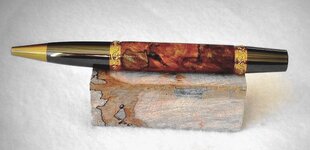
Better????..........still messing with getting better pictures so I am adding another here. I used a photo shop type program, a FREE one at that! Thanks for you kind words..Be well.......JanJan that is a great looking pen and a good picture.
This one's got better focus and you can see more details of the body, but it looks like it's got too much red, thus the gold bands look much darker, almost orange in color. Keep playing and learning and you'll get there though.
By the way, what free program are you using Gimp by chance, or something else? I've got that one, even got a book for it, but haven't had the time to sit down and play with it, even a year after getting the book!
76winger
Member
Yes (IMHO). Did you see my attempt just before this? I think the block of wood looks better on this attempt of yours, but you'll have to tell me which looks most realistic since you have items in front of you.
Also a lot of it is "What do you want the photo to represent?" Do you want to represent reality, or do you want to add in artistic flare and colorization to make a different statement. There's really no wrong photo if it depicts what you want.
Also a lot of it is "What do you want the photo to represent?" Do you want to represent reality, or do you want to add in artistic flare and colorization to make a different statement. There's really no wrong photo if it depicts what you want.
tommax
Member
re: what kind of wood is this?
The blank looks like spalted ambrosia maple. The pen may be richer/darker due to stabilization or finishing which actually looks more like Amboyna Burl or Gmelina Burl from SE Asia. I've seen good old usa spalted maples look phenominal like this before, especially spalted ambrosia maple.
Just my 2 cents…
Tom
pensfromholland.com
..........still messing with getting better pictures so I am adding another here. I used a photo shop type program, a FREE one at that! Thanks for you kind words..Be well.......JanJan that is a great looking pen and a good picture.
The blank looks like spalted ambrosia maple. The pen may be richer/darker due to stabilization or finishing which actually looks more like Amboyna Burl or Gmelina Burl from SE Asia. I've seen good old usa spalted maples look phenominal like this before, especially spalted ambrosia maple.
Just my 2 cents…
Tom
pensfromholland.com
plantman
Member
Jan; Only thing I would add, is to filter your light sorce to get rid of the reflection on your pen. It's realy amazing how you can take a so-so photo and improve it with programs that are out there. I know it has helped my photos look better than the original ones I have taken. Keep up the good work !! Jim S
Last edited:
SerenityWoodWorks
Member
Wonderful..Love the wood
1080Wayne
Member
If the wood that the pen is sitting upon is what the pen is made from , I would bet on spalted big leaf maple .
Yes, it was from that same blank. I would like to thank everyone for your kind words and advice. Spalted Maple it well may be. Thanks again and be well...............JanIf the wood that the pen is sitting upon is what the pen is made from , I would bet on spalted big leaf maple .
Last edited:
BSea
Member
I was thinking the same thing as I was reading the different posts.If the wood that the pen is sitting upon is what the pen is made from , I would bet on spalted big leaf maple .
Very nice Jan. Love the blank. The finish gives it an almost metallic look. I think I'm going to Reno this weekend to get supplies. Would like to stop by and finally met you and check out your new lathe. Looks to be working just fine.
ttpenman
Member
Pens are beautiful and the photos are pretty nice, much better than mine for sure. If I have one nit to pick -- on the second picture -- place the pen at an angle (like the first pic) rather than lying flat on the blank. If you want it flat, make sure it's level. The second one looks like it's going downhill. Use the 'rotate' function in your editing program, then recrop. Will look much better if straight. But IMHO, on an angle looks better.
Keep it up -- nice work.
Jeff in northern Wisconsin
Keep it up -- nice work.
Jeff in northern Wisconsin
SDB777
Member
Almost looks like Ramon Burl w/spalting.....but it's hard to tell.
It does have a nice fit-n-finish though!! And the color is 'eye-catching'!
Scott (you 'boosting' the photo with Picsas3) B
It does have a nice fit-n-finish though!! And the color is 'eye-catching'!
Scott (you 'boosting' the photo with Picsas3) B
Pen Man
Member
??
What is the name of that pen kit and where did you get it
What is the name of that pen kit and where did you get it
What is the name of that pen kit and where did you get it
I purchased it from Smittys Pen Works. It is the Le Roi Elegant. Be well....Jan
knight_muzzleloader
Member
great pen, what kit is it again? and where can I get one! Jim
mikespenturningz
Member
Well that is definitely dyed as well as stabilized. Could be plain old spalted maple of some kind. Maple is so under rated and a beautiful wood. Excellent pen!
Last edited: