Golden Mean?

Signed-In Members Don't See This Ad
See more from DCBluesman

Status
Not open for further replies.

DCBluesman

Passed Away Mar 3, 2016
In Memoriam
Joined
Aug 22, 2004
Messages
7,679
Location
WOODBRIDGE, VIRGINIA
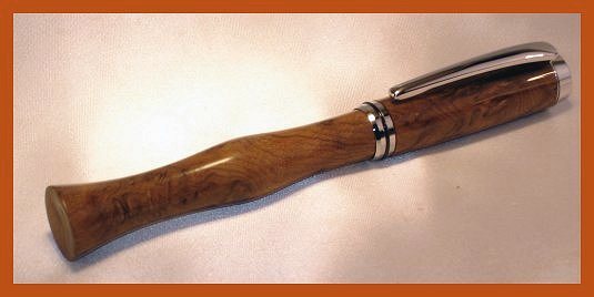
You've seen this one before. There is no optical illusion. The picture is taken head on. The Golden Mean (which I don't believe has any value in pen making) has been used twice here. First, the lower barrel is 1.618 times the length of the upper barrel. Second, the width of the base is 1.618 times the width of the cap. This was turned with the aid of one of the new Baron chucks from Arizona Silhouette (thanks Bill!).

200641917655_SnakewoodCCULIMG_0280.jpg


Thanks to all who look and particularly to those who take the time and effort to comment.

NOTE: 1.618 is approximate, but pretty darned close. Also, here's the wiki for the Golden Ratio or Golden Mean http://en.wikipedia.org/wiki/Golden_ratio
 
Signed-In Members Don't See This Ad

jthompson1995

Member
Joined
Mar 14, 2006
Messages
861
Location
Parkville, Maryland, USA.
This is a case of personal taste, but thae bottom looks way too big to me. I like the choice of woot and kit finish, the fit is good, and the finish looks real nice. I wouldn't buy it, though.

Jason T.
 

Skye

Member
Joined
Jan 3, 2006
Messages
3,487
Location
Rock Hill, SC
What exactly does the Golden Mean.... um... mean? Been outa school for a long time.

I like it a lot, I assume it'll stand on end?

My only critique would be the cap and body's grains dont match. Not that they have to, but I like it when they do.

Speaking of the finishing looking real nice as JT said, may I ask what you finished it with? [;)]
 

gerryr

Member
Joined
Sep 22, 2005
Messages
5,353
Location
Billings, MT, USA.
There was an article in PenWorld about the revival of Tibaldi that talked about this although it was called something else, "divine proportion" or something similar, but it still referenced the 1.618 ratio.

Obviously the fit and finish are superb and the wood is enough to make me drool. I'm having trouble visualizing it without the "bell-bottom" end and I can't. But, to me, it looks too long and unfortunately reminds me of bell-bottom pants from the 70's. My personal Baron FP, by sheer luck, has a very similar proportion and I've decided it's too long also.
 

DCBluesman

Passed Away Mar 3, 2016
In Memoriam
Joined
Aug 22, 2004
Messages
7,679
Location
WOODBRIDGE, VIRGINIA
Jason - Exactly the kind of comment I was hoping to draw. The golden ratio or golden mean is thought to represent a balance in nature between symmetry and asymmetry. Some folks think it's a proportion that represents people's perception of beauty. I think they're full of malarkey.

Steve - in the pen's defense, unposted it feels better in the hand...a nice, full-length. Do I like it? Not really. Will I make more? Only if someone asks. I just love to experiment with weird stuff.

Skye - Yes, then pen stands on the end...probably the best feature of the pen. The wood is from one piece and I still can't figure out why the coloring and grain changed, but I cut it at the pattern change! (It may have something to do with the diameter of the two pieces.) The finish is sanding sealer followed with TSW. It will get another coat of two of TSW before I consider it finished.
 

alamocdc

Member
Joined
Apr 26, 2005
Messages
7,970
Location
San Antonio, Texas, USA.
Lou, while I was chastised by a few professional furniture makers (one was Mark Adams) for violating this with the nightstands I built a few years ago, I suppose it does have it's place. I actually like the use of it here and may just borrow the idea. The only thing I would have done differently is made the cap closed end and clipless. It's too big to stick in your pocket, but will stand nicely on a desk. Because of that, I think a clipless closed ended cap would have really set this off. Plus it would draw more attention to the exquisite grain of the wood. [^]
 

wayneis

Member
Joined
Mar 15, 2004
Messages
1,948
Location
Okemos, Michigan, USA.
Well Lou, I guess that I am once again in the minority because I like what you have done. I agree with Billy that it would look better without the clip and cap though. It stands to reason that I would like this because I also like the Panache and this looks kind of like that.

Wayne
 

RussFairfield

Passed Away 2011
In Memoriam
Joined
Feb 10, 2004
Messages
1,522
Location
Post Falls, Idaho.
Besides good proportions, we also have to consider weight, balance, and confort in writing with the pen.

When I first started playing around with closed end pens, I looked at the "Golden Proportions" but they immediately got me into trouble. I ended up with a pen that was too long to be practical.

The problem is that some pens have a longer grip area between the cap threads and the tip than others. That means they have a longer cap than others. Making the pen barrel 1.618 times the cap length might make a pen that looks better with the cap in place, but it ends up being too long to fit into a shirt pocket. There is a reason for the traditional; pen being 5.5" long from under the clip to the other end of the pen with the cap in place. Sometimes we have to make a choice between being practical and being beautiful.

The other problem is that the closed end pen has to be comfortable and balanced without the cap being posted. Without the metal posting fitting on the end, the pen can end up with too much weight at the tip. Stabilized wood, smaller holes inside, and a larger diameter can provide the extra weight needed to balance the pen for writing. That "hour glass" shape that I use has the benefit of being a nicely balanced pen as either a fountain or rollerball.

On the pen in the photo - I like the pen and I like the cap, but to me they don't go together. The two different shapes are in conflict with each other, and that has nothing to do with their diameter. To me, this would be a beautiful pen if the cap followed through with the same form as the pen. Maybe even with the same little beads at the end. The cap in the photo would just look better on a more traditional pen with a similar form.

The coloring is spectacular, and your finish looks to be perfect. Both halves of the pen are exquisite. They are just not exquisite together. My opinion.
 

mick

Member
Joined
Mar 13, 2005
Messages
2,608
Location
Decatur AL, USA
Man, it's amazing what you can learn here. I was just reading a new book last night that dealt with the Golden mean, or PHI. I was amazed and now I log on and here it is again! I had no idea that the ratio 1.618 applied to so many things in nature as well as being a basis that so many the "Old Masters" used in their artwork.
It is odd though, according to the book I am reading, our bodies follow the golden mean proportion-wise. So wouldn't it seem that a pen designed that way would "fit " that same body?
 

Rudy Vey

Member
Joined
Jan 26, 2004
Messages
2,032
Location
South Plainfield, NJ, USA.
Lou, I like it! But I do not like the clip/end finial of it. I think without it it would look better. For the PITH I made an El Grande both side closed ends, and it looks similar to yours (the pen side of it).
 

wdcav1952

Activities Manager Emeritus
Joined
Mar 18, 2004
Messages
8,955
Location
Montgomery, Pennsylvania, USA.
Count me in with the guys who say clipless for this pen. Very interesting concept pen. I only wish I could push the limits of design, but my brain is rather B2B I'm afraid!
 

micah

Member
Joined
Nov 22, 2005
Messages
417
Location
Searcy, Arkansas
Lou,
I'm with the Minority as well. I really like it. In fact, I made one that looks a LOT like it a little while back.

I do agree the clipless closed end would look better with it, as well as maybe another type of wood. In fact I think I may have to steal...ooppss, I mean borrow that idea!
Nice job!
Micah
 

DCBluesman

Passed Away Mar 3, 2016
In Memoriam
Joined
Aug 22, 2004
Messages
7,679
Location
WOODBRIDGE, VIRGINIA
Thanks, again, for the nice comments. For those who suggested it would have looked better capless and with no clip--I agree! Maybe next time. By the way, there are no brass tubes in this one. Everything's glued in, so knocking it apart is not an option.

Wayne, Rudy and Micah - thanks for the encouragement.

Russ - You're spot on about balance. There is a lot of extra wood on the lower barrel, since I only had to accomodate the fountain pen pump. It's drilled only as wide and deep as I had to. Also, the upper barrel really should have been B2B at least. Clipless? Undoubtedly. All of that being said, thank you for the comment about the finish. You know that you and Dresdner (in that order) are my "heroes of finishing" so that means a lot!

The feedback and opinions from you folks will help a lot with my next idea!
 

ashaw

Member
Joined
Jun 23, 2004
Messages
1,590
Location
Phila, PA, USA.
Lou
By the way great looking pen. Lou just check out this issue of pen world. I will not do the article justice trying to explan it.
 

DCBluesman

Passed Away Mar 3, 2016
In Memoriam
Joined
Aug 22, 2004
Messages
7,679
Location
WOODBRIDGE, VIRGINIA
The February/March issue of PenWorld also has an excellent article on Tibaldi and their use of the the golden mean or divine proportion in their new pens. It's definitely worth a read!
 

Rifleman1776

Member
Joined
Dec 18, 2004
Messages
7,330
Location
Mountain Home, Arkansas, USA.
Originally posted by DCBluesman
<br />Jason - Exactly the kind of comment I was hoping to draw. The golden ratio or golden mean is thought to represent a balance in nature between symmetry and asymmetry. Some folks think it's a proportion that represents people's perception of beauty. I think they're full of malarkey.

Steve - in the pen's defense, unposted it feels better in the hand...a nice, full-length. Do I like it? Not really. Will I make more? Only if someone asks. I just love to experiment with weird stuff.

Skye - Yes, then pen stands on the end...probably the best feature of the pen. The wood is from one piece and I still can't figure out why the coloring and grain changed, but I cut it at the pattern change! (It may have something to do with the diameter of the two pieces.) The finish is sanding sealer followed with TSW. It will get another coat of two of TSW before I consider it finished.

As to your pen, the shape isn't to my personal liking. The flat bottom, appearance-wise, looks strange. But to stand up, it must be flat. Who stands their pens up? [:p]
As for the Golden Mean and "malarkey", a couple members of my woodturning club, who are masters at bowls and vases, claim the Mean is almost an absolute in making great bowls and vases. Their stuff sells for upwards of $3000.00 per. And they claim those made with the Mean rule sell best, fastest and for the most money. Can't argue with that.
Another member who makes tops says the best spinners are made according to the Mean also.
As a (former) professional photographer, I was taught to compose a picture following a similar forumla. I hadn't heard of the Golden Mean but the principal was pretty much identical.
For whatever that's worth. [:)]
 

jeff

Administrator
Staff member
Joined
Dec 5, 2003
Messages
8,971
Location
Westlake, OH, USA.
I've been interested in the Golden Ratio for years, but from a scientific rather than asthetics point of view. (Started in college when I wrote a paper on improving the performance of search algorithms using golden section division rather than halving or other means. I know, a real snoozer...) Anyway, it's hard to read anything about it without touching on the asthetics, which are fascinating as well. I read somewhere that if you average the ratios a huge number of "rectangular-ish things" man-made or biological, the average is extremely close to the ratio.

Here's an interesting article on the asthetics...
http://plus.maths.org/issue22/features/golden/
 

btboone

Member
Joined
Dec 5, 2004
Messages
2,421
Location
Roswell, GA, USA.
Back in the early days B.C., (before computers) I worked on some Rubik's Cube type puzzles. One of those was a dodecahedron (a 12 sided shape consisting of pentagons on each face.) I was amazed to learn of all the golden ratios hidden in the dimensions. Even included angles of the solid were divisible by phi. I stumbled upon this on my own without having read about that first. It was a little freaky to find it everywhere.
 

mick

Member
Joined
Mar 13, 2005
Messages
2,608
Location
Decatur AL, USA
Fibonacci would love it!!

I'm actually forwarding this thread to my daughter, who teaches Geometry in high school. Am working on a Fibonnaci spiral & Golden Mean bulletin board idea for the start of school in the fall.

Me? I stink at math. LOL But I gave birth to two math wizards-- so I KNOW they'd appreciate the pen!


(connie and not mike lol)
 

dfurlano

Member
Joined
Oct 8, 2005
Messages
757
Location
Avondale, PA
Somehow I posted this in the wrong topic [:eek:)]

This Visconti was in this months Pen World:

http://www.airlineintl.com/visconti/visconti_divine.htm
 
Status
Not open for further replies.
Top Bottom