Gold Celluloid Gent FP

Signed-In Members Don't See This Ad
See more from Jim in Oakville

Status
Not open for further replies.
Joined
Aug 9, 2004
Messages
2,195
Location
Oakville, Ontario, Canada.
Hi,

This is a recent solid end Gent Fountain Pen. I love making these pens.
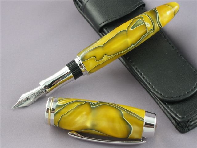


20061220142020_IMG_4227.jpg
 
Signed-In Members Don't See This Ad

Skye

Member
Joined
Jan 3, 2006
Messages
3,487
Location
Rock Hill, SC
Wow, that's a phat fat pen! You got a shot of it with the cap on? Hard to get an idea of what it would look like.
 
Joined
Aug 9, 2004
Messages
2,195
Location
Oakville, Ontario, Canada.
Hi Skye,

This is a picture as you asked for...I did not get one with better lighting/exposure/composition...it sold quickly this weekend..


20061220144114_IMG_4218.jpg
<br />
I like the look of the gold and will make another one or two , or three...[;)]
 

LanceD

Member
Joined
Oct 3, 2005
Messages
1,590
Location
Houma, La, USA.
Hi Jim, I think that's one of the nicest closed end pens I've seen you make to date. Normally I like more of a squared end to it but that particular shape is growing on me. I think I'll try one like that today sometime.
 
Joined
Aug 9, 2004
Messages
2,195
Location
Oakville, Ontario, Canada.
Originally posted by LanceD
<br />Hi Jim, I think that's one of the nicest closed end pens I've seen you make to date. Normally I like more of a squared end to it but that particular shape is growing on me. I think I'll try one like that today sometime.


Thanks Lance,

I appreciate the kind feed back.[:)]

I have looked at the squared off design and the tapered look, I am a tapered design guy I think..[;)]

I find though that the solid end pens are light in the hand, the hardware that is omitted lessens the balance weight of the finished pen. I am working on a few ideas to add weight back into the pen barrel of this design.
 

Skye

Member
Joined
Jan 3, 2006
Messages
3,487
Location
Rock Hill, SC
I think I like the squared off look more just because I like the symetrical look, but I bet that thing finds it's way into a pocket quickly with the tapered end. Not to mention, it's what the customer likes more than you or I.

Good idea about adding a weight inside the blank. A hefty feel says "Quality".
 
Joined
Aug 9, 2004
Messages
2,195
Location
Oakville, Ontario, Canada.
Originally posted by Skye
<br />I think I like the squared off look more just because I like the symetrical look, but I bet that thing finds it's way into a pocket quickly with the tapered end. Not to mention, it's what the customer likes more than you or I.

Good idea about adding a weight inside the blank. A hefty feel says "Quality".

I understand the idea that the design of the squared end does look symmetrical with the top, I see that all the time. I also like the enhancements of a cabochon on the end of a squared end too, a soft detail that also brings attention to the pen. I include a leather case with all my pens of a certain value and higher. The customer feedback is they mostly use the case, but your comment that a tapered end finds the pocket quickly is true.

I am a furniture maker first, so turning comes to me as a way to make furniture parts. Most of my furniture turning involves work with tapering and smooth continuous surfaces, the tapered end sort of fits that design mentality for me as well..the squared end is pleasing but looks at time to me to be too "pinched" if that is a way to describe it. I am not criticizing the squared off look, but my eye and customer feedback (what sells and what does not sell from my trays) tells me that I sell 3-4 tapered ends for every squared off pen....all materials being equal.

Weight is a critical FEEL of any pen, the solid end pens suffer from some neglect in this area I think. I am working on a simple weighted solution. When I am happy with what I find I will share it here on IAP, in the mean time I have to work on a few things.
 

Firefyter-emt

Member
Joined
Mar 30, 2006
Messages
2,903
Location
Putnam, Connecticut, USA.
I like it myself.. I see that the nib is not a two-tone on this kit either, sigh... I guess the one that shows up on my door step will be a solid color nib too. I have not made one of these before, is that nib the larger sixe like the Churchills?? It looks big in that photo (I like big) [:D]
 

gerryr

Member
Joined
Sep 22, 2005
Messages
5,353
Location
Billings, MT, USA.
Originally posted by Firefyter-emt
<br />I like it myself.. I see that the nib is not a two-tone on this kit either, sigh... I guess the one that shows up on my door step will be a solid color nib too. I have not made one of these before, is that nib the larger sixe like the Churchills?? It looks big in that photo (I like big) [:D]

All the Rhodium kits I've received from CS have had a silver nib, while the gold kits have had the two-tone nibs.

Great looking pen, Jim. I might have to get some of that acrylic and maybe even try that shape.
 

Skye

Member
Joined
Jan 3, 2006
Messages
3,487
Location
Rock Hill, SC
Originally posted by Jim in Oakville......what sells and what does not sell from my trays) tells me that I sell 3-4 tapered ends for every squared off pen....all materials being equal...

Wow! I would have never thought that. Very good marketing tip there! (no pun intended, lol)
 
Joined
Aug 9, 2004
Messages
2,195
Location
Oakville, Ontario, Canada.
Originally posted by johnnycnc
<br />Looks awesome,Jim.[:)]
That blank,hardware,and your talent
sure make a cool package!
Makes me want to try a closed end.[:p]


Thanks Every One, I appreciate your kind and construtive thoughts. I like this design, I have made quite a few in this look, I think a Tru Stone may be my next. [:D]
 
Status
Not open for further replies.
Top Bottom