Jus,
Nice job. As I keep mentioning, I don't mind giving critiques (one BIG caveat - please see the footer to my post!) because I generally WANT critiques of my own pens, too, and most of the time I'm more critical of my own work than the people here. So, with that disclaimer... [

]
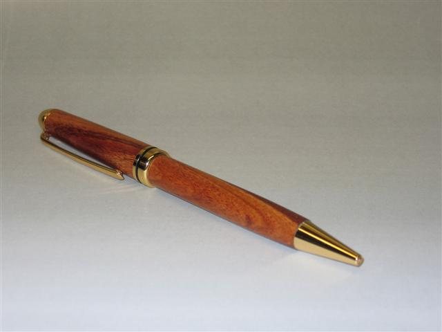
I would orient the pen so that it's central axis is paralell to the lens of the camera, or only an acute angle from the lens. In English, what I was trying to say is that the angle you used makes it tough to see the top of the pen and the joint at the CB, so my comments will focus mostly on the lower barrel.
The bottom of the lower barrel appears to be slightly "proud" - that is, a little bit bigger than the tip. I can't tell if that was intentional, completely unintentional, or the result of a slightly out-of-round turning. If the later, some tips include:
* loosten the knurled nut after roughing down the blanks and then re-tightening it;
* stop the lathe when you have the blanks CLOSE to the desired size, twist the blanks 90 degrees on the bushings (i.e. keep the bushings still (if you can), and just rotate the blank), then start again and touch up the ends; repeat this one more time (total of 180 degree turn); and
* don't over-tighten the tailstock, since that will cause the mandrel to bow.
I can't see the sanding job that well, nor can we get a good sense of the finish. How many coats of BLO/CA did you use? I tend to stick to 3 or 4 coats so I have good coverage without completely losing the "wood" feel. It doesn't give the ultra-high-gloss that some others get on their pens, but works OK for me, and it looks like that's what you have too.
OK, that's about it! Wasn't too bad, was it? Over all, nicely done and something you should be proud to put your name on!
 but here's my first attempt at photographing one ( Would welcome comments re the photography as well). Its what Aussies call a "European Style". The wood is Western Rosewood which luckily had an undisclosed colour variation that I think works well. The finish is my first attempt at CA/BLO method which IMHO works better than Shellawax, which I had used previously. Jus.
