jasontg99
Member
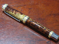
Again, thanks Harold (splinter99) for the finishing tips. I have had this kit for quite some time, but I did not want to waste it due to my terrible finishing skills. Finally, I am getting consistant mirror finishes using CA.

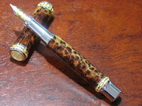
That's first class!! all the way too the front page you would think.
Gorgeous pen.
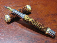
But.......you needed to match the grain when the cap is on.

That is some beautiful burl and very well turned and finished.
Just a personal opinion, I would not have used that kit - beautiful though it is= with that blank
What would you have used?Jason that is a mighty fine pen you have made, some penmakers follow the rule of if the kit has a lot of bling factor then it is better to use a plainer blank for the barrels, and visa versa. It stops the two fighting with each other for the attention of the viewer, less is more etc..
You could always send it to me and I will keep it hidden!!! LOL
Ligget, you got it, what is your address?!?! :biggrin: So perhaps for a blank like this, a gentlemans or baron kit would be a better match? I thought the better the blank - the more appropriate a higher end kit would be.
Jason that is a mighty fine pen you have made, some penmakers follow the rule of if the kit has a lot of bling factor then it is better to use a plainer blank for the barrels, and visa versa. It stops the two fighting with each other for the attention of the viewer, less is more etc..
You could always send it to me and I will keep it hidden!!! LOL
Artme,
You are killing me!!! :biggrin: You did not like my lotus with the purple maple burl either!
Jason I think I made the same point before as Ligget has made now.A plain blank with a kit such as the Emperor works very well. A Plain kit with a busy or spectacular blank also works well.
You have great turning and finishing skills. Just need to work on the matching skills.:biggrin:
Don't fret Jason!! There are plenty who think the way you do. I's not wrong, just a different point of view that I have.
I think the point is the visual overload in such a small space. I once saw a swimsuit display where there were some spectacular colours and designs worn by models of all colours. The one that grabbed my attention was A white one piece worn by a black model. The simplicity of the design and the colouring could not be overlo0ked.
I think also that the word and concept of "class" comes to have some weight here.
Class and beauty are not necessarily the same thing.Nor are class and that feeling of awe and splendor when you first see something so utterly different and captivating to the eye.
As for you point of the Rolls Royce dashboard; just think about the rest of the car. Of course the Walnut burl veneer fits, because the rest of the car is quite understated.
Might I suggest a look at "Stylophiles Online".Simpl Google it in.
Also look at " Woodworking Australia Forums ' Go to th pen forum and look for recent posts by Les in Red Deer and Penpal. That will give you some idea of what I am talking about.
I do not dislike your pens, I think your work is wonderful. I just have personal reservations of taste for reasons I have stated.
BTW, have a look at Tim Harvey's recently posted Amboyna burl pen. See how the blank is not fighting with the kit for attention?