A few failed attempts and others

Signed-In Members Don't See This Ad
See more from ProutyBoy

ProutyBoy

Member
Joined
May 17, 2010
Messages
43
Location
Wylie, TX
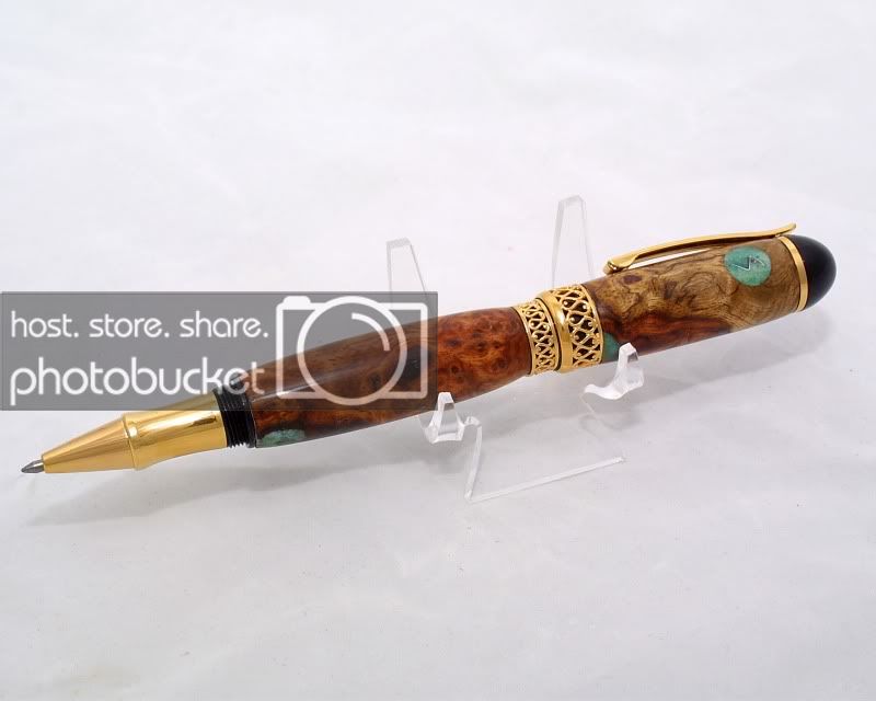
I was wanting to experiment with some segmenting so I just used a few pieces of tru-stone blanks that were cutoffs from other pens. These looked a lot better in my head. I'm ok, but not overjoyed with them I has some squareness issues on the first one and it looks funky when capped. Just out of balance.

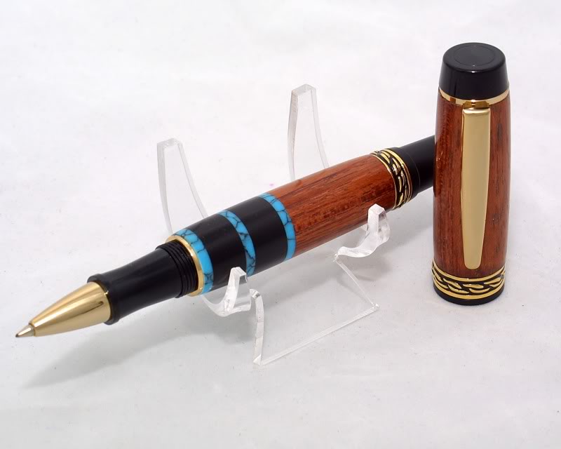
This one is Bubinga with ebony and turquoise tru-stone. It's not bad out of square, but enough to notice. I love the mix of colors, but not the final product. Bubinga and Ebony are probably my two favorite woods to work with or turn so far. Olympian Elite gold kit.
OlympianEliteGoldwithTurquoiseEbony.jpg


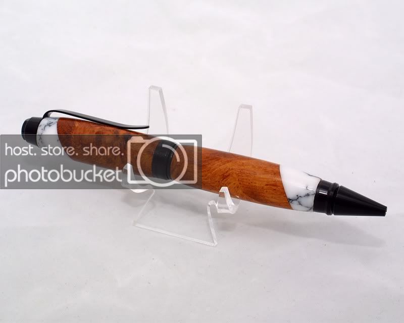
This is (I believe) Afzilia burl and marble Tru-Stone. Again, it looked better in my head, but I'm not totally disappointed in it. Black chrome cigar kit.
BlackCigarwithRedwoodBurlandMarble.jpg


This one was an attempt to put a sort of makers mark on it as seen in the top. It's a piece of a coke can bent into an "s" and then filled around with crushed colored glass. The other voids were filled with crushed glass as well. I just wish the glass would have been either more opaque or more translucent. It's hard to see the "s". Apollo kit (all I had left in stock)
ApolloInfinityGoldAmboynaBurlwithLo.jpg


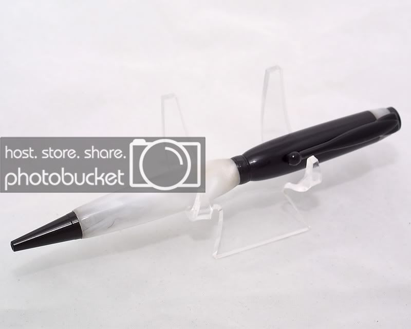
Black slimline kit with Pearlite acrylic and ebony. I painted the tubes silver before I glued them in, but some of the paint rubbed off and you can see hints of brass if you look closely at the pen. The top piece of acrylic either melted or something that I put on it ate it away because it got damaged somehow. I tried to polish it back up as best I could, but there's still evidence.
EbonyandPearliteAcrylicSlimlineinBl.jpg


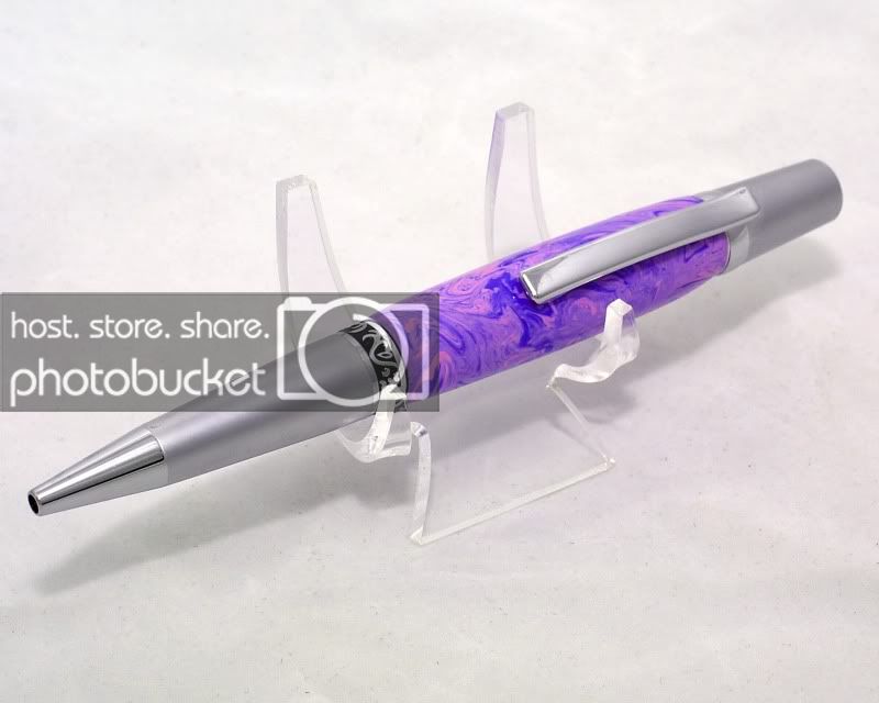
I may put this one back on the lathe to clean it up a little more, but the combo makes for a nice looking ladies pen. Just a basic sierra with an unknown acrylic.
SierraSatinNickelwithPurpleandPinka.jpg


As always, let me know how I could do better! Love this stuff!

Chris
 
Signed-In Members Don't See This Ad

ToddMR

Member
Joined
May 3, 2010
Messages
1,715
Location
Columbus, OH
That ladies pen is really looking good Chris. I like the purple on that one and all the swirls. Really fantastic job imo.
 

Jgrden

Member
Joined
Mar 27, 2009
Messages
6,287
Location
hOUSTON, Texas
Why did you want to put the "S" in the crushed glass. What dies it stand for?
Your photography is OUT STANDING. You pointed out all the issues and I agree with about them. Still good work and the photography is great.
 

Craftdiggity

Member
Joined
Mar 10, 2010
Messages
1,373
Location
Egg Harbor Township, NJ
Man that last one is pretty cool looking. I'm not crazy about mixing acrylic and wood. It always looks funny to me. One thing you might try when using the coke can aluminum is to double up on the aluminum strip. It will make the 'S' pop a little bit more. no matter what material you put around it.
 

phillywood

Member
Joined
May 10, 2010
Messages
2,067
Location
San Antonio, TX, 78250, USA
ok, 5th is your best, it's not busy. 1st one ther is no balance in the wood and the black and the blue. had you used acrylic instead of the wood it would have worked. 2nd one, yor wood is much prettier than the marble, no visual balance.
third one not appealing 4th you already the problem. Pics. very nice, turnings very nice. Hope youwon;t take it personally. i am looking at it from a buyers point of view.
And, you get to grill me when it's my turn. But, you asked for honest opinion.
 
Last edited:

ProutyBoy

Member
Joined
May 17, 2010
Messages
43
Location
Wylie, TX
Phil...I did ask, But SHEEESH! Just Kidding. I don't take anything personally. I honestly appreciate the feedback...especially from the talent that floats around these forums.

and John, I am launching my pen company soon, under STYLOS, so the S will sort of be the mark. I'm working on ways to get it in threre and still look like it should be. I might try the clear printed film or maybe some special order stickers. Not sure

And I agree about all that was said about the balance. For now, I'm going back to basic pens, but I'm sure some segmenting will find its way in occasionally :)

Thanks again for all the advice and feedback
 

avbill

Member
Joined
Oct 18, 2007
Messages
1,973
Location
San Bruno, CA, USA.
Everyone's has their opinion.

1. The reason it out of balance is that there is too much black in the pen. The black nib, the two wide ebony pieces in the pen and then cap. If you reversed the turquoise and the ebony you would have been fine.

2. The pen is balanced,yet you used the wrong contrasting color. You selected a color that does not complement the main color of the pen, Aflizia burl. it fights it.

3. no opinion

4. Working with slim lines is tricky. Review Russ Fairfield tapes or web site. He has many creative ways to enhance a slim line pen. Your pen is not fully in focus. [bad for web sales] Then photographing micro-photography your depth of field is reduced by 2/3. Just be careful.

5. Blue River Agate or Royal Flame is a beautiful tru-stone. Good selection of kit option.


Designing segmented turning brings into an additional element into pen turning. I have seen many excellent segmented pen on the technique side. Yet the color combination can put a thumbs down on the completed pen.

As an exercise put together a folder of pictures of segmented pens that you like. Get thirty to fifty of them. Then review / draw out the pen in a box divide the box into nine equal squares. three across and three down. Then review where the elements of segmented pen. You will see the element of composition whether good or bad its a learn exercise also study the color chart. Do the colors complement one another or contrast one another.
 

Jgrden

Member
Joined
Mar 27, 2009
Messages
6,287
Location
hOUSTON, Texas
Phil...I did ask, But SHEEESH! Just Kidding. I don't take anything personally. I honestly appreciate the feedback...especially from the talent that floats around these forums.

and John, I am launching my pen company soon, under STYLOS, so the S will sort of be the mark. I'm working on ways to get it in threre and still look like it should be. I might try the clear printed film or maybe some special order stickers. Not sure

And I agree about all that was said about the balance. For now, I'm going back to basic pens, but I'm sure some segmenting will find its way in occasionally :)

Thanks again for all the advice and feedback
My signature on pens is lower case jg. I took a nail head and filed the jg on it and burned it into some woods.
 

Jgrden

Member
Joined
Mar 27, 2009
Messages
6,287
Location
hOUSTON, Texas
Okay, I made a trip to the shop to get the pictures.
Don't make fun of my branding irons, I have already taken enough "shots" for the day. Branding Iron 5.jpg

Branding Iron 4.jpg

Branding Iron 3.jpg

Branding Iron 1.jpg
 

phillywood

Member
Joined
May 10, 2010
Messages
2,067
Location
San Antonio, TX, 78250, USA
Everyone's has their opinion.


As an exercise put together a folder of pictures of segmented pens that you like. Get thirty to fifty of them. Then review / draw out the pen in a box divide the box into nine equal squares. three across and three down. Then review where the elements of segmented pen. You will see the element of composition whether good or bad its a learn exercise also study the color chart. Do the colors complement one another or contrast one another.

Bill, vey good pointer. I think that's a great idea to improve on. Way to go.
 

Jgrden

Member
Joined
Mar 27, 2009
Messages
6,287
Location
hOUSTON, Texas
John that's very inovative how did you that? Did yougrind the end of the nail? Man you are a true artist. I thought it gives it a unique signature.
Jewelers files. Just kept gnawing away at the head until I got what was intended. The error was that you must remember to do everything back wards. I intended to heat these irons with a propane torch. Each wood reacts differently. Some worked and some did not. I thought antler would look great but gave up. I could not get the branding iron hot enough.

I would like someone to teach me how they use gold leafing on pens.
 
Top Bottom