An experiment with Polymer Clay

Signed-In Members Don't See This Ad
See more from G1Pens

G1Pens

Member
Joined
Oct 4, 2010
Messages
1,859
Location
Atlanta, GA area (Dacula)
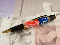
Not sure I like it, but here is what I came up with for my first polymer pen. We have a big event coming up Memorial Day, so I am working on a lot of pens with patriotic themes. This one is close to what I wanted. Not too bad for my first try I guess. I'm not really sure I like it.

Kit is LeRoi from Smitty.

The finish is CA. One thing I noticed is that the CA "yellowed' the white areas more than I would have expected.

Let me know what you think. Good, bad...ugly....I don't care. Honest criticism welcomed.
 

Attachments

  • IMG_5935a-web.jpg
    IMG_5935a-web.jpg
    128.2 KB · Views: 625
Last edited:
Signed-In Members Don't See This Ad

Russianwolf

Member
Joined
Jul 13, 2007
Messages
5,690
Location
Martinsburg, WV, USA.
I think it looks pretty good.


The red and white portion shows a good Mokume effect going on which isn't exactly easy in the thicknesses that the kits allow.

Not quite sure what you were going for in the blue side, but it looks okay.
 

G1Pens

Member
Joined
Oct 4, 2010
Messages
1,859
Location
Atlanta, GA area (Dacula)
The red/white was supposed to be a little more like stripes, but with the same effect. It is okay. The blue was supposed to be more like star on the blue with some swirling. That is the part that really didn't work and the part I am more unsure about.
 

JohnU

Member
Joined
Jan 31, 2008
Messages
4,951
Location
Ottawa, Illinois
I like it. I can see where more waves would give it a closer flag look but i like the design. For being your first shot at it, you got a keeper. Nice work !
 

OOPS

Member
Joined
Feb 6, 2010
Messages
674
Location
Spokane, WA
When I looked at it, I thought you were going for a more modern or stylized effect rather than an accurate reproduction of the flag. As a result, I thought that it was rather cool. Reading your comments suggest you aren't that thrilled with it. I imagine that some people will really go for this design. Did you just mix some red and white clay to develop these lines?
 

G1Pens

Member
Joined
Oct 4, 2010
Messages
1,859
Location
Atlanta, GA area (Dacula)
When I looked at it, I thought you were going for a more modern or stylized effect rather than an accurate reproduction of the flag. As a result, I thought that it was rather cool. Reading your comments suggest you aren't that thrilled with it. I imagine that some people will really go for this design. Did you just mix some red and white clay to develop these lines?


Actually I wanted something between actual stripe and what I got for the red and white. I started out with red and white stripes, rolled it out and then folded it over on itself and rolled. I repeated that several time. Probably did it a few times too many.

The blue with white just needed a little more or the swirling in it with the white dots.

Overall I guess it is okay. Like you said, hopefully someone will like it enough to part with a few bucks.
 

mtgrizzly52

Member
Joined
Feb 24, 2008
Messages
326
Location
Kalispell, MT, USA.
I definitely like it. Caught my eye immediately and made me want to read the thread completely through. The one thing I'm not wild about is the pen kit. I think something with a lot more gold would really look sharp with the blank.

I think you did a good job for your first attempt! :)

Rick (mtgrizzly52)
 

76winger

Member
Joined
Aug 30, 2009
Messages
2,784
Location
Lebanon Indiana
I think the kit's OK, but my personal taste runs toward using Chrome or Rhodium with Red, White and Blue pens. For some reason the colors seem to jump out more when bright, shiny silver is in the mix.
 

TreeBits

Member
Joined
Apr 13, 2011
Messages
49
Location
Ohio
Don't like the gold finish with the red, white and blue, but I like the red white and blue. Good work. Tom Hale
 

wouldentu2?

Member
Joined
Jan 27, 2011
Messages
899
Location
Oak Creek WI
Maybe it is not likely to turn out like a decal, but maybe the medium lends itself to more impressionistic. Try it again with that in mind and you might be onto someting new
 

PenMan1

Member
Joined
Jul 8, 2009
Messages
6,380
Location
Eatonton, Georgia
As a fellow "statesman", I kinda, sorta like it, and i'd love to talk to you about your thought process and design . As an avid admirer of your work, I'd appreciate a chance for a meaningful dialog.

Please send me a PM! I have a toll-free phone number.
 

wizard

Member
Joined
Aug 27, 2009
Messages
3,569
Location
Houston, Texas
Gary, I like it. It's not the classic typical flag pen but it is a piece of art that definitely has a contemporary, abstract but patriotic look to it. Regards, Doc
 

kevrob

Member
Joined
Jul 16, 2010
Messages
352
Location
Manhattan, KS 66502
I think it turned out pretty good. In fact, I like the abstractness of it...

I try to get a good marbled effect with PC and I can never get a good look like your red and white. I also have a heck of a time applying even pressure all the way around a PC blank and usually end up with divots that look like the back of my....well, never mind. I usually end up sanding them on the lathe after baking to get them to look good. After messing around with PC I certainly give my regards to any PC artist and Toni especially for her gorgeous blanks!
 
Top Bottom