Euro RT Premium

Signed-In Members Don't See This Ad
See more from rd_ab_penman

rd_ab_penman

Member
Joined
Jun 1, 2007
Messages
1,646
Location
Red Deer, Alberta, Canada.
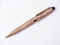
8mm twist ballpoint with Gold plating and Curly Bubinga. Finished with Minwax Satin Polyurethane.
As always comments and suggestions welcome.
Thanks for looking.

gold8mmeuropremiumtwistnv6.jpg
 
Signed-In Members Don't See This Ad

ed4copies

Local Chapter Manager
Joined
Mar 25, 2005
Messages
24,527
Location
Racine, WI, USA.
It's a NICE looking pen, Les.

But that is the oddest color for bubinga that I have seen.
(the gold on the metal is the right color, so it's not likely to be your lighting - not trying to slam your photography)
 

DurocShark

Member
Joined
Jul 26, 2008
Messages
3,622
Location
Anaheim, CA
That is some amazing grain. As to the color, don't count on a shiny metal to give you a reference point. This was just by applying "auto levels" in Photoshop:
 

Attachments

  • rd_ad_penman.jpg
    rd_ad_penman.jpg
    32.6 KB · Views: 123

DurocShark

Member
Joined
Jul 26, 2008
Messages
3,622
Location
Anaheim, CA
The Photoshop "auto levels" don't show the true color, look like it has a pink tint??

I agree. I was just making a point that shiny metal is a poor reference point. The gold is very close in both images, but the wood is much warmer in the one I "processed".
 

rd_ab_penman

Member
Joined
Jun 1, 2007
Messages
1,646
Location
Red Deer, Alberta, Canada.
I agree. I was just making a point that shiny metal is a poor reference point. The gold is very close in both images, but the wood is much warmer in the one I "processed".

Sorry. I don't get your point that the shiny metal is a poor reference point.
To me the reference point is the whole pen.
I don't see why you would need to "Doctor" up your photos and hide the true color of the wood, finish and fittings.
 

DurocShark

Member
Joined
Jul 26, 2008
Messages
3,622
Location
Anaheim, CA
Sorry. I don't get your point that the shiny metal is a poor reference point.
To me the reference point is the whole pen.
I don't see why you would need to "Doctor" up your photos and hide the true color of the wood, finish and fittings.

It was a comment to the post that "The gold looks right" and I was showing that it's easy for the gold to still "look right" by itself, when not comparing side by side, and still get a different color for the rest of the image.

I can get drastically different looks with the gold still "looking right" between my calibrated monitor and my non-calibrated monitor (factory settings both on vid card and on monitor).

That's all. I wasn't suggesting that the OP's photo was doctored or anything like that. I just happened to have Photoshop up and running at that moment so thought I'd do a quick test.
 
Top Bottom