Earth Tones - Pix critique please

Signed-In Members Don't See This Ad
See more from Brooks803

Brooks803

Member
Joined
Sep 13, 2009
Messages
5,632
Location
Aiken, South Carolina
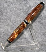
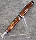
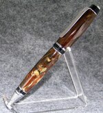
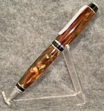
Here we have a cigar with a blank I threw together last night in earth tones. A nice rich brown with a golden tan mottled with a deep green. Tubes were painted black and the finish is MM to 12000 and PlastX polish. All four pictures are of pretty much the same angle. I discovered a new lighting technique and I'm stuck on which I like best so if you could help me out please I'd appreciate it. The first photo is of my usual way and the next three I'm playing with the lighting. Thanks for looking and for any help! Also, I know the grey backdrop is ugly, but it's the best one I've found to show off the true colors in the pen.
 

Attachments

  • 102_9867.jpg
    102_9867.jpg
    51.5 KB · Views: 218
  • 102_9868.jpg
    102_9868.jpg
    73.4 KB · Views: 217
  • 102_9872.jpg
    102_9872.jpg
    60.5 KB · Views: 155
  • 102_9873.jpg
    102_9873.jpg
    62.7 KB · Views: 222
Signed-In Members Don't See This Ad

snyiper

Member
Joined
Aug 24, 2009
Messages
1,601
Location
St Inigoes, MD
The lighter background of the 3rd pic gets my attention but the 4th pic overall shows more of the ben in a good light.
 

Jon-wx5nco

Member
Joined
Oct 29, 2009
Messages
351
Location
Tulsa
I love that blank. It goes well with a cigar. I have to vote for pic #2 as well. Pic #4 is a very close second.
 

Tanner

Member
Joined
May 17, 2006
Messages
2,307
Location
Peoria, Arizona, USA.
I like the second one because it doesn't show the shadow like in the others and light doesn't hit the top of the pen in the third picture.
 

Brooks803

Member
Joined
Sep 13, 2009
Messages
5,632
Location
Aiken, South Carolina
Thanks everyone for the feedback! I'm gonna play around with the lighting some more tonight bc I agree with pics 2 & 4 as being best, but I prefer the overall look of pic 3, just need to not have it cast in shadow!
 
Top Bottom