Did these two last night

Signed-In Members Don't See This Ad
See more from MorganGrafixx

MorganGrafixx

Member
Joined
Jan 20, 2009
Messages
290
Location
Snelville, GA
My first attempt at the Jr. Gent II and the Wall Street II. Actually, the Jr. Gent is my first attempt at a cap/post pen period.

jrgent2blkwhtebny.jpg
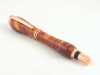
A Satin Gold Jr. Gent II. To be honest I don't know what the wood is. I bought a bag of misc. blanks from Woodcraft last week and none of the pieces were labeled. I just though it looked pretty cool. My best guesses are Tigre Caspi, Black and White Ebony or Zebra Wood. Maybe someone on here is can identify it for me?

jrgent2blkwhtebny_2.jpg
Another.

wallst2whiteacrlic.jpg
Black Titanium/Platnum Wall Street II made with white Pearl acrylic. This is also the first one of these I've attempted to make. So any constructive criticism on either pen would be appreciated.

Comments? Suggestions?
 
Signed-In Members Don't See This Ad

hunter-27

Passed Away Aug 14, 2013
In Memoriam
Joined
Oct 17, 2007
Messages
4,608
Location
Chadron, Ne, USA.
Honestly, I like the Wall Street, hate the shape of the jr. I would not have said anything but.............. you did ask. Does not look like the Zebra Wood I have but hard to say for sure it could be.
 

wdcav1952

Activities Manager Emeritus
Joined
Mar 18, 2004
Messages
8,955
Location
Montgomery, Pennsylvania, USA.
I have to agree with Landon. The Jr is nicely finished, but the fiinal shape is out of proportion to the kit IMHO.

That said, I like the Wall Street. Nice work on it.
 

hunter-27

Passed Away Aug 14, 2013
In Memoriam
Joined
Oct 17, 2007
Messages
4,608
Location
Chadron, Ne, USA.
WOW

I have to agree with Landon. The Jr is nicely finished, but the fiinal shape is out of proportion to the kit IMHO.

That said, I like the Wall Street. Nice work on it.
Now this is getting scarry!!!!!!!!!!! People agreeing with ME!!! WOW!
 
Last edited:

MorganGrafixx

Member
Joined
Jan 20, 2009
Messages
290
Location
Snelville, GA
Honestly, I like the Wall Street, hate the shape of the jr. I would not have said anything but.............. you did ask. Does not look like the Zebra Wood I have but hard to say for sure it could be.

I have to agree with Landon. The Jr is nicely finished, but the fiinal shape is out of proportion to the kit IMHO.

That said, I like the Wall Street. Nice work on it.

I like Wall Street, and think that JR would look better if you would move the "top" further to the nib. But in any case ,nice pair.

All great comments. Thanks guys. Question though...Hunter, When you say "shape" to you mean the profile contour, or the placement of the curve apex? Like what George said, "move the top further to the nib"? George, am I right? Is that what you meant?
 

VisExp

Member
Joined
Oct 1, 2007
Messages
2,738
Location
Palm Coast, FL, USA.
The Wall Street looks very nice. I agree with the others about the shape of the Jr. Gent. The upper barrel looks fine but I don't like the profile of the lower barrel. If you got rid of the bulge near the end cap it would look much better.

I'm glad you took the comments in the spirit they were offered.
 

hunter-27

Passed Away Aug 14, 2013
In Memoriam
Joined
Oct 17, 2007
Messages
4,608
Location
Chadron, Ne, USA.
Maybe it is just me, but, if you WERE gonna have that lower barrel bulge, I would think it needs to be nearer the nib for Griping purposes but personally I think it just to "fat" and unbalanced looking. The cap not too much but a little too much like Santa's belly. Just an opinion, not claiming to be an "expert" but like I said before, you did ask. I still really like the pearl one.

P.S. the Jr. is a fairly substantial feeling pen by itself. I don't see it being the kind of kit you need to "bulk up" with a lot of shape.
 
Last edited:

wdcav1952

Activities Manager Emeritus
Joined
Mar 18, 2004
Messages
8,955
Location
Montgomery, Pennsylvania, USA.
Scott,

Thanks for taking my comment in the positive manner in which I made it. I don't know how long you have been turning, so if this next is out of line, please forgive me.

When I first started turning, I absolutely hated to turn away beautiful wood. Accordingly, I made a number of "wasp-waisted" pens. Some were so overcontoured that the clips were non-functional. After a bit of time, I cam to realize that the pens were better balanced and, to me, more functional if they were close to more usual contours.

I would suggest you practice your adaptations with closed end or segmented pens, and keep the "unadapted" kits closer to a bushing to bushing contour.

FWIW,
 

MorganGrafixx

Member
Joined
Jan 20, 2009
Messages
290
Location
Snelville, GA
Yeah I'm still really new to this. I just got the lathe for Christmas. And you are right..I do tend to try to use more contour in my pens. I'm jut afraid that if turn them too far down they won't look very good. I haven't figured out yet how to stick the shavings back on and try again. LOL! Again guys, thanks for the comments. Don't worry, you aren't going to hurt my feelings.
 

hunter-27

Passed Away Aug 14, 2013
In Memoriam
Joined
Oct 17, 2007
Messages
4,608
Location
Chadron, Ne, USA.
This prolly get me blasted but..................... I cant believe it, a real thread, with real comments, that have been taken exactly as they were intended. Must be the EVE of a party or something =-)
 

rdunn12

Member
Joined
Dec 2, 2007
Messages
1,098
Location
Gardendale, AL, USA.
I agree with the others about the shape of the Jr Gent.The wood looks a lot like some of the Black and White Ebony I have.I like the Sierra.Nice work.
 

george

Member
Joined
Jan 17, 2006
Messages
458
Location
Ljubljana, Slovenia.
All great comments. Thanks guys. Question though...Hunter, When you say "shape" to you mean the profile contour, or the placement of the curve apex? Like what George said, "move the top further to the nib"? George, am I right? Is that what you meant?

Yes, that is what I meant. The top (bulge or the part with the largerst diameter) could be made on the "nib" end of the barell. Doe I have made few of this kind my self (as enclosed), and some do prefer this design. In fact I currently have an order for 2 Lotus fountain pens of this shape. So I guess... 100 people, 100 opinions.
 

Attachments

  • 630.jpg
    630.jpg
    29.8 KB · Views: 90

rlharding

Member
Joined
Nov 20, 2007
Messages
844
Location
Nr Vancouver, BC
I think they both look great. I would also caution you to 'hear' what is being said about the Jr. Gent. Get used to doing the shapes you like regardless of feedback about 'I don't like the shape, Change the shape'.

If your pens sell well, or, if they are received as wonderful, why change? It could become your signature.
 

MorganGrafixx

Member
Joined
Jan 20, 2009
Messages
290
Location
Snelville, GA
Yes, that is what I meant. The top (bulge or the part with the largerst diameter) could be made on the "nib" end of the barell. Doe I have made few of this kind my self (as enclosed), and some do prefer this design. In fact I currently have an order for 2 Lotus fountain pens of this shape. So I guess... 100 people, 100 opinions.

I see what you are saying. As I was assembling it, something didn't seem quite right to me. I mean I liked the shape when it was on the lathe, but when I put on all the hardware it seemed strange. I think where I went wrong is that I turned it "backwards", basically the bulge should have been on the other side. Oh well, we'll see how it comes out on the next one. As a side note I made a Copper Slimline with that same acrylic color/style as the one in your pic. I think the combination is awesome.

I think they both look great. I would also caution you to 'hear' what is being said about the Jr. Gent. Get used to doing the shapes you like regardless of feedback about 'I don't like the shape, Change the shape'.

If your pens sell well, or, if they are received as wonderful, why change? It could become your signature.

Very true...very true.
 

Ligget

Member
Joined
Jan 13, 2005
Messages
13,474
Location
Bonnybridge, Scotland.
Considering how long you have been penturning I would say the pens were fantastic Scott, other than what has been previously said about the shape the only other constructive comment I would make is use a different coloured background for photographing the white pen. :cool:

Keep up the good work my friend! :)
 
Top Bottom