
Jim in Oakville
Member
You know, sometimes I am just happy to have people who enjoy the pens I make, sometimes they chose the materials to make them the pen they want.
I have such a client, she loves my pens, that is excellent for both of us, she choose the Bumble Bee I posted about a month ago and now she spec'd this Gasperite Green Tru STone.
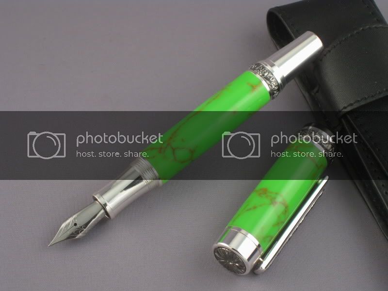
She loves the green and the all Silver look, she's hasn't seen this yet, but I know she will love it.
I am not that crazy about the look, any thoughts or honest critiques are welcomed and encouraged please.
Thanks
I have such a client, she loves my pens, that is excellent for both of us, she choose the Bumble Bee I posted about a month ago and now she spec'd this Gasperite Green Tru STone.
She loves the green and the all Silver look, she's hasn't seen this yet, but I know she will love it.
I am not that crazy about the look, any thoughts or honest critiques are welcomed and encouraged please.
Thanks
Last edited:
 Looks great to me. :wink::wink::wink: