Derek,
Thank you a better turner indeed that is a challenge and from 6000 miles away they both come up smiling from my page on the net.
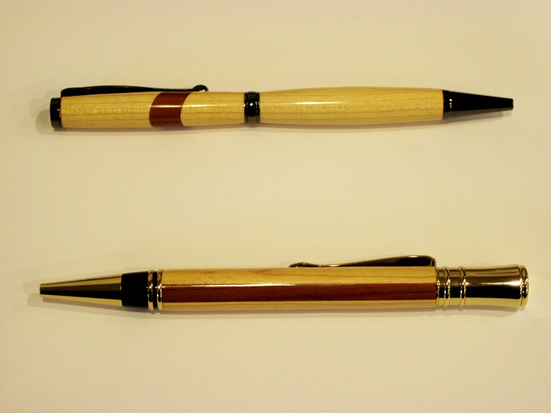
The first pen follows the kiss principle and you kept the kit in harmony with the design, alleviating the pen itself with that bold angled colour slash across the top of the pen as a distinct accent broad enough to announce its intention. The design is smooth as kept this way with a perfect matching grain all the way, the exceptional fit at the tip, centre band, top
present well.
Since I would rather never compare any two different pens placed near to one another I tried an exercise trying to view both at the same time simply not possible. Besides the pens are only related by two things the pen blanks basically the same timber.
Second pen has length attributed to it by the long red stripe, no bleed either also striking and now you changed the design turning straight between the tip to top. In your pic also excellent the gold reproduces cleanly you can nearly feel it is so truly shown. The main pen timber is matched so well to the kit on this occasion as in the previous pen it was by contrast.
Great to see you have the courage of your conviction in your innovation and choices in combinations of accents and design. I admire the bold approach whilst adhering to first principles those of fit ,finish,presentation and with these firmly in your mind extra progress will follow.
Enjoyed your pens you see I have few predudices with kits, timber,seeing these quite made my day. Here it is 11.30 pm on Wednesday. Thank you for the narrative also that gives others the oportunity to share.
Kind regards Peter.