A couple Jr Gents and a Poll

Signed-In Members Don't See This Ad
See more from woody350ep

Which is your favorite display type?

  • Caps on pens laying on wood

    Votes: 4 7.7%
  • Uncapped laying on caps

    Votes: 13 25.0%
  • Uncapped laying on wood with cap upright

    Votes: 35 67.3%

  • Total voters
    52

woody350ep

Member
Joined
Aug 18, 2008
Messages
377
Location
South Bend, IN
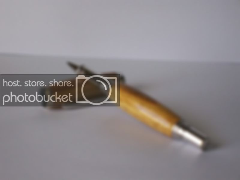
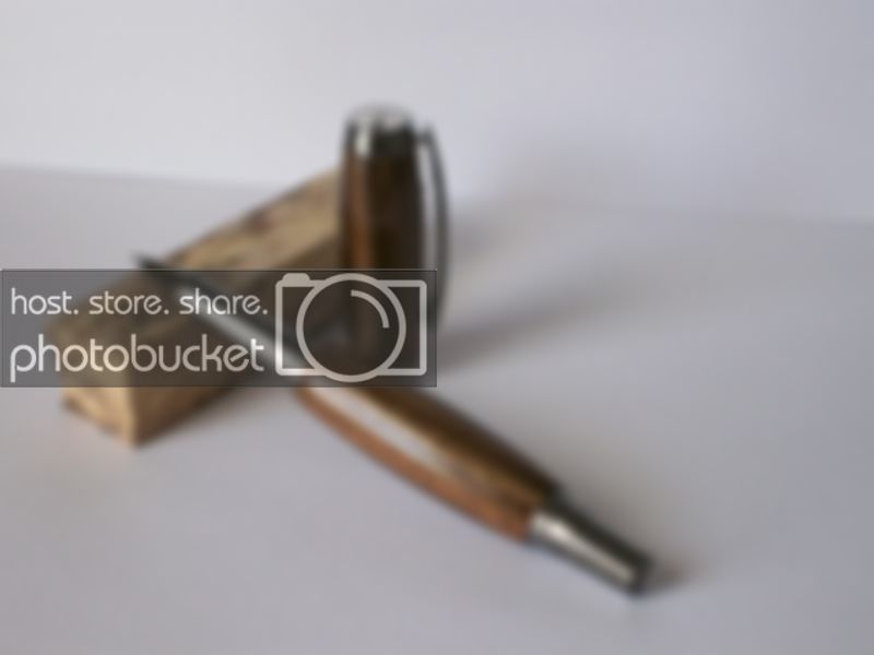
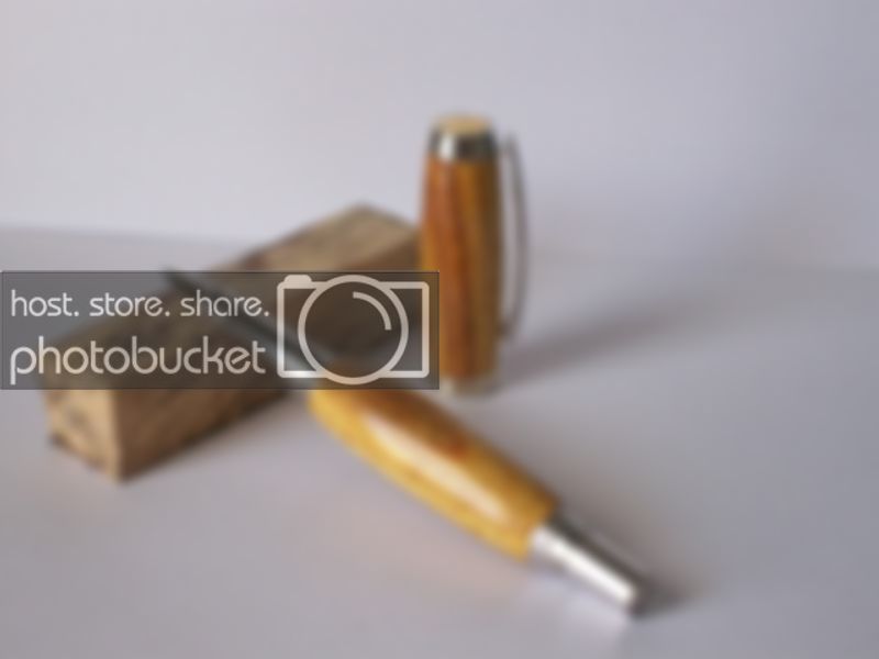
Here are a couple of Jr Gents I made this week. One is Purnama on Black Ti and the other Canary wood on Rhodium. I had never heard of Canary wood but I bought some 1x1x12s from CSUSA when I had another order. This stuff turns like butter. I loved turning it, and I think it has some really nice grain features/colors.

My question is this - Of the different methods of display shown, which would be your favorite setup if you had to choose only one?

So here they are. Both are my CA finish.

100_2183.jpg


Canary


100_2188.jpg


Purnama


100_2191.jpg


100_2194.jpg


100_2196.jpg
 
Signed-In Members Don't See This Ad

workinforwood

Member
Joined
Mar 1, 2007
Messages
8,173
Location
Eaton Rapids, Michigan, USA.
I use Canary wood all the time. It's weird stuff. Interesting grain pattern with different color grains and a greenish tint overall. Soft to cut, yet waxy at the same time which you don't expect from a softer wood. Last two pics look best to me.
 

Jim Smith

Member
Joined
Jul 27, 2008
Messages
1,962
Location
Lakeland, FL
I think I'd like a fourth option which is caps off, not laying on caps or wood; sort of what you might see at a desk. I feel that the wood distracts my focal point away from the object which is the pen and when you lay the pen on the cap, it does not show off the cap well at all since it is in the shadow of the pen. Just one man's opinion.

Jim Smith
 

pianomanpj

Member
Joined
Sep 24, 2007
Messages
1,147
Location
Augusta, Maine, USA.
I guess if I had to pick one, I'd have to go with cap off standing on end. But with that comes a caveat: It depends on the blank. If it were a Gisi, Eagle, or some other mind-blowing blank, I would want to see it capped. I know what the nib of a Junior Gent looks like, so I'd be more interested in seeing how the whole blank flows together.

Just my two shekel's worth. :)
 

NewLondon88

Local Chapter Leader
Joined
May 15, 2008
Messages
5,077
Location
Claremont NH
I like it without the wood, but understand why using the wood can work, too.
But my preference is just the pen.. and probably with the cap standing and
the pen laying against it.
 

ed4copies

Local Chapter Manager
Joined
Mar 25, 2005
Messages
24,528
Location
Racine, WI, USA.
Can we have the wood match the wood used in the pen?

I was surprised that I liked the last ones best, but I would rather see the same wood as the pen, used as the support.
 

OKLAHOMAN

Member
Joined
May 17, 2006
Messages
10,228
Location
Costa Rica
Of all your pictures cap off and laying on wood, but agree with Ed use the same wood as the pen or no wood and a prop that won't take away from the pen.
 

chriselle

Member
Joined
Sep 1, 2008
Messages
1,251
Location
Ito City, Shizuoka, Japan
Jason,

Question.....

Who is your target audience for the pictures? If it's just for us "makers" then maybe just change the wood prop as the others have suggested. But, if it's for the public I might suggest a more natural display setting with the pen's business end facing forward. I think there is something subliminally negative with the nib facing away. JMHO.
 

papaturner

Member
Joined
Apr 5, 2007
Messages
3,397
Location
Buchanan,Georgia USA
Beautiful pens....However when it comes to photos (even the position of the pen) I`m so camera challenged I pass on giving any advise or opinions.:biggrin:
 

fernhills

Member
Joined
Jan 22, 2007
Messages
2,142
Location
Hellertown, PA, USA.
Hi, i try and arrange the card stock i am using not to show a seem, makes for a lot better pic. If you overlap it on an incline a little more you can make seem disappear when using two different pieces.
 

woody350ep

Member
Joined
Aug 18, 2008
Messages
377
Location
South Bend, IN
Thanks for all the input guys. I had never thought about the wood being distracting to the pens, but this was brought up on another forum as well. I will take this into consideration in the future.

Chris - I was intending the question more from a public standpoint. If I were to put a picture of the pens on a website, which would be best? Something along those lines.

Again, thanks for all the input. I know these photos are not edited for maximum potential or taken at the best angles or with the right light. I wasn't trying any of that right now, but was more wanting to get the opinions of position as this has been something I have been thinking about.
 

bitshird

Member
Joined
Aug 27, 2007
Messages
10,236
Location
Adamsville, TN, USA.
I think I'd like a fourth option which is caps off, not laying on caps or wood; sort of what you might see at a desk. I feel that the wood distracts my focal point away from the object which is the pen and when you lay the pen on the cap, it does not show off the cap well at all since it is in the shadow of the pen. Just one man's opinion.

Jim Smith

I concur but the pens do look nice Jason.
 

jttheclockman

Member
Joined
Feb 22, 2005
Messages
19,148
Location
NJ, USA.
Are you showing the pens for a forum like this or a web site to sell??? I think props take away from the focus of the pen. I also always like to see a pen capped. I think we all know what a pen looks like without a cap. If you insist on the cap off then show 2 photos and maybe make them part of the same photo. One with the cap on and one with the cap standing next to it. When people lay the pen on top of the cap you can not see the cap. If the cap has some nice bling then that will add to the pen blank. Make the pen the focus of the photo not some plain blank of wood or something else holding the pen up.

I am going to start practicing with different colored backgrounds. I like what Curtis does when showing his pens. He has a black background and some sort of black plexiglass underneath it. All the focus is now on the pen. That is my opinion.
 

sefali

Member
Joined
Jan 23, 2009
Messages
361
Location
Philly
I gotta go with #1, because it's the only one with the cap on. It is a bad angle, though. If there's only going to be one pic, I think it should be with the cap on. Once you buy a pen, the majority of the times you see it, it will be capped. You wanna know what it's goona look like every time you go to pick it up, put it down, see it on your desk, show it off... capped. Just my penny's worth.
Sef
 

chriselle

Member
Joined
Sep 1, 2008
Messages
1,251
Location
Ito City, Shizuoka, Japan
Jason,

All the research and marketing strategies have been sussed out by the big guys...Parker, Mont Blanc.....and so on. My philosophy is there's no need to re-invent the wheel....emulate and adjust to your needs what is already proven to work.
OR!! Forget about the wheel altogether and go straight to levitation..:biggrin:
 

ldb2000

Member
Joined
Sep 11, 2007
Messages
5,381
Location
Laurence Harbor, NJ, USA.
Beautiful pens Jason . I agree with Chris , goto the big guys sites and see what they do , most don't use any props at all or show the pen in a real world situation like a desk top with papers as a background but ALWAYS with the pen as a focal point . I chose #3 but would have liked to see a 4th option with no prop .
 
Top Bottom