Closed end Mania + One question

Signed-In Members Don't See This Ad
See more from alxe24

Status
Not open for further replies.

alxe24

Member
Joined
Jan 26, 2007
Messages
667
Location
palmdale, ca.
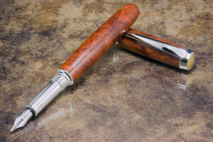
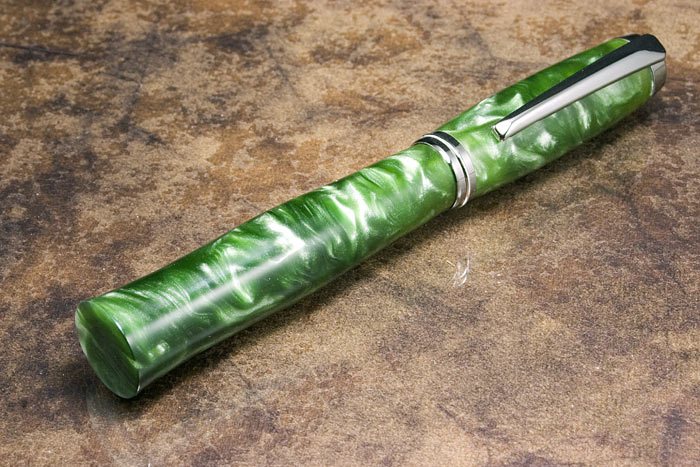
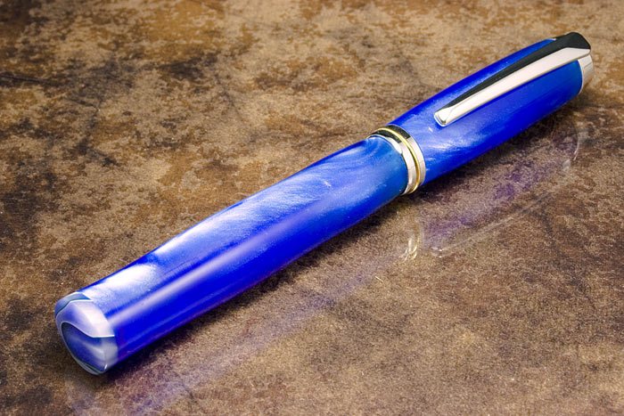
These are the last closed end pens I made I like the wood the most and then the green. I show the green one to a guy at work and He asked for the same in blue so that is his I needed a bit longer blank so I patched it at the end.

The question is about the picture color, contrast and saturation. On my screen they look great, yesterday I got a laptop and check them there and they look like washed, dull they don't have the punch I get on my screen. I'll check some other computer. What is your opinion.
Thanks
Alex
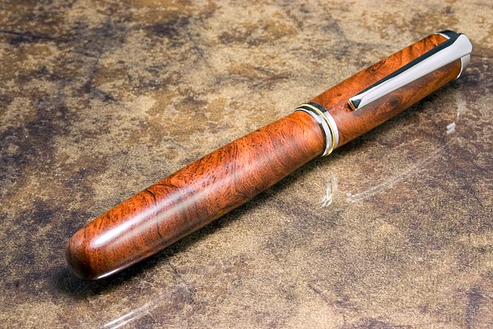
200722722156_Closed-End-Amboina-Burl.jpg


200722722212_Closed-End-Amboina-Burl-01.jpg


200722722226_Closed-End-Green-PR.jpg


200722722238_Closed-End-Blue-PR.jpg
 
Signed-In Members Don't See This Ad

JimGo

Member
Joined
Jan 24, 2005
Messages
6,498
Location
North Wales, PA
Images look sharp and clean, with a nice vibrance to the blue. The green looks nice and deep in the appropriate places. You may need to get advanced drivers for your laptop's graphics card (typically free from the manufacturer of the card or the laptop), and tweak the gama or other settings. You may also just need to adjust the brightness of the laptop's screen (there are typically special key combinations for this right on the keyboard).

What I've always wanted to do, but keep forgetting, is to adjust my monitor's settings so what I get on the screen matches what I see in real life, using something like a color card or the like.

The pens look great, too! I think I like the shape of the green one best, but that's just my never-so-humble opinion.
 

BRobbins629

Passed Away Dec 28, 2021
In Memoriam
Joined
Mar 8, 2006
Messages
4,037
Location
Richmond, VA, USA.
As for the pens, I prefer the shape of the wood. The others are nice, I just like wood better. As for the photography, I'm no expert but do notice that all 4 backgrounds look like different colors of brown. Not sure if they are really different or if its in the photos. Closed ends are another thing on my ever growing list. Posts like these tend to make them a little higher. Nice job.
 

1080Wayne

Member
Joined
Feb 5, 2006
Messages
3,344
Location
Brownfield, Alberta, Canada.
Alex They look both very washed out and absolutely great on my notebook screen . The appearance is totally dependant on the viewing angle . I hadn`t realised how dependant until last weekend when I lost the harddrive on my computer , and switched to viewing pen photos on the notebook . Just move your head around and exercise your neck . Wayne
 

alxe24

Member
Joined
Jan 26, 2007
Messages
667
Location
palmdale, ca.
First of all thank you all for the comets and feed back. Seems like I need to review the laptop settings.
I took the blue pen to work today for the guy to get it and he ended up changing his mind and getting a burgundy Havana Roller ball. I did not mind since I had that one for the last 8 months.
I was thinking about making the wood one with the shape of the green one but I could not visualize it, for whatever reason.
I any case thanks again
Alex
 

Rifleman1776

Member
Joined
Dec 18, 2004
Messages
7,330
Location
Mountain Home, Arkansas, USA.
You have no apologies to make for any of those, beautiful.
We had dinner the other night with a couple that is in the business of making color brochures using photographs they take. These are very savvy computer, photo and photo-editing gurus. They said the most difficult problem they regularly encounter is getting the color on their computer monitor to accurately represent what is going to be on the final print. Even with the best of equipment, this is a tricky endeavor. Also, notebook/laptop computers are (generally) not known for sharp images or accurate color rendition. I would suggest you try a color neutral, non-reflective, background. I use felt squares, purchased at Wal-Mart for a whole 39 cents each.
 
Status
Not open for further replies.
Top Bottom