A Cambridge Rollerball in 2 views

Signed-In Members Don't See This Ad
See more from Mack C.

Mack C.

Passed Away Sep 29, 2018
In Memoriam
Joined
May 4, 2008
Messages
2,019
Location
Brooklin, ON Canada
attachment.jpg


attachment.jpg


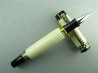
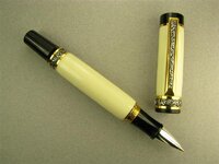
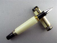
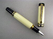
2 views of the same Cambridge Ster. S/Ti. Gold RB. That's Ed4copies Alternate Ivory covering it.

I found the Ivory somewhat difficult to turn. It had a nasty habit of chipping away if I took too deep a cut. I ruined 1 blank before catching on to what I was doing. It will be a little while before I attempt turning the Ivory again, it's too hard on my nerves.

Now my reason for posting 2 pics with 2 different backgrounds and poses -- would you mind taking a minute and give me your honest opinion of which is the better photo, or which one you like the best.

Honest opinions only! I won't take them as personal attacks.
 

Attachments

  • 197 002 (Medium).jpg
    197 002 (Medium).jpg
    67.2 KB · Views: 318
  • 197 Cambridge RB Pen, Sterling & Bk. Ti., Alternate Ivory (Medium).jpg
    197 Cambridge RB Pen, Sterling & Bk. Ti., Alternate Ivory (Medium).jpg
    64.9 KB · Views: 300
Signed-In Members Don't See This Ad

alphageek

Former Moderator
Joined
Jul 19, 2007
Messages
5,120
Location
Green Bay, WI, USA.
Personally, I like the top pose.... But either is ok. However, ONE of these pictures is better than the other, but I can't tell which. The white balance if off on one of them (my guess is the top one is the more correct). With a pen like this, accurate color is CRITICAL and thus one of these needs color correction.
 

Mack C.

Passed Away Sep 29, 2018
In Memoriam
Joined
May 4, 2008
Messages
2,019
Location
Brooklin, ON Canada
Personally, I like the top pose.... But either is ok. However, ONE of these pictures is better than the other, but I can't tell which. The white balance if off on one of them (my guess is the top one is the more correct). With a pen like this, accurate color is CRITICAL and thus one of these needs color correction.
Hi Dean; The top one is closer to the correct colour, but still showing overly yellowish.

My WB was set against a grey card, and I'm using 3 5000K lights. I can't recall if I was taking pics in WB or Daylight mode. I do know it's taking me longer to get a good photo of a pen than it is to make one, but as long as it's fun that's what counts.
I appreciate your straight forward comments.
 

pipecrafter

Member
Joined
Oct 31, 2008
Messages
320
Location
Clayville, Rhode Island
Sometimes getting a good color balance is the most frustrating part of taking any photo - well, aside from dealing with highlights washing out detail on shiny things. My camera (a Canon 300D) actually requires a plain white background as the white balance sample image in order to bring out the best colors.
 

Mack C.

Passed Away Sep 29, 2018
In Memoriam
Joined
May 4, 2008
Messages
2,019
Location
Brooklin, ON Canada
Sometimes getting a good color balance is the most frustrating part of taking any photo - well, aside from dealing with highlights washing out detail on shiny things. My camera (a Canon 300D) actually requires a plain white background as the white balance sample image in order to bring out the best colors.
Hi Kurt; I'm using a Canon S5 IS.
 

bitshird

Member
Joined
Aug 27, 2007
Messages
10,236
Location
Adamsville, TN, USA.
Top picture, looks just a bit blue, I love Ed's Alt Ivory. but I turn it on a metal lathe, (cheat) I blew a piece up I was going to use for a JR Emperor, trying it on my wood lathe.
Your Cambridge is beautiful, I love the larger pens done in Alt Ivory.
 

NewLondon88

Local Chapter Leader
Joined
May 15, 2008
Messages
5,077
Location
Claremont NH
Maybe this will help for comparison.
I like the top pose, myself.
 

Attachments

  • 197 002 (Medium).jpg
    197 002 (Medium).jpg
    58.3 KB · Views: 94
  • 197 Cambridge RB Pen, Sterling & Bk. Ti., Alternate Ivory (Medium).jpg
    197 Cambridge RB Pen, Sterling & Bk. Ti., Alternate Ivory (Medium).jpg
    58 KB · Views: 94

GouletPens

Member
Joined
Nov 9, 2008
Messages
1,449
Location
Ashland, VA
If you have a hard time with color balance, there are plenty of basic photo editing programs out there that will save you a lot of time and aggravation. It looks like you're hovering over the pen with your camera and take a picture from directly above. I've never been a fan of this strategy b/c it always casts wierd shadows. Try doing different light and camera setups.
 

Jim Smith

Member
Joined
Jul 27, 2008
Messages
1,962
Location
Lakeland, FL
First off, beautiful pen! I love the classy look of the alternate Ivory with that kit. As far as the photos, I also think the first photo is cleaner and shows off the pen better.

Super nice work!!!

Jim Smith
 
Top Bottom