
You are using an out of date browser. It may not display this or other websites correctly.
You should upgrade or use an alternative browser.
You should upgrade or use an alternative browser.
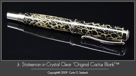
Cactus
- Thread starter MesquiteMan
- Start date
Signed-In Members Don't See This Ad
See more from MesquiteMan


I find it attractive.

In that case, it looks great!


Cool -- it looks terrific.


Curtis can I borrow that term....it does sound so much better than "I painted the insides black"
I love the layout....at first I thought something was off with the picture. Then I realized the pen was displayed opposite from what we're used to seeing, the cap to the left with the finial end angled toward the camera. Flipping the pen around gives it a fresh, unusual look! Plus you see the designs on the cap finial. To me the reflection, since it is faint adds to the picture.


http://www.penturners.org/forum/showthread.php?t=47992
Water mark was not an appropriate description. It is more of a text box in the corner. To me the framing/matting detracts from the pen.
Edit: Actually this one from your website is more like what I was thinking about.

Not sure how it works with trademarks, but with copyrights you're limited to actual damages (not attorney's fees, filing fees, statutory damages, etc.) if the copyright is not registered. If you're not making a significant profit off the image, and the infringer isn't either, then actual damages aren't going to be enough to cover the court's filing fee. Since you can register an entire CD of digital works for one fee, ($35, IIRC, and I'm not sure if they'll accept a DVD-ROM of stills yet since the documentation I have just says CD) it can be worthwhile even when you're not doing pro photography.
Not sure how it works with trademarks, but with copyrights you're limited to actual damages (not attorney's fees, filing fees, statutory damages, etc.) if the copyright is not registered. If you're not making a significant profit off the image, and the infringer isn't either, then actual damages aren't going to be enough to cover the court's filing fee. The presumption of ownership that registration gives you also puts the burden of proof on the infringer, which can save you a lot of hassle in court.
Since you can register an entire CD of digital works for one fee, ($35, IIRC, and I'm not sure if they'll accept a DVD-ROM of stills yet since the documentation I have just says CD) it can be worthwhile even when you're not doing pro photography.

Signed-In Members Don't See This Ad
rpearson
Member
The picture looks clear, clean and really pops! I think you did an excellent job with the picture and background. Outstanding pen and blank!
johnnycnc
Member
Curtis, it just doesn't get any better!
Fine pen, fine photo.
Fine pen, fine photo.
altaciii
Member
As always when you post one. Beautiful. Theres no more to say.
glycerine
Member
Looks great. One suggestion I would make is use a photo tent. And correct me if I'm wrong, it just looks like you didn't use one because of the darker reflections off of the metal parts. It's just my opinion of course, but I think metals look better when they are reflecting lighter surfaces. It just brings out the "bling" in them I guess. The lighting and background are great though.
As far as the layout, I think that's perfect. You've got the pen in the picture and not alot of other jazz. You're showing the viewer exactly what you want them to see.
As far as the layout, I think that's perfect. You've got the pen in the picture and not alot of other jazz. You're showing the viewer exactly what you want them to see.
MesquiteMan
Retired Head Moderator
This pic, as well as all of my photos (including the blanks I sell on my site) are all shot with a photo tent. I am not really looking for critiques of the photo itself but rather the layout, ie, the "matting" and description below. Does it add or detract from the photo? Thanks all!
soccer2010
Member
some day i will try a cactus blank and if it looks half as good as that I'll be proud
JohnU
Member
Curtis, I like the layout. The image looks great and the grey border and text are soft enough to make it easy on the eyes but yet bright enough to stand out. Very professional looking.
el_d
Member
Looks Good Curtis I like the Frame, nice and elegant. I guess to be nitpicky the description font may be a little larger and the Copywrite smaller
How do you go abouts "copywrite"ing the picture?
How do you go abouts "copywrite"ing the picture?
MesquiteMan
Retired Head Moderator
All original artworks are automatically copyrighted the minute they are created. Adding the copyright notice simply puts people on notice that you take your copyright rights seriously and that they photo is not to be duplicated without permission.
johnnycnc
Member
This pic, as well as all of my photos (including the blanks I sell on my site) are all shot with a photo tent. I am not really looking for critiques of the photo itself but rather the layout, ie, the "matting" and description below. Does it add or detract from the photo? Thanks all!
I find it attractive.
stoneman
Member
Great job on pen & layout. I like the apparent depth of the blank as shown. Awesome job all around!
glycerine
Member
This pic, as well as all of my photos (including the blanks I sell on my site) are all shot with a photo tent. I am not really looking for critiques of the photo itself but rather the layout, ie, the "matting" and description below. Does it add or detract from the photo? Thanks all!
In that case, it looks great!
Curtis,
That pen is incredible. The blank done that way makes it absolutely 3D!
But I know you are asking about the photo, matte and caption.
The photo, matte, and layout look fantastic. Very professional. It could be an ad in a high end magazine. The pen fills up the whole space and grabs your attention.
The only thing I would say is I agree with Lupe about making the "copyright" line
a little smaller. Very professional work!
Bree
Member
That is a spectacular pen. Great job on it!
:biggrin::biggrin::biggrin:
:biggrin::biggrin::biggrin:
alphageek
Former Moderator
Very nice Curtis.
Other than agreeing with other's comments, I'd like to suggest an alternate layout. I like the current one, but I think another that might looks as good (or better) would be to move the picture to the center of the frame area... Put the 'caption' text above the picture and you name below (with a smaller copyright). I would suggest you name be bigger than it is (say 60-75% of the pen title) and the copyright about 1/2 of your names size.
Just a thought... Feel free to ignore if you wish.
artme
Member
That pen is a ripper Curtis!!!
mbroberg
IAP Activities Manager, Emeritus
Curtis, that pen is beautiful. The photo is exceptionally clear and as burgerman said, could appear in a high end magazine. I don't think that your captions detract from the pen at all. My only criticism of the photo at all would be the reflection of the pen. I am probably alone here but I have never liked that effect. I know a lot of people create a reflection of the pen in their photos, but I just don't like it when the photo includes a mirror image of the pen on the surface it is sitting on. In my opinion the reflection detracts from the actual pen.
Mrs Rojo22
Member
Great looking picture and LOVE the pen!
Robin
Robin
jkeithrussell
Member
- Joined
- Oct 20, 2008
- Messages
- 1,277
What do you mean by "reverse painted black"?
The pen, layout, photo, text, and everything else about it, all look outstanding.
The pen, layout, photo, text, and everything else about it, all look outstanding.
MesquiteMan
Retired Head Moderator
Reverse painting is what I call the paint on the inside of the blank. It sound better than "With the inside of the blank painted black"!
THarvey
Member
This photo looks nice, but I like the style with your watermarked logo better.
MesquiteMan
Retired Head Moderator
Tim,
Can you elaborate? I don't recall ever doing a watermarked logo on a photo.
Can you elaborate? I don't recall ever doing a watermarked logo on a photo.
jkeithrussell
Member
- Joined
- Oct 20, 2008
- Messages
- 1,277
Reverse painting is what I call the paint on the inside of the blank. It sound better than "With the inside of the blank painted black"!
Cool -- it looks terrific.
devowoodworking
Member
I wouldn't change a thing Curtis...everything looks awesome!
Verne
Member
Looks good/great/awesome/ as usual.
What finish did you use he said with tongue in cheek.
Vern
What finish did you use he said with tongue in cheek.
Vern
mick
Member
Reverse painting is what I call the paint on the inside of the blank. It sound better than "With the inside of the blank painted black"!
Curtis can I borrow that term....it does sound so much better than "I painted the insides black"
I love the layout....at first I thought something was off with the picture. Then I realized the pen was displayed opposite from what we're used to seeing, the cap to the left with the finial end angled toward the camera. Flipping the pen around gives it a fresh, unusual look! Plus you see the designs on the cap finial. To me the reflection, since it is faint adds to the picture.
snowman56
Member
Curtis
As allways your pens and photos are beyond belief great work.
As allways your pens and photos are beyond belief great work.
CSue
Local Chapter Leader
Okay Curtis, this looks like a professional layout/photo - as if you had hired a pro to set it all up. I really like it.
First, though, I don't think the "Copyright" line should be that much smaller. But for some reason, the font in that line isn't as crisp as the larger fonts. I don't know why, but maybe you could 'clear it up' somehow.
Secondly, have you applied for the Trademark for "Original Cactus Blank?" I'm not sure you can put the "TM" if the trademark isn't registered. Just a question.
Matting, layout, photography, font all looks wonderfully professional.
MesquiteMan
Retired Head Moderator
Cathy Sue,
Thanks for the reply. No, I have not registered "Original Cactus Blank"". Registering a trademark is not necessary in order to claim trademark rights just like registration is not necessary to claim copyrights. I can not, however, use the ® symbol unless the trademark is registered.
Here is more information if you are interested...
http://en.wikipedia.org/wiki/Trademark
Here is an excerpt from another site:
"Question: Do I have to register my brand name to get trademark rights?
Answer: Not in the United States. Here, you do not need to register a mark to establish rights to it, though registration provides important advantages. Registering a mark means that the registrant is presumed to be the owner of the mark for goods and services specified in the application. This makes proving your rights easier in court.
However, US federal law also provides rights to unregistered (?common law?) marks if they are actually used in commerce. In addition, each state provides local protection for both registered and unregistered marks under regulations governing unfair competition. Most other countries require prior registration to protect a mark.
If you register a trademark with the PTO, you have rights to the mark only in the United States and its territories. If you want protection in other countries, you must register the mark in each country in which you want to protect it. However, you can file a single trademark application that covers all the European countries. Contact an attorney for help on rights and procedures in other countries."
http://www.chillingeffects.org/trademark/faq.cgi#QID217
THarvey
Member
Tim,
Can you elaborate? I don't recall ever doing a watermarked logo on a photo.
http://www.penturners.org/forum/showthread.php?t=47992
Water mark was not an appropriate description. It is more of a text box in the corner. To me the framing/matting detracts from the pen.
Edit: Actually this one from your website is more like what I was thinking about.
Attachments
Last edited:
bitshird
Member
I think it looks great Curtis, nice layout and not a shabby pen either. Heck I'd even carry it, might even use it in public.
CSue
Local Chapter Leader
Thanks Curtis - for the link and info. It is much appreciated.
KD5NRH
Member
Registering a trademark is not necessary in order to claim trademark rights just like registration is not necessary to claim copyrights.
Not sure how it works with trademarks, but with copyrights you're limited to actual damages (not attorney's fees, filing fees, statutory damages, etc.) if the copyright is not registered. If you're not making a significant profit off the image, and the infringer isn't either, then actual damages aren't going to be enough to cover the court's filing fee. Since you can register an entire CD of digital works for one fee, ($35, IIRC, and I'm not sure if they'll accept a DVD-ROM of stills yet since the documentation I have just says CD) it can be worthwhile even when you're not doing pro photography.
KD5NRH
Member
Registering a trademark is not necessary in order to claim trademark rights just like registration is not necessary to claim copyrights.
Not sure how it works with trademarks, but with copyrights you're limited to actual damages (not attorney's fees, filing fees, statutory damages, etc.) if the copyright is not registered. If you're not making a significant profit off the image, and the infringer isn't either, then actual damages aren't going to be enough to cover the court's filing fee. The presumption of ownership that registration gives you also puts the burden of proof on the infringer, which can save you a lot of hassle in court.
Since you can register an entire CD of digital works for one fee, ($35, IIRC, and I'm not sure if they'll accept a DVD-ROM of stills yet since the documentation I have just says CD) it can be worthwhile even when you're not doing pro photography.
PenPal
Member
Hi Curtis
Re your Statesman. Your pen is a masterpiece of care with tremendous detail and impact.
The reflection saves the pen image from falling out of the frame, the inclination is disturbing but thoughtful in that it gives a peep into the detail of the pen with hints of there is more to this pen, not like a mini skirt where all is revealed. The pen is suspended in space giving a modernistic approach,not a bad look at that, daring , provoking really.
The writing if pin sharp would be more in keeping with your absolute quality pen and relate better to the magic of the moment.
To the left of the image a small reflector would restore the beaut detail to the bottom of the pen itself necessary to really show that kit to advantage.
With only one pic not open eg you have provided a teaser leaving me wanting to see more.
It would have been so easy to give you a one liner please be assured as I have said to you before if you had not requested comments I would feel impertinent as my thoughts are expressed by way of observations, in the long run it will be the image that sells if you so desire in the higher echelon of master penmakers.
As ever I am in awe of the Cactus series in general and this pen in particular.
Kind regards Peter.