Buckeye Burl Emperor with lots of extras in NH

Signed-In Members Don't See This Ad
See more from mikespenturningz

Joined
Feb 24, 2012
Messages
4,368
Location
Claremont NH
Here is my latest, it is Quilted Buckeye burl with a few segments made in it.

il_570xN.647940481_482o.jpg


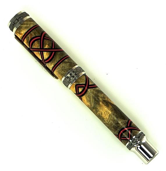
These Emperor kits were really nice to work with. Lots of real estate to work with.

C&C welcomed.
 
Signed-In Members Don't See This Ad

Jim Burr

Banned
Joined
Feb 23, 2010
Messages
3,060
Location
Reno, Nv
That rocks Mike!!
For a C&C...I'm wondering if the red seg's really match with yellow BEB, Mechanics are solid, angles are perfect...just wondering about the colors. Keep it up...Great pen!
 

mark james

IAP Collection, Curator
Joined
Sep 6, 2012
Messages
12,750
Location
Medina, Ohio
That rocks Mike!!
For a C&C...I'm wondering if the red seg's really match with yellow BEB, Mechanics are solid, angles are perfect...just wondering about the colors. Keep it up...Great pen!

I understand Jim's Q, and it's valid. For my tastes, the red is a good match. It's not overpowering, so it's fine with me.
 
Joined
Feb 24, 2012
Messages
4,368
Location
Claremont NH
I was looking for real contrast. I am working on another for a particular project that I am working on that will use cream and black. That won't give as much contrast but should look great with the Buckeye Burl and Padauk with the cream black composite. I am trying to figure out how to make the Padauk work with the main body now? This will be a really looker and the practice I have gotten on the preceding pens will really make this one stand out.I have the knot made now I have to figure out what segment color to use then add the scallops.

The red and black on this pen were very difficult to align to make them look just right. There are a lot of very small lines and any variation really shows up. This also used a brand new way of scalloping for me. The scallops are much more precise than I have done before.

Thanks
Mike


That rocks Mike!!
For a C&C...I'm wondering if the red seg's really match with yellow BEB, Mechanics are solid, angles are perfect...just wondering about the colors. Keep it up...Great pen!

I understand Jim's Q, and it's valid. For my tastes, the red is a good match. It's not overpowering, so it's fine with me.
 
Last edited:

NittanyLion

Member
Joined
Feb 3, 2013
Messages
804
Location
State College PA
There are a few folks on here that once you see a pen, you instantly know who made it. Skip-Rat, Stephen Taylor, Mike Redburn, Don Ward, Seamus, MikeL, Jonathon Brooks are a few that come to mind. Mike, for me, you're in that group as well. Each of these artists have their own style that really is only theirs and stands out. That is getting harder to do these days....so I admire what you are able to do with every pen you create. This pen carries on that tradition. Fantastic segmenting, fit & finish is spot on, but above all, it's very creative. Nice job!
 

turncrazy43

Member
Joined
Apr 22, 2012
Messages
1,104
Location
Marietta, GA
Now that's a beautiful segment job on that pen. You always do great work Mike.
__________________________________________________
Everyday I'm vertical is a great day
 

OZturner

Member
Joined
Aug 5, 2013
Messages
6,663
Location
Sydney. NSW. Australia
Beautiful Pen Mike,
Excellent Knot, Segmenting and Scalloping.
I am with Jim Burr, IMHO the Red / Black, doesn't Pop for me as much as your previous White / Black.
Your Fit and Finish, is Superb.
Congratulations,
Brian
 
Top Bottom