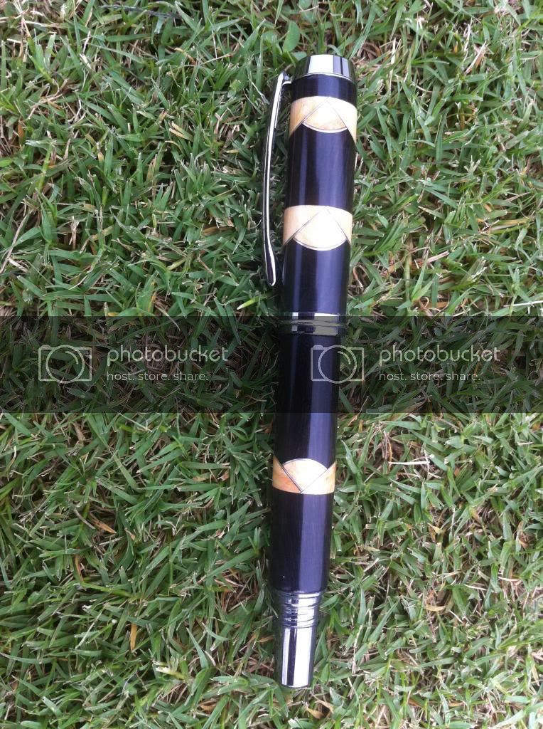
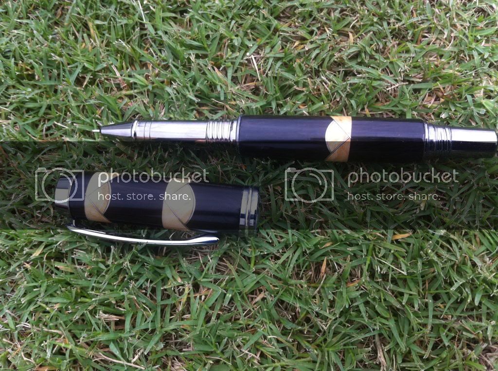
3 sets of scallops of box elder and aluminum. Black ti jr gent 2 with a fine tip rollerball. Comments and critiques are welcome and thanks for looking.
They might look better if they were all in the same direction, other than that I would say a pretty nice job. I have yet to get them to come out to my satisfaction.
Aspects that I like of your pen are the choice of materials...the stark contrast of the box elder against the black wood comes across very well. The other is your workmanship evident in the scallops themselves: angles and accent lines line up well and good symmetry is maintained. I will likely use these features of your effort as inspiration points on future pens of my own.
Fantastic "Art Deco" Pen, Phil .
Love your Scallops, and Inserts.
And I like the fact that when posted, the Scallops will all face the same direction. Outstandingly Clever.
Superb Choice of Materials.
And Outstanding Craftsmanship.
Brian.
MY C/C; Your grass is a little dry and needs water and some 26-10-05 to green it up. Your lawnmore needs the blades sharpened as it is splitting the grass blades insteasd of cutting them crisply. And, that colored stick you have in the lawn photos, a priceless work of art and craftsmanship. Very well done !! Jim S
Beautiful workmanship! That said, I agree with RickG that perhaps it would look better if the scallops were all going the same way. Also, the grass in the photos is a bit distracting. Perhaps a plain or neutral background would show off your work a bit better. Overall, a great job. Thanks for sharing.
About the only thing I see is that they could have been trimmed just a tough so the aluminum would come to a point rather than overlapping. But that's not the easiest thing to see unless it's in a closeup. I'm not a fan of the 2nd set in the cap. If you had done 2 on the lower barrel, I think it would balance it better, and look more natural with the 2 sets in opposite directions. But those are design opinions, and take nothing away from the quality of your work.
I do like the contrast of materials. And you did a great job of making the scallops even. That's not nearly as easy as it looks. And your fit & finish look flawless. :good:
Thanks for all the comments. Funny thing is this pen blank has been on my rack for 2 years. This is the pen I first built trying to up my scallop game. I used it to learn quite a lot about scallops. The pen I did after this won me my intermediate 1st place.
The grass could all die and make me happy. Will work on my photo skills, they are terrible.


")