Blue/black double silver

Signed-In Members Don't See This Ad
See more from Texatdurango

Texatdurango

Member
Joined
Apr 23, 2007
Messages
4,649
Location
Show Low, Arizona
Well let's see, 6 drill bits, two tap and die sets and a little imagination.... :wink:

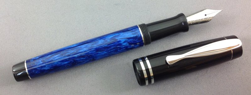
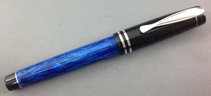
Actually this is a pen with lots of "firsts" and thought I'd post it to get some opinions and thoughts.

This is the first time for:

  • Putting double silver accents on the lower body
  • Thinner silver accent bands on the cap
  • Using this clip
  • Making the body to cap threads a separate piece
Not really obvious in the photos, the cap tapers slightly to the finial and the lower body also tapers slightly to the lower finial. All material is hand poured alumilite.

This is my prototype and I realize I need to ease the edges on either side of the clip for a smoother look and feel and the section has a scratch so please don't point those flaws out. Other than that, let 'er rip
and tell me what you think.

1_showlow1.jpg


1_showlow2.jpg


1_showlow3.jpg
 
Signed-In Members Don't See This Ad
Joined
Feb 24, 2012
Messages
4,368
Location
Claremont NH
WOW, WOW, WOW that is incredible. I like the blank, I like the cap and I love the silver accents this pen is one of the nicest that I have seen! Lots of different colors going on it exhibits class and elegance! I have to admit I like the kitless pens but have not had much interest in trying it myself. This makes me interested maybe next year I will have to give something like this a try! WOW
 

Dalecamino

Local Chapter Leader
Joined
Jan 2, 2008
Messages
14,572
Location
Indianapolis, In.
George, thank you. This pen is just my style, and gives me something to aspire to. :wink: I really like the design. The material and finish are spot on. Thanks for sharing.
 

Robert111

Member
Joined
Apr 12, 2011
Messages
1,127
Location
Saratoga Springs, NY 12866
Wow! Superb design and workmanship. I love this pen. I feel just like Chuck--this is a pen that gives me ideas, makes me want to try new things, kicks me in the butt! Thank you, George!
 

gwilki

Member
Joined
May 20, 2007
Messages
971
Location
Ottawa, ON, Canada.
What the heck, George. You've always been frank with me. I find the clip overpowering.The thin silver rings say "sleek" and "fine" to me, but the clip seems large in that context. And since I'm out on a limb here, I'm not sure what it is, but the cap seems large in diameter for the barrel. Looking at the small step from the cap to where it meets the barrel belies that, so I'm thinking that my eye is drawn to the end of the barrel, which, as you say, you've tapered. It could simply be the perspective of the picture, but the difference in diameter between the finial end of the barrel and the open end of the cap seems large.
To end this on a more up note, I really like the new design with two silver accent rings on the barrel and the thinner silver rings on the cap.
 

IPD_Mr

Member
Joined
Jun 27, 2007
Messages
3,707
Location
Zionsville, In
Nice job George, you have done a great job as usual. The cap looks darn near store bought not hand made. I think the bands on the cap are just about perfect. Normally I like smaller cap bands but with that clip you need the bigger bands. Another option would be three cap bands like on the Parker Major Vacs. But I think that what you chose would look best. You could do the same thing with that specialty clip you have with the three cap bands the same thickness as the body bands. The double silver on the body is great and gives it a balanced look. Your castings are awesome. Classy and not over the top.

BTW - Linda took the Parker red pen that I got from you to Richards. I bet it has a cursive italic on it when it gets back.
 

Robert111

Member
Joined
Apr 12, 2011
Messages
1,127
Location
Saratoga Springs, NY 12866
Okay, now I want to add my $.02 on a design issue. I might think about lowering the clip just a little because of the way the top of the clip obscures the top of the finial just a tad. I think the top of the finial (the end of the pen) should not be obscured, even when the view is from a low angle. Maybe it's just even with the top, but in my opinion it would be better a little lower.

Still, this is a beautiful design.
 

Texatdurango

Member
Joined
Apr 23, 2007
Messages
4,649
Location
Show Low, Arizona
What the heck, George. You've always been frank with me. I find the clip overpowering.The thin silver rings say "sleek" and "fine" to me, but the clip seems large in that context. ....
Grant, I feel that we can always be open with each other and thanks for being frank, when I ask for opinions that is exactly what I want... honest criticisms!

I too feel the clip is overpowering but I have several of these clips and thought I'd give them a try. I think I'll go back to my split clip, which is my favorite and as Mike says, will blend in better with my thinner rings. The other clip has a wider ring so the cap will still taper, but only half as much.

Mike, I already have nine caps made up with two rings so I'll stay with that for a while but not to say that I won't try three rings. The bands on my older pens were .100" + wide, these are .040" wide but after turning them down they still look wide!

Robert, Good catch on the clip, I never even noticed that the clip sat so high and actually overshadowed the finial, I guess I was just in a hurry to try it out.

Thanks everyone for your comments, that's exactly what I was looking to see, now I can go downstairs and make some changes!
 

plano_harry

Member
Joined
Jan 12, 2012
Messages
1,959
Location
Plano, TX 75093
That is a very classy pen George. Style is so subjective. My first impression beyond the overall look was that it had a unique clip that I would like to have. Sometimes ties are wide, sometimes narrow. In pens, we don't have Madison Ave to tell us which one is correct.
 

wizard

Member
Joined
Aug 27, 2009
Messages
3,569
Location
Houston, Texas
Absolutely beautiful pen..I love the combination of blue/black/silver. The silver accents really enhance the appearance. That pen leaves one with a feeling of inspiration. Regards, Doc:)
 

Chasper

Member
Joined
Mar 22, 2007
Messages
1,987
Location
Indiana
There is a lot I like about this. The tapers toward the ends give it a artistic sleekness. The construction creativity is evolutionary. I like the big honking clip, and in my opinion the black end caps elevate the overall look significantly. What I dislike is that the cap and body do not match. Simple as that, the artist side of me makes me think that cap belongs on a different pen.
 
Last edited:

Texatdurango

Member
Joined
Apr 23, 2007
Messages
4,649
Location
Show Low, Arizona
There is a lot I like about this. The tapers toward the ends give it a artistic sleekness. The construction creativity is evolutionary. I like the big honking clip, and in my opinion the black end caps elevate the overall look significantly. What I dislike is that the cap and body do not match. Simple as that, the artist side of me makes me think that cap belongs on a different pen.
Thanks for the comments. While I was not by any means trying to copy this Pelikan Sovereign 405 pen, I was however inspired by it. I think this might have been where I got the idea of a black cap on a blue body.


pelikan-souveran-405-fountain-pen-blue-LRG.png


As mentioned above, this is a prototype and will never be for sale. The cap diameter on the final version is .030" thinner than the prototype and of course I am making the caps in the same colors as the bodies but since they are all 100% interchangeable, I am also making some solid black caps if the customer likes the look.
 
Top Bottom