
You are using an out of date browser. It may not display this or other websites correctly.
You should upgrade or use an alternative browser.
You should upgrade or use an alternative browser.
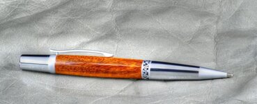
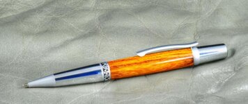
Berea Elegant Sierra
- Thread starter joefyffe
- Start date
Signed-In Members Don't See This Ad
See more from joefyffe


Signed-In Members Don't See This Ad
Younka
Member
Very nice job!
Jackson
Member
I like them. I generally like to put natural colored woods, including oranges and reds, with gold and some of the other acrylics and died woods with chrome. But if it is too yellow it can clash. The first one could have been put on a gold kit, but the second looks like it would have clashed. Don't get me wrong though, they look great with chrome.
G1Pens
Member
Looks good to me. The elegant sierra is one of my favorites. It always looks ....well....elegant!. The DIW looks good on the pen.
There is a blue reflection in the lower (nib) section of the second picture that I find distracting, but other than that its all good.
There is a blue reflection in the lower (nib) section of the second picture that I find distracting, but other than that its all good.
BSea
Member
I'm pretty sure it's the same pen taken from different angles. I also think it would have looked good with some gold. I don't think there is an elegant beauty that's all gold, but there is one with some gold & black TI I think.I like them. I generally like to put natural colored woods, including oranges and reds, with gold and some of the other acrylics and died woods with chrome. But if it is too yellow it can clash. The first one could have been put on a gold kit, but the second looks like it would have clashed. Don't get me wrong though, they look great with chrome.
Always wear a white shirt.:wink:Looks good to me. The elegant sierra is one of my favorites. It always looks ....well....elegant!. The DIW looks good on the pen.
There is a blue reflection in the lower (nib) section of the second picture that I find distracting, but other than that its all good.
Last edited:
Dalecamino
Local Chapter Leader
Looking good Joe! That DIW is beautiful wood. I looked real hard for some finger prints, and didn't find ANY :biggrin: Nice pen!
boxerman
Member
Wow nice pen.
Robert111
Member
I like the combo a lot. The DIW sapwood is rich looking.