Which background with this pen?

Signed-In Members Don't See This Ad
See more from elkhorn

elkhorn

Member
Joined
Apr 22, 2013
Messages
1,199
Location
Utah
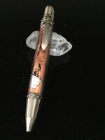
Okay, I promised another Knight's Armor and here it is. This one is in antique pewter and has a steampunk blank.

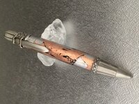
I tried two backgrounds: black and silver. Both give a different effect.

Which one do you think shows off the pen the best?

C & C and opinions welcome!

(Just posted this and the one on the right rotated even though both had the same orientation. Can anyone help me with this? Thanks)
 

Attachments

  • Knight's Armor Steampunk Black.jpg
    Knight's Armor Steampunk Black.jpg
    125.8 KB · Views: 383
  • Knigth's Armor Steampunk Silver.jpg
    Knigth's Armor Steampunk Silver.jpg
    310.1 KB · Views: 360
Last edited:
Signed-In Members Don't See This Ad

elkhorn

Member
Joined
Apr 22, 2013
Messages
1,199
Location
Utah
Thank you both! I was leaning toward the black, but figured I'd post both to get some opinions.

Have a great weekend.
 

magpens

Member
Joined
Feb 2, 2011
Messages
15,912
Location
Canada
The black one is best ! Really nice pen !! Actually, I like the silver too except for the "cloud" in the middle, and that pic is overexposed, it seems.

The black background picture doesn't seem to show the knight's helmet top as well .... something a little funny there.
 
Last edited:

elkhorn

Member
Joined
Apr 22, 2013
Messages
1,199
Location
Utah
Rich & Mal, thanks for the input.

Mal, I finally figured it out - the "cloud" is actually the reflection of the crystal holding the pen up. I think i've learned a lesson!
 

Tom T

Member
Joined
May 12, 2012
Messages
1,883
Location
Sanford Florida
Well it is tough. The black pops really nice so I liked that the best. Then I looked at the gray and it seem as though the pen was more real. Then pen itself was much lighter than on the gray. I would use the one that represents the color the best. The top of the black looks smaller for some reason.

But for sure sir, excellent work on that pen. Really sharp.
 
Joined
Feb 25, 2010
Messages
1,799
Location
webberville, mi
My taste calls for the black background.

As for the pen I need to preface my comment with this: I really haven't found a "themed" kit pen that I like. IMHO they overpower and distract from the pen itself. On a more selfish note, I see them as taking away from our "craft" and putting emphasis on the purchased components. HOWEVER - this baby is the exception to that rule. The blank and the kit work together to enhance each other. GREAT PAIRING of blank and kit. And a high gloss finish would have been all wrong. That is perfect. A real winner - nice, nice work!
 

Edward Cypher

Member
Joined
Feb 8, 2011
Messages
1,901
Location
Denver, Colorado
I think the black also but since they are different views one landscape the other portrait it is hard to tell. Plus the crystal in the gray one did some interesting stuff to the light appearing to make a cloud behind the pen which is a major distraction. I think if the cloud was gone it would be awesome. I also think if the black was landscape it would not look like the top is smaller. JMHO.
 

elkhorn

Member
Joined
Apr 22, 2013
Messages
1,199
Location
Utah
Thanks for the critiques and comments, everyone. Very much appreciated. I apologize for the landscape look of the pen on the silver, but it was portrait when I tried to post it - honest!

I agree, the "cloud" does take away from the picture. I may try to re-photograph and eliminate it. The angle also affected the way the pen looked.

Thanks again.
 

JohnU

Member
Joined
Jan 31, 2008
Messages
4,951
Location
Ottawa, Illinois
I like the black a little better but I think the pen should be turned a bit to fill the screen from corner to opposite corner. The current view distorts the shape and hides a lot of the character that the upper half of the pen could show off.
 

ctubbs

Member
Joined
Sep 12, 2010
Messages
3,588
Location
Murray, Kentucky
The hardest part of using very dark (black) backgrounds is keeping the darn things clean. Just like a black car, every, and I mean EVERY, speck of lint/dirt stands out like a smashed thumb. One of the best black backgrounds I ever saw was a piece of black glass, easy to clean and lint blows off.

Charles
 

elkhorn

Member
Joined
Apr 22, 2013
Messages
1,199
Location
Utah
Thanks, John & Charles.

John, you're right. I have to learn to better position the pens so that nothing gets distorted.

Charles, I'm using a piece of black granite. The black glass may be a better idea.
 

maxman400

Member
Joined
May 25, 2009
Messages
3,111
Location
Omaha Arkansas
Maybe it's just my computer but I like the gray, the black seems to close in on the pen and kill the detail around the edges, where as the gray enhances it and I can see all of the details right to the very edge of the pen.
 

elkhorn

Member
Joined
Apr 22, 2013
Messages
1,199
Location
Utah
Thanks, Max. It really gets tough to make a choice on backgrounds sometimes.
 
Top Bottom