Amboyna Burl Jr. Retro

Signed-In Members Don't See This Ad
See more from gerryr

gerryr

Member
Joined
Sep 22, 2005
Messages
5,353
Location
Billings, MT, USA.
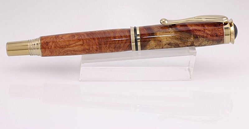
I got the wood from Nolan several months ago and this piece looked like it might be interesting. Gold titanium Jr. Retro rollerball kit from Aaron. The finish is CA.

20083112624_AmboynaRetro.jpg


Comments are welcome and thanks to those who take the time to comment.
 
Signed-In Members Don't See This Ad

wdcav1952

Activities Manager Emeritus
Joined
Mar 18, 2004
Messages
8,955
Location
Montgomery, Pennsylvania, USA.
Gerry, very nice work. My questions are asked only because I know you take far more care in your photos that the average joe like me.

The shine line only extends part of the length of the pen. Is that purposeful, or would it be better to have a longer shine line to show off the finish?

Is it just my screen, or is the color of the gold titanium washed out a bit?

Those questions aside, it certainly is a pen anyone would be proud to own.
 

DCBluesman

Passed Away Mar 3, 2016
In Memoriam
Joined
Aug 22, 2004
Messages
7,679
Location
WOODBRIDGE, VIRGINIA
I borrowed a copy of the Photo and viewed it at 2X. Perfect fit at each intersection of wood and metal. Finish is crystal clear throughout the entire length of both barrels. Photo is in focus throughout. Having not seen the new Dayacomm gold titanium, it appears to be much less intensely gold than Bereak kits. Either that or the picture may be a hair over exposed. Top quality work, as usual.
 

OKLAHOMAN

Member
Joined
May 17, 2006
Messages
10,228
Location
Costa Rica
Gerry,as always your craftmanship is great but as Cav said the Gold seems washed out to me also.

That being said you can send it to me for further review..

Almost like the prop as well as spike:D
 

gerryr

Member
Joined
Sep 22, 2005
Messages
5,353
Location
Billings, MT, USA.
Yes, I think the photo is a bit over-exposed and I don't know why it should be. Everything is exactly the same as it has been for a couple of weeks and the ones I've put on my website aren't over-exposed. Maybe the camera was in a hurry tonight.:D

To answer Cav's question, the length of the shine line probably has something to do with the shape of the pen and the angle of the pen to the camera, but I'm not at all sure. I have some plastic pens that I'll be working on tomorrow or the next day and I will try to get the shine line lllllooooonnnnnnnggggggger just for you.;)
 

Nolan

Member
Joined
Feb 28, 2006
Messages
2,105
Location
oakdale, ca, USA.
I wish I could take that crappy of a photo :D I would wet myself if my photos looked that good. Maybe after my upcomeing class. Very nice work Gerry.
 

IPD_Mrs

Member
Joined
Jun 27, 2007
Messages
2,048
Location
Zionsville, Indiana
gerry,
I got a little anal with looking at your photo since you always take the time to offer photography help to all who ask.:) After a couple of folks said that it seemed the gold was a tad washed out I went to your web site and did a bit of comparing. The color and tone on the Ti Jr Retro and the Ti Jr Gent DIW on your site is the same, so your consistency on your photography is down right scary. Now if you have the photo on screen and hold a Ti Jr Gent up to the screen I can see why the Ti seems washed out. Then again Cav was probably comparing it to an old 10k.

As for the reflection line I have mixed feelings on this one. It is easy to go into the photo with CS3 and remove the line with the cloning tool and nobody can tell until you magnify the photo. With that being said that line helps to show how shiny the finish is. So personally I am kind of torn between leaving it in and taking it out.

With all that being said the pen looks great and I would love to see the side opposite the clip. Nolan blanks are always top of the line.

Mike
 

avbill

Member
Joined
Oct 18, 2007
Messages
1,973
Location
San Bruno, CA, USA.
Gerry is correct:
"To answer Cav's question, the length of the shine line probably has something to do with the shape of the pen and the angle of the pen to the camera, but I'm not at all sure."

The shine is proportionate to the angle of the light and the subject in relationship to the axles to the film plain. The drop off of the light is do to the curvature of the pen. The second part to the photo is if Gerry took his camera setup and placed the camera maybe ten feet backwards the light reflection will increase more. At the same time the subject would become smaller.

Not only is this one fine pen but the photograph is A-1. If I were to nic-pick this photo if you look close at it you will see a narrow reflection from the cap of the pen to the base of the pen about a 1/16th wide. It's a reflection of the area on the ceiling, which is not getting any direct light for the florescence tube.

Bill Daniels
 

gerryr

Member
Joined
Sep 22, 2005
Messages
5,353
Location
Billings, MT, USA.
Originally posted by avbill


you will see a narrow reflection from the cap of the pen to the base of the pen about a 1/16th wide. It's a reflection of the area on the ceiling, which is not getting any direct light for the florescence tube.

Bill Daniels

I can easily fix that and will.
 

GaryMGg

Member
Joined
Nov 23, 2006
Messages
5,786
Location
McIntosh, Florida, USA.
See now that's the kinda work that got me interested in turning pens for myself.
Absolutely gorgeous workmanship: fit and finish are stunning.
Unaxol, Lacquer, or CA?
 

wdcav1952

Activities Manager Emeritus
Joined
Mar 18, 2004
Messages
8,955
Location
Montgomery, Pennsylvania, USA.
Originally posted by MLKWoodWorking

gerry,
I got a little anal with looking at your photo since you always take the time to offer photography help to all who ask.:) After a couple of folks said that it seemed the gold was a tad washed out I went to your web site and did a bit of comparing. The color and tone on the Ti Jr Retro and the Ti Jr Gent DIW on your site is the same, so your consistency on your photography is down right scary. Now if you have the photo on screen and hold a Ti Jr Gent up to the screen I can see why the Ti seems washed out. Then again Cav was probably comparing it to an old 10k.

As for the reflection line I have mixed feelings on this one. It is easy to go into the photo with CS3 and remove the line with the cloning tool and nobody can tell until you magnify the photo. With that being said that line helps to show how shiny the finish is. So personally I am kind of torn between leaving it in and taking it out.

With all that being said the pen looks great and I would love to see the side opposite the clip. Nolan blanks are always top of the line.

Mike

No Mike I wasn't comparing it to one of yours. ;)
 

gerryr

Member
Joined
Sep 22, 2005
Messages
5,353
Location
Billings, MT, USA.
OK, the first photo was a bit over-exposed and Mike wanted to see the side opposite the cap so here it is. I increased the shutter speed from 1/15 to 1/20 to make it a bit darker.

2008311234414_AmboynaRetro2.jpg


Edit: Looks like 1/20 still isn't fast enough.
 

IPD_Mrs

Member
Joined
Jun 27, 2007
Messages
2,048
Location
Zionsville, Indiana
Actually gerry the Ti color looks pretty good in this photo. I also like the slight reflection below in the plexi. Thanks for taking the time and showing the back side. The sap looks like a lions mane to me. One thing that I find conflicting is what side of the pen to show. Abalone Jewelers here in Zionsville, the Private Reserve people, display all of their pens with the clip side down. I have also been taught that the clip goes on the opposite of the best side. On a Baron or Jr Gent. I understand this concept as the clip is plain. On the kits with nice clips this does not always hold true in my way of thinking.

Not meaning to steal your thread gerry but since you have some of the best photographs on IAP I wanted your thoughts on this as well as others.

Mike
 

gerryr

Member
Joined
Sep 22, 2005
Messages
5,353
Location
Billings, MT, USA.
I always struggle with where to put the clip, except on Eagle's cross blanks and then it's easy. I certainly don't have any particular method.
 

OKLAHOMAN

Member
Joined
May 17, 2006
Messages
10,228
Location
Costa Rica
Gerry,great looking from both sides. Mike you brought up a good point,Diane has been after me to move the clips to the planer side.Maybe we should move this to the penturning forum.
Originally posted by MLKWoodWorking

Actually gerry the Ti color looks pretty good in this photo. I also like the slight reflection below in the plexi. Thanks for taking the time and showing the back side. The sap looks like a lions mane to me. One thing that I find conflicting is what side of the pen to show. Abalone Jewelers here in Zionsville, the Private Reserve people, display all of their pens with the clip side down. I have also been taught that the clip goes on the opposite of the best side. On a Baron or Jr Gent. I understand this concept as the clip is plain. On the kits with nice clips this does not always hold true in my way of thinking.

Not meaning to steal your thread gerry but since you have some of the best photographs on IAP I wanted your thoughts on this as well as others.

Mike
 
Top Bottom