
You are using an out of date browser. It may not display this or other websites correctly.
You should upgrade or use an alternative browser.
You should upgrade or use an alternative browser.
amazing worthless wood
- Thread starter altaciii
- Start date
Signed-In Members Don't See This Ad
See more from altaciii


Signed-In Members Don't See This Ad
Skye
Member
Probably very good, but the pic is terrible. Not sure if it's the dark background, but something is throwing off your balance.
workinforwood
Member
yea, it's a bit dark, but I can see it's a beauty!
Gary Max
Member
Looks great from here----of course knowing that the blank comes from Curtis helps the pic:biggrin:
desertyellow
Member
That cap is indeed amazing.
bitshird
Member
Nice pen Alex.
toolcrazy
Member
Beautiful pen.
altaciii
Member
Ok, I took 24 pics of the pen in different poses but never changed the setting on the camera. This picture thing has really tested my patience.
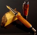
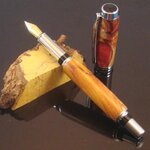
After seeing the comments and appreciating all that was said. I've come to the conclusion that each monitor is different. I asked my daughter to pick the best pic out of the bunch and the one I posted was it. it seems the pic I posted is a little dark but it seems to be clear on my monitor. Will different screens show the same pic differently? Here's two shots of the pen and for the life of me I can't figure out why they came out differently. Help???????
After seeing the comments and appreciating all that was said. I've come to the conclusion that each monitor is different. I asked my daughter to pick the best pic out of the bunch and the one I posted was it. it seems the pic I posted is a little dark but it seems to be clear on my monitor. Will different screens show the same pic differently? Here's two shots of the pen and for the life of me I can't figure out why they came out differently. Help???????
Attachments
Skye
Member
It's getting better but I think the majority of your problem is probably coming from your black background. I'm guessing it being reflective is making it even worse.
I'm no photo guru, but I'd try shooting it on something different.
Also, since the cap is the really special part of this pen, put it in front of the lower barrel, even if that means the lower barrel is partially obscured.
I'm no photo guru, but I'd try shooting it on something different.
Also, since the cap is the really special part of this pen, put it in front of the lower barrel, even if that means the lower barrel is partially obscured.
SamThePenMan
Member
The cap is ....well captivating. Sorry I was going to say amazing, but I just couldn't help my self! ")
Yeh, pictures tend to look different on different screens. LCD monitors very greatly. They have what they call contrast ratio, which is the differnce between the blackest black and the whitest white, or something like that. Also with LCD's the angle that its vied at can make it look lighter or darker.
On old style CRT monitors, depending on how long(age) the screen has been in use can make a differance as well.
If you haven't completely given up, even though the reflection of the pen in the table surface looks neat I would try a different background.
MesquiteMan
Retired Head Moderator
Nice pen, Alex! Give me a call some time and I can give you some pointers on how I do my pics. You still have my number I am hope.
Ligget
Member
Pen looks fantastic, it is very hard to get a good picture of a pen, after all we are penturners not photographers! lol :good: