2nd Attepmpt at a Jr. Gent II

Signed-In Members Don't See This Ad
See more from Joe Burns

Joe Burns

Member
Joined
Sep 9, 2011
Messages
383
Location
Temple Texas
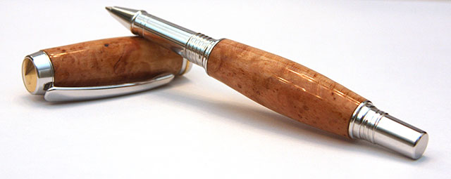
Here is my 2nd attempt at a Jr. Gent II pen in Cherry Burl. I really like these kits.

There are a couple of thing about this one: 1, While I did turn the blank flush with the bushings it looks like I'm still struggling with the CA finish being a little high at the end caps. I keep thinking Im going micro-mesh through the finish trying to get the ends flush. Any suggestions? Also its not readily noticeable until you photograph the pen.

2nd I'm not quite sure about the swell and bevel of the pen barrel. Not sure I like it. Any thoughts?


1_112111_Jr-Gent_small.jpg
 
Signed-In Members Don't See This Ad

joefyffe

Passed Away Aug 19, 2018
In Memoriam
Joined
Mar 29, 2010
Messages
1,316
Location
Indianapolis (almost Zionsville) Indiana
I like a little "body", but that one looks a bit "fat" to me. What we like doesn't matter, if it's for sale. If someone else likes it enough, and it's properly priced, it'll sell. That can be considered "variety"!
 
Joined
Nov 3, 2010
Messages
47
Location
Aiken SC
Joe:

Don't be a bit worried about what is wrong. Somebody will like it and buy it.

If you are have a problem getting the wood ends tigher into the metal. Buy an inexpensive dial caliper and learn to use it. You can do a micrometer measurement of the pen metal (not the bushing) the then a measurment of the wood or end of the barrel while the barrel is still mounted on the mandrel. Don't try to turn it to size with the turning tool, you'll cut into the bushing. Get it close then sand it to the right size. Try it & practice, it works. Just keep going.

Richard Van Hulle, Aiken Pen & Pencil
 

RogerH

Member
Joined
Jul 28, 2011
Messages
307
Location
Illinois
I like "chubby" pens (like my waistline) so I think that is a gorgeous pen.

Like Richard says, a dial caliper or a micrometer will let you get the end of the blank to the exact diameter of the kit parts. You will also get more of a "feel" for it once you do a bunch of one pen, IMHO.

I love the Jr. Gent II also. You might want to try the Triton, a similar Jr. size pen that I think has very nice lines and good quality as well. Triton is a few bucks cheaper than the Jr. Gent II. Finally, I enjoy making the Sedona too, another inexpensive cap/roller ball pen.

Anybody have experience with Woodturningz Orion roller ball?
 

toddlajoie

Member
Joined
Feb 6, 2010
Messages
1,728
Location
Feeding Hills MA
I'll agree that for me, the barrel looks a little on the awkward side, but not obnoxiously so, and as was said by others, to each his own, and someone will love it...

As for being worried about going through the CA, the calipers mentioned help a great deal, but I also make sure there the CA is thicker towards the center of the barrel (I apply to the center and wipe outward to the ends). then when sanding/mm/polishing, I make sure I do it as evenly as possible over the whole blank, and measure the ends. As long as I have at least as much, and preferably a little more toward the center, I should be fine.
 

76winger

Member
Joined
Aug 30, 2009
Messages
2,784
Location
Lebanon Indiana
My tastes tend to think the main body is a little 'chubby' as well, although the cap looks OK. But as also mentioned that's a matter of personal taste and you can adjust to suit your own tastes.

As for getting a better fit, use a set of calipers (vernier, dial, digital, whatever you have or works in your budget) and set them for the size of the pen part to match up with. Then use that as a gauge as your turning down the pen body. (when I remember to use this method) I turn down where the calipers "just" slide over the body when dealing with wood and then the application of the CA finish will build it back up to where it make a matching joint when you assemble. In the case of acrylics, I stop turning "just before" the calipers slide over, then the final reduction during sanding and polishing make the final fit right-on.
 

bitshird

Member
Joined
Aug 27, 2007
Messages
10,236
Location
Adamsville, TN, USA.
I like the contour of the cap, but I too think the lower barrel is a wee bit chubby, this is an odd kit any way since the nib end of that tube is a bit larger than the finial end of the lower barrel, I never could understated why they arranged it that way on the Gent II but I love that blank, very nice timber, and as others have said "some one will like it"
 

Bobalu

Member
Joined
Sep 17, 2009
Messages
604
Location
Social Circle, GA
It may be possible that you assembled the lower section of the pen incorrectly. The two rings that slip over the coupling are not idetical. One is about .045" smaller than the other. Your photo shows that you are very proud of the ring on the right hand end and below the ring on the other. Try reversing them and see if it doesn't look better.
 

marksman

Member
Joined
May 31, 2011
Messages
285
Location
Dacula, GA
I like a heftier lower barrel but as you see by my pens, I shift the bulge toward the nib to give visual balance with the cap on while pushing the weight toward the nib while writing. Just my preference though. Overall, great job...nice pen!
 

Bree

Member
Joined
Jun 19, 2009
Messages
1,736
Location
Buffalo, NY
I taper every pen that I make. Sometimes I make fatties and sometimes I make skinnies... sometimes in between. I don't like pen bodies that run dead straight across. It's a matter of personal taste.

As far as function goes some people like the straight ones and some like the tapered ones. Some like a fatter taper and some like a thinner taper. There is no right or wrong. It is your art and you make it as you feel it.

If you are going to sell them, your customers decide what you make. Ask them what they like and want. Then give it to them. Simple law of selling. Again... others may disagree with your customers but they aren't paying the bill!

I think this one looks fine. You know the areas that you want to work on to get imporvement and this is certainly THE place to get the best advice on how to tweak any perceived flaws.
:cool::cool::cool:
 
Top Bottom