**SUPER RARE!!!**

Signed-In Members Don't See This Ad
See more from JBCustomPens

JBCustomPens

Member
Joined
Oct 3, 2009
Messages
717
Location
Everett, Washington
That sure got your attention didn't it! :tongue: Maybe some people will comment and criticize this time! :biggrin::biggrin::biggrin:

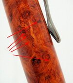
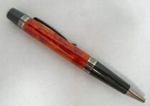
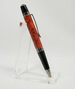
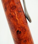
This is an Amboyna burl on a Black Ti Sienna from CSUSA. Thanks to Isaac Rapelje for the awesome amboyna. CA finish on this one, best one in a while.

Can I please get some criticism on this pen please? If I get none, then I will assume it will be on the front page next week!!!:biggrin: Thanks in advance...
 

Attachments

  • Dscn2498.jpg
    Dscn2498.jpg
    43.3 KB · Views: 464
  • amboyna_2.jpg
    amboyna_2.jpg
    27.2 KB · Views: 345
  • amboyna_3.jpg
    amboyna_3.jpg
    47.6 KB · Views: 325
Last edited:
Signed-In Members Don't See This Ad

David Keller

Member
Joined
Nov 30, 2009
Messages
1,618
Location
Enid,OK
It looks... well, it looks invisible! You should try for a more visible pen.


It looks great, and I don't see any way to improve it.
 
Last edited:

mredburn

IAP Activities Manager
Staff member
Joined
Jul 5, 2009
Messages
8,753
Location
Fort Myers FL
Criticisms, hmm ......nope thats ok.......and ....nope ....thats ok too........clip should be on the front side for the picture?
MIke
 

JBCustomPens

Member
Joined
Oct 3, 2009
Messages
717
Location
Everett, Washington
Very nice amboyna burl pen...nothing to criticize here. Did you think there was a problem here that we are missing? Darrell Eisner

No, not really. I just wanted people's real opinion.
Specifically on how the plating matches the blank.

OK, it may be the photo but it appears slightly overturned in the clip area. That is all i could see. The fit and finish look excellent and the blank is superb!

I just double checked, it is just in the photo, it is pretty much spot on. My photo skills need some work!
 

ed4copies

Local Chapter Manager
Joined
Mar 25, 2005
Messages
24,527
Location
Racine, WI, USA.
Well, Justin, can you HANDLE the TRUTH???

Truth is, when looking at a picture it is very hard to see any flaws in a pen.

When I look at a pen in person, the first question is the joints with the hardware--do they flow smoothly? Some people intentionally leave the wood a little "proud", others see this as a flaw--both could be acceptable.

Then, look at the finish. Can you see scratches in it? Have the "radial scratches" been completely removed, or can you see lines going around the pen? In a picture, you will rarely be able to tell.

So, that's the "guide" for YOU to evaluate your pen. Take it to the nearest high wattage light and look at it. You will be MUCH more difficult to please than we are, anyhow!!

Looks good, from the pic!
 

mbroberg

IAP Activities Manager, Emeritus
Joined
Mar 9, 2009
Messages
5,959
Location
Columbus, OH
There is a shadow beneath the pen which could probably be eliminated with the proper light set up. I don't know about the clip end being over turned, but to me the lower end of the barrel looks a tad under turned, but I know that photos can deceive. I think the timber is beautiful, with a great finish. And I looked hard for fingerprints just to be able to gripe about them............none!
 

DCBluesman

Passed Away Mar 3, 2016
In Memoriam
Joined
Aug 22, 2004
Messages
7,679
Location
WOODBRIDGE, VIRGINIA
The Sienna is made to have a very slight bow in the barrel. Look at the lines of the hardware. By making the barrel straight B2B, the pen looks awkward. The finish looks quite good, but that may be disguised due to the photo being out-of-focus. And your lighting is not balanced...check the shadows.

Still, a beautiful pen!
 

JerrySambrook

Member
Joined
Dec 4, 2006
Messages
1,312
Location
Southwick, MA, USA.
I think you did a great job, and personally, I do not think this style should have the bow.
However, the pic to me appears to have a dip because of houw you located the clip in the pic
 

SDB777

Member
Joined
Feb 6, 2010
Messages
6,620
Location
Cabot, Arkansas USA
Also, one thing I forgot to ask.

Do you think the black titanium goes with the amboyna good?


I'd say it probably goes better then say gold/chrome....but I am not the one that would be purchasing it. What I think will be sitting in the 'binder' is usually the first one the wife sells to her friends at work....go figure!


To me that wood can be put against just about anything and it'll look good.


Scott (but what do I know) B
 

avbill

Member
Joined
Oct 18, 2007
Messages
1,973
Location
San Bruno, CA, USA.
Justin,
Both Ed and Lou have good points on self examination of your pen. You asked a finial question about black titanium works with amboyna blank. Black titanium does work but the black of the grip and top does not. A gold titanium would go better with the reddish amboyna blank. my opinion.
 

rjwolfe3

Member
Joined
Feb 12, 2008
Messages
8,352
Location
Mansfield, Ohio, USA.
My favorite wood and you did an awesome job. I looked hard to find something to criticize but could not. I think the finish and fit is perfect. I like the b2b myself. Your photos look great too.
 

its_virgil

Member
Joined
Jan 1, 2004
Messages
8,125
Location
Wichita Falls, TX, USA.
I must agree with Lou...a slight bow would look much better than the straight barrel you have made. Finish and fit appear to be spot on. But, **SUPER RARE!!!** may be a bit of an overstatement. There seems to be a lot of extra nice amboyna burl out there. And, yes...a beautiful pen.
Do a good turn daily!
Don

The Sienna is made to have a very slight bow in the barrel. Look at the lines of the hardware. By making the barrel straight B2B, the pen looks awkward. The finish looks quite good, but that may be disguised due to the photo being out-of-focus. And your lighting is not balanced...check the shadows.

Still, a beautiful pen!
 

jskeen

Member
Joined
Oct 11, 2007
Messages
1,754
Location
Crosby, Texas, USA.
Well done! A very nice looking pen by any standards. Now, you want some observations, here you go, but remember these things are very subjective, and also are based on a picture. In person they may be completely different. I also think the nib end of the blank is a little underturned (slightly larger than the black ti band) it looks like you rolled the edge so it probably is nicely smooth, but you will still feel the transition if you run your finger over it. Try for a smooth transition from metal to wood. On a sierra that does mean you will need to have a little arc to the barrel. Personally, I think that amboyna looks better on a gold ti kit. The highlights in the wood are gold, and the black ti kit kind of leaves them flat. I also don't care for the black enamel sections of that kit with it. I would go with a gold ti/platinum EB version or the gold/black TI. But hey, that's just my opinion from here, worth exactly what you pay for it :)
 

phillywood

Member
Joined
May 10, 2010
Messages
2,067
Location
San Antonio, TX, 78250, USA
Justin, your pen looks very nice, Adn lou is right you needed little curve to give it more charactor, Ed advise was very much true, since I have seen Keith (Mrburls) pen inperson and he is still teaching me what just ed, said about scratches. and, I am telling youthese guys hae soem eyes that I kill for. and, most of the time the pic. can't show all the beauty of the pen made, but your pic. looks verynice. I am not that expert on pic.s yet.
to me your blank looks it's not apprecaited enough with that kit aomehow you got one heck of a amboyna burl there that needed a stonger kit to make it pop. I love that blank though it's beautiful.
 

Texatdurango

Member
Joined
Apr 23, 2007
Messages
4,649
Location
Show Low, Arizona
Can I please get some criticism on this pen please?...

Justin,

WARNING! Constructive criticism ahead :).............

Amboyna is my favorite burl and I use it a lot and I noticed something in your blank that I might shed some light on.

I attached a photo of your blank with some arrows pointing to some specs.

I found that when I sanded amboyna, there were generally some tiny pinhead sized cavities that would collect the light colored sanding dust and when the finish was applied, you could still see the lighter colored specs especially when they were in a dark area. I think this is the case with your blank.

To overcome this, after final sanding I would take an air blower and give the blank a good blowing. Then I would clean the blank with denatured alcohol and blow again. When the blank was wet with alcohol the light colored areas were easy to spot if they still remained.

Finally I would apply a bit of Mylands sanding sealer to make the blank really come alive just before applying the CA finish.

I think blowing the light colored dust out of the voids will make your blanks look a lot nicer.

Works for me...... might work for you

By the way....... I believe the term **SUPER RARE!!!** is reserved for certain vendors selling their blanks, not penmakers showing their pens! :biggrin:
 

Attachments

  • amboyna.jpg
    amboyna.jpg
    46.5 KB · Views: 125
Last edited:

Fred

Member
Joined
Feb 18, 2007
Messages
3,557
Location
N.E. Atlanta, Georgia U.S.A.
I love this wood and believe that your pen is very well turned. Great job!

As for the pictures ... Since you do not have the ink tip exposed simply push a pin into the wood under your background fabric and then set the pen (tip down with no ink refill inside) and bend the pin over just a tad to whatever angle you like. You may have to play around with the balance to keep the clip visible, but this may/will help you eliminate a fair portion of any shadows. Play around with the lighting to eliminate any shadow line caused by the light(s) as best as you can.

Of three pictures you have shown us, I like the third one as more detail of the wood is visible in the close-up.

Just my $0.02 worth!
 

Willee

Member
Joined
Jul 19, 2007
Messages
365
Location
Corpus CHristi Texas
Sorry ... but truth be told it is hard to really judge a pen from a photo.

You went out of you way asking for comments ... so ... if you can handle it ... here is mine.

To me there is nothing special about this pen.
It looks like any other pen made by any other wood turner using the same kit and the same wood.
I look at the photos and ask ... what is it about this pen that makes it different ... special ... super rare ... worthy of the work it took to make it?
I see nothing in the photos that answers that question.

Did you think about adding some ring work or perhaps a simple inlay that might set it apart from the hundreds that have been made and will be made ... and look just like it

Another test is when you offer it for sale.
Do you think it is something someone else would pay money to own?
Go to some local office supply stores and look at what they are selling for $20.
Is this pen any better that those? ... Why and how is it better?

Edit ... I make pool cues and ask my self what makes this pool cue different and why would someone want to pay good money for it.
Is it like something anyone could get somewhere else?
It is very hard to make a pen or pool cue that is really different or unique to MY style.
Finding your own style and then sticking to it is the most difficult thing about wood turning.
Sometimes I succeed ... often I fail ... and I dont think I have really found my true style yet.
No where is there a harsher judge of my work than myself.
If you aspire to be a real craftsman you will know every flaw in what you make without one word from anyone else.
Only you can decide if you want to be one of the thousands grinding out pens or one of the few who's work set them apart from the rest.
Everything we need to achieve our goals ... or to fail ... is right there in our heads.
 
Last edited:

OLDMAN5050

Passed Away May 15, 2019
In Memoriam
Joined
May 8, 2007
Messages
2,112
Location
Unionville, tn, USA.
why would you wat someone to bad mouth the pen and your work? I personaly don't like to tell someone that they need to do this or that to improve. different styles and finishes and overall looks are to ones own taste.
 

its_virgil

Member
Joined
Jan 1, 2004
Messages
8,125
Location
Wichita Falls, TX, USA.
Members make pens, post them and some ask for critiques...honest critiques. Do they really want the truth? I don't know. I thought the critiques on this pen were all well done. But, the negative response from those who really don't want truthful critiques or those who think it is a bad idea is why the Critiques forum is not longer up and running. We tried it once ... but not for long. Too many cant handle or really don't want the truth. I do not critique unless the poster asks and if the poster asks I must assume they really want to know what we think...good or bad or indifferent. I would suggest if a poster does not really want to know the truth then don;t ask for critiques and then they will get the "good pen good job" posts that they may really be looking for. It is not that we like or want to offer negative comments but if the poster asks...well... I also think negative posts when the poster asks for critiques should be followed with ways to correct the issues.
Do a good turn daily!
Don


why would you wat someone to bad mouth the pen and your work? I personaly don't like to tell someone that they need to do this or that to improve. different styles and finishes and overall looks are to ones own taste.
 

mredburn

IAP Activities Manager
Staff member
Joined
Jul 5, 2009
Messages
8,753
Location
Fort Myers FL
As always there is a difference between technical criticism of fit and finish, and Personal prefrences of final shape,color,kit selction,and choice of finish. Sometimes you have to sort out which is which. As to the title he freely admits it was only to get your attention and make you look. I personally dont like the combination of blank and kit, thats not a criticism, and I normally wont post that. Im not the one thats going to buy the pen.
MIke
 

JBCustomPens

Member
Joined
Oct 3, 2009
Messages
717
Location
Everett, Washington
Thanks guys. I realize the only way you get better, is if someone honestly looks at your work with a sharp eye. I do not mind the criticism I have been given, I think they all make very valid points, and I will employ these thoughts in the future!:)

Btw, this is my 600th post!
 

broitblat

Member
Joined
Feb 9, 2006
Messages
3,226
Location
Bellevue, WA, USA.
My main criticism is that it's not mine :)

A great looking blank and, from what I can see, a great finish, too. Having said that, I agree that a little more shape in the middle would make it even better.

-Barry
 

Crickett

Member
Joined
Mar 22, 2009
Messages
569
Location
Saskatoon, SK CANADA
Members make pens, post them and some ask for critiques...honest critiques. Do they really want the truth? I don't know. I thought the critiques on this pen were all well done. But, the negative response from those who really don't want truthful critiques or those who think it is a bad idea is why the Critiques forum is not longer up and running. We tried it once ... but not for long. Too many cant handle or really don't want the truth. I do not critique unless the poster asks and if the poster asks I must assume they really want to know what we think...good or bad or indifferent ...

why would you wat someone to bad mouth the pen and your work? I personaly don't like to tell someone that they need to do this or that to improve. different styles and finishes and overall looks are to ones own taste.

I posted a pen picture and asked for it to be critiqued and it was. I did it because I really wanted to know if it showed as a nice, well-made pen. I read the posts for "Lenny's" pen and I learned a lot from what was said about it, in particular the blank chosen. This is why I visit the IAP, to better myself and learn what to look for when I'm selecting a blank for kit.

With this particular thread there are two opinions regarding the shape of the barrel, although it comes down to personal preference, if someone was to post a poll on this I believe the barrel with a light bulge would win because it's more pleasing to the eye and follows the shape of the hardware.
 

Tanner

Member
Joined
May 17, 2006
Messages
2,307
Location
Peoria, Arizona, USA.
Can I please get some criticism on this pen please?...

Justin,

WARNING! Constructive criticism ahead :).............

Amboyna is my favorite burl and I use it a lot and I noticed something in your blank that I might shed some light on.

I attached a photo of your blank with some arrows pointing to some specs.

I found that when I sanded amboyna, there were generally some tiny pinhead sized cavities that would collect the light colored sanding dust and when the finish was applied, you could still see the lighter colored specs especially when they were in a dark area. I think this is the case with your blank.

To overcome this, after final sanding I would take an air blower and give the blank a good blowing. Then I would clean the blank with denatured alcohol and blow again. When the blank was wet with alcohol the light colored areas were easy to spot if they still remained.

Finally I would apply a bit of Mylands sanding sealer to make the blank really come alive just before applying the CA finish.

I think blowing the light colored dust out of the voids will make your blanks look a lot nicer.

Works for me...... might work for you

By the way....... I believe the term **SUPER RARE!!!** is reserved for certain vendors selling their blanks, not penmakers showing their pens! :biggrin:

I saw the specs right away as well. I do like the kit you picked. It brings out the darker areas in the wood.
 
Top Bottom